
Fen & Field
FEN & FIELD, AI Campaign Imagery
BRAND STRATEGY
BRAND IDENTITY
ART DIRECTION & STYLING
CAMPAIGN IMAGERY
SERVICES
ABOUT
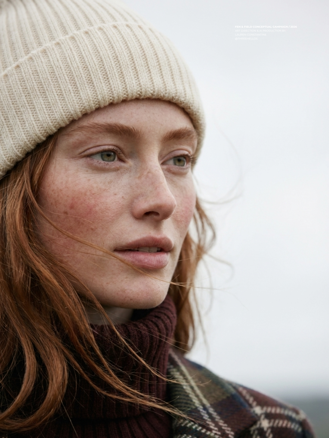
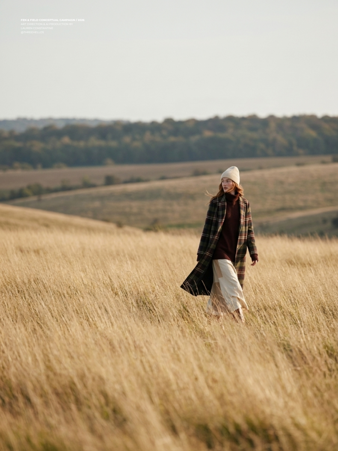
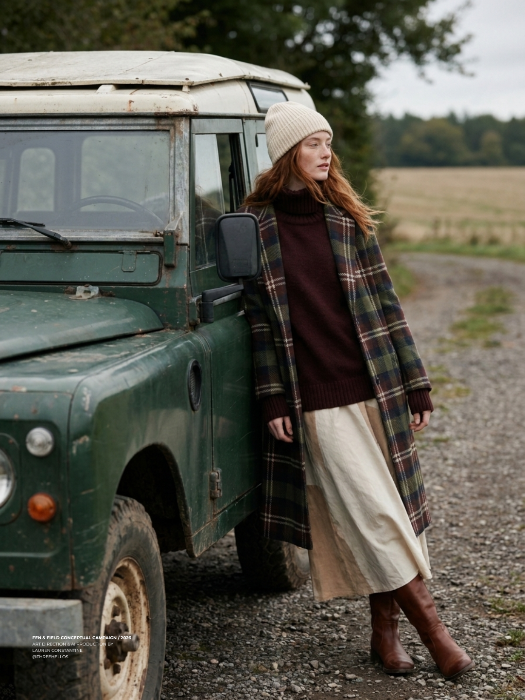
Fen & Field is a heritage wool brand built for this project as a full creative world, not a single campaign. The starting reference point was The Holiday's Rosehill Cottage, an English countryside mood of tartan, oxblood, and cream, wind, wood smoke, and a weathered vintage Land Rover parked on a gravel track. From there, the brand needed to be something that could live beyond one season. A wool company whose story could stretch from a fall countryside campaign into a summer beach evening just as easily, built on one material and one visual identity rather than one holiday.
THE PRODUCT
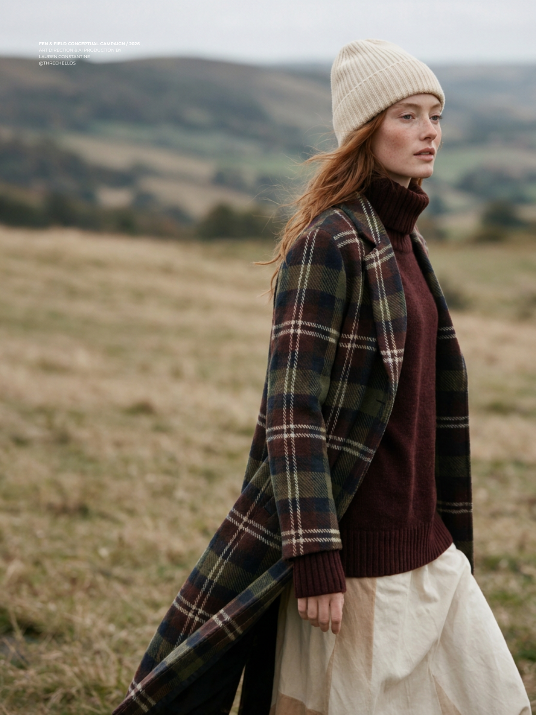
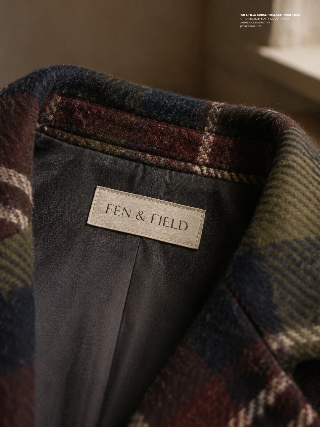
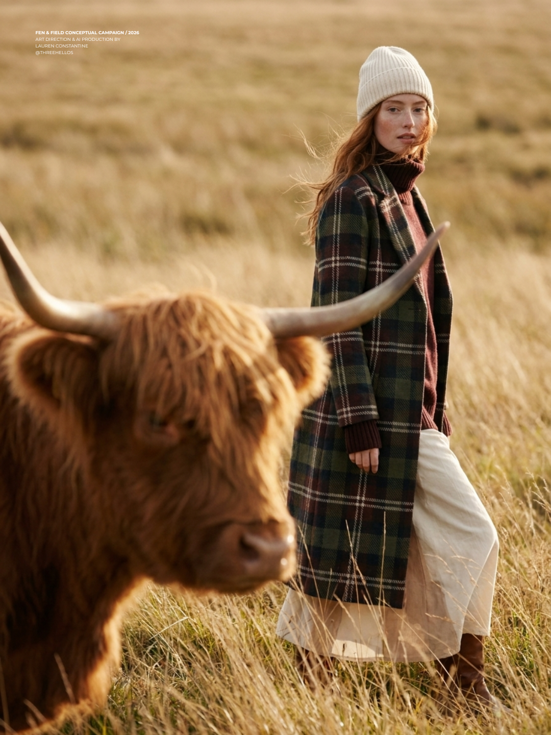
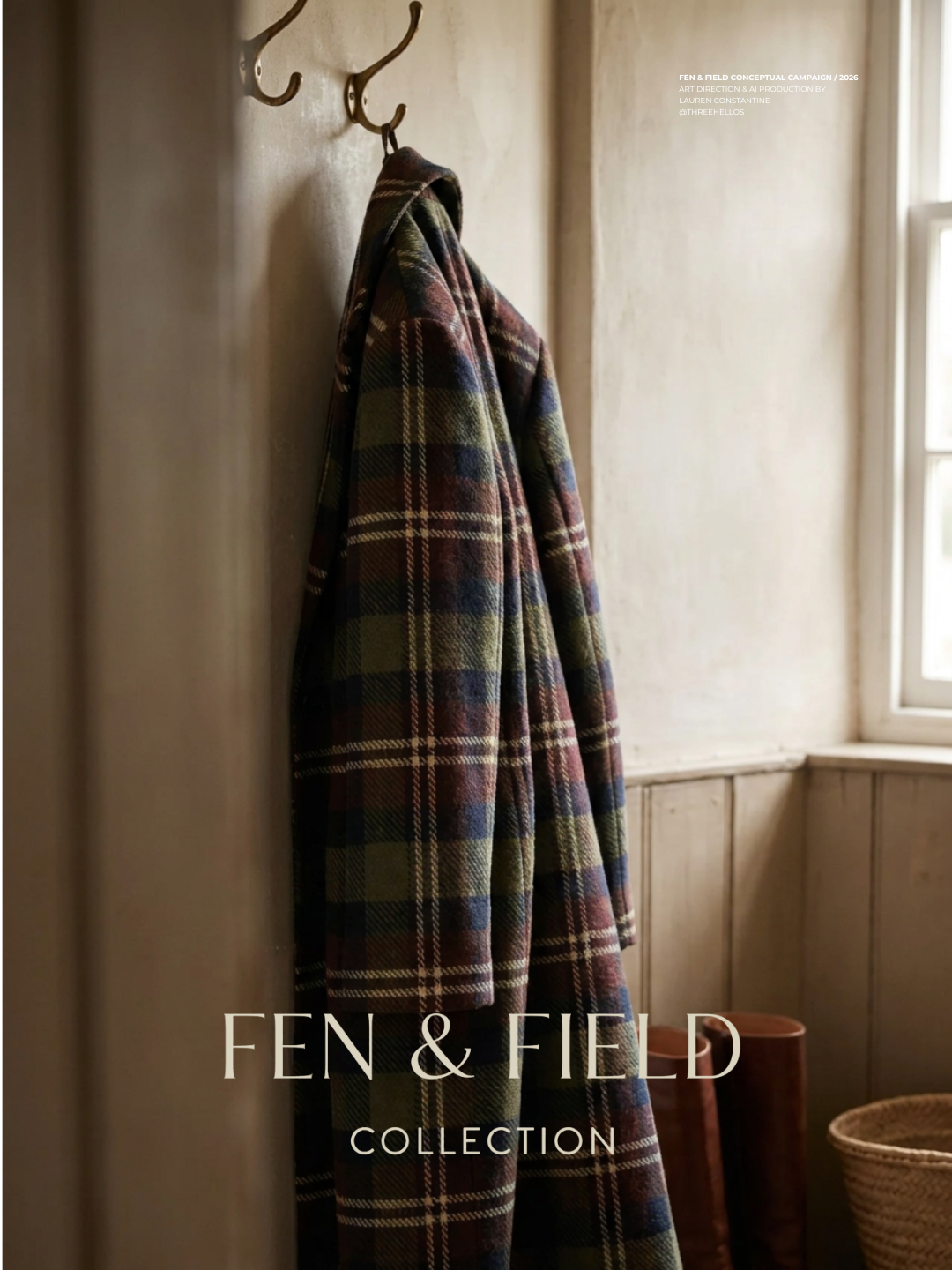
Every piece in this campaign centers on a structured, knee-length wool coat in a custom tartan, designed from scratch rather than pulled from stock references. The pattern (olive, oxblood, navy, and cream pinstripe) was built as its own asset first, then used as a direct reference across every generation to keep the weave and colorway consistent from the wide landscape shots down to the close detail of the woven interior label.
THE PROCESS
Every image in this campaign started with the product, not the prompt. The tartan pattern was designed first as its own asset, then used to anchor color and weave consistency across every shot. The model's face and styling were locked once, early, and carried forward as the reference for all six scenes, the same discipline used for MAREN's identity consistency across three different tools.
Getting each shot to feel like a real photograph rather than a generated image took real iteration, not luck. Composition, lighting, and texture were all treated as deliberate creative decisions, refined shot by shot until the set held together as one cohesive world rather than six disconnected images.
ART DIRECTION, BRAND IDENTITY AND AI PRODUCTION BY LAUREN CONSTANTINE @THREEHELLOS
CREDIT