BRAND IDENTITY / COLLATERAL
aligned. Orthodontics
From vision to reality: a brand built from the ground up for a spa-like orthodontic experience on Denver’s Pearl Street
aligned. Orthodontics is a functional and cosmetic orthodontic practice on South Pearl Street in Denver, one of the city's most well-known and well-loved corridors. Dr. Amanda Vanderstelt had spent years working within an established practice before taking the leap to build something entirely her own. When she did, she went all in. She worked with an architect to design and construct a brand new space from the ground up with a clear vision: an orthodontic experience that felt more like a spa than a clinical office.
That vision needed a brand to match.
The Challenge
Dr. Vanderstelt wasn't just opening a practice. She was creating an entirely new patient experience in a competitive, design-forward market. The brand needed to communicate warmth, sophistication, and clinical excellence all at once, while also serving as the visual foundation for an entire physical environment. From exterior signage to interior finishes, every touchpoint would carry this identity. It had to be distinctive enough to stand out on Pearl Street, refined enough to attract discerning adult patients, and flexible enough to live beautifully across architecture, stationery, signage, and digital platforms.
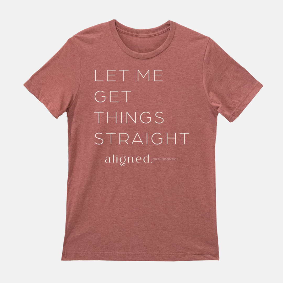
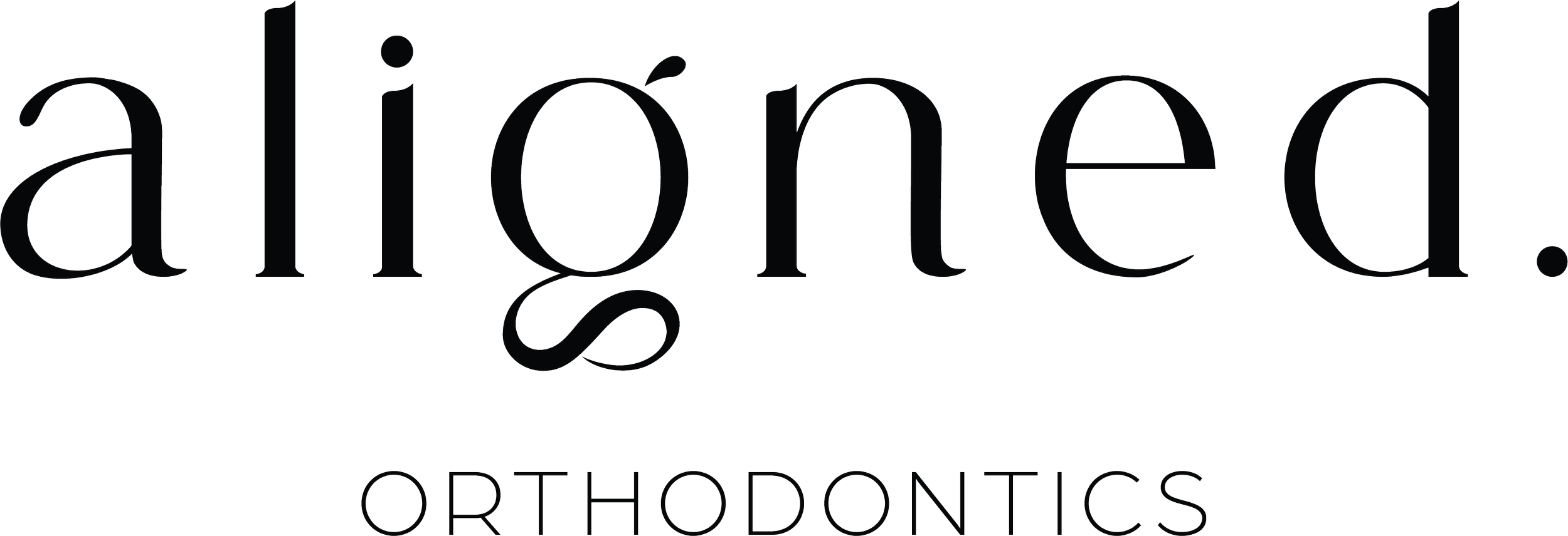
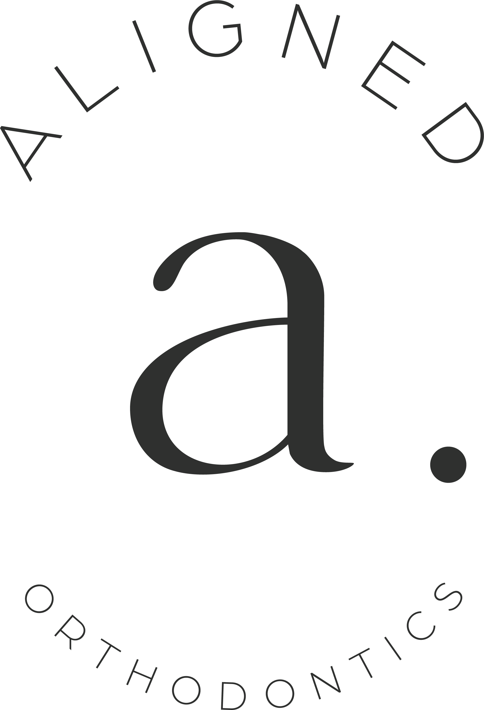
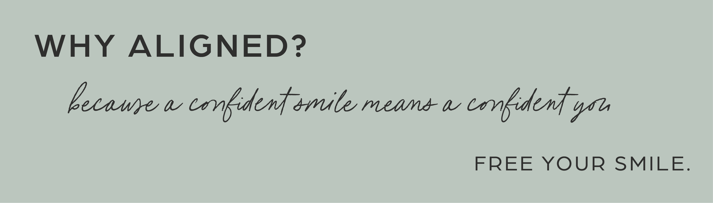
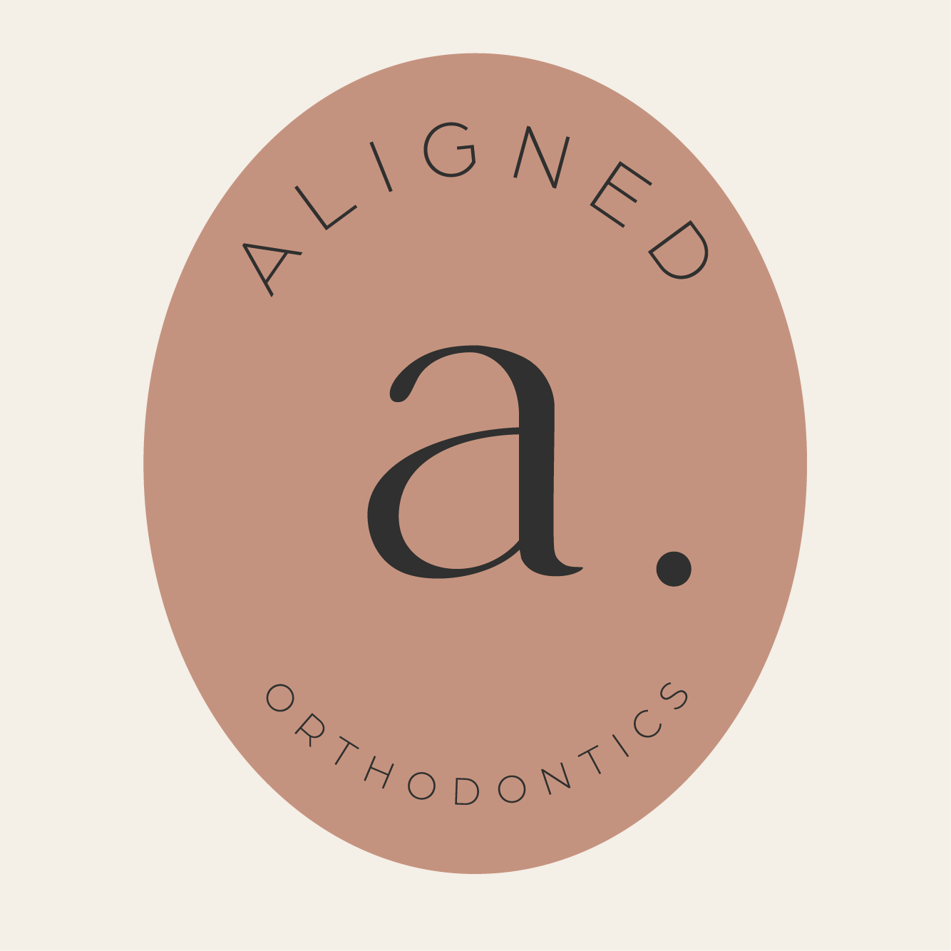
We developed a brand identity rooted in calm confidence and quiet luxury, a reflection of the experience Dr. Vanderstelt wanted her patients to feel the moment they walked through the door. The lowercase "aligned." wordmark with its deliberate period communicates both precision and approachability. A warm neutral palette and botanical-inspired aesthetic reinforced the spa-like atmosphere she envisioned, while a full suite of submarks, signage treatments, and brand elements gave the identity the flexibility to live across every surface of the space.
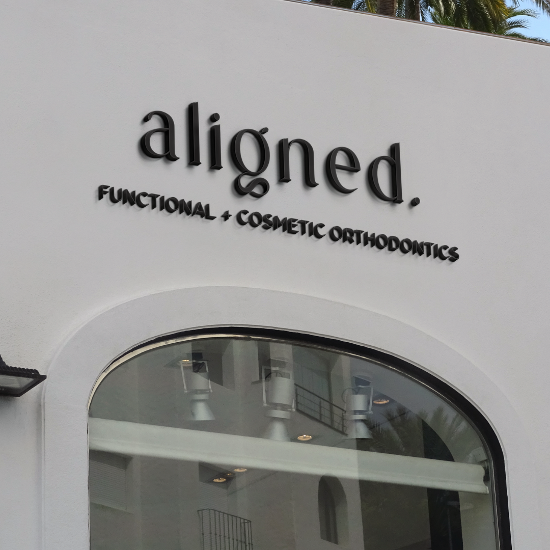
The brand didn't just translate to the physical environment. It shaped it. Dr. Vanderstelt incorporated the brand colors, typography, and identity elements throughout the entire buildout, from the exterior facade and blade signage to the reception wall mural, frosted glass partitions, and the illuminated feature wall. The result is a practice where the brand and the space are genuinely inseparable.

Brand System Integration
The aligned. brand system was built to function at every scale, from a business card to a building facade. The wordmark, submarks, and pattern system were designed with environmental applications in mind from the start, so that as the physical space took shape, the brand remained cohesive at every touchpoint. Brand guidelines gave Dr. Vanderstelt and her team the tools to carry that consistency across signage, stationery, social media, and beyond.