Rich, Grounded & Warm: A Color Palette for Sophisticated Brands
Color has the power to shape how your audience feels about your brand before they ever read a word. Some palettes whisper with softness, while others bring depth, confidence, and richness.
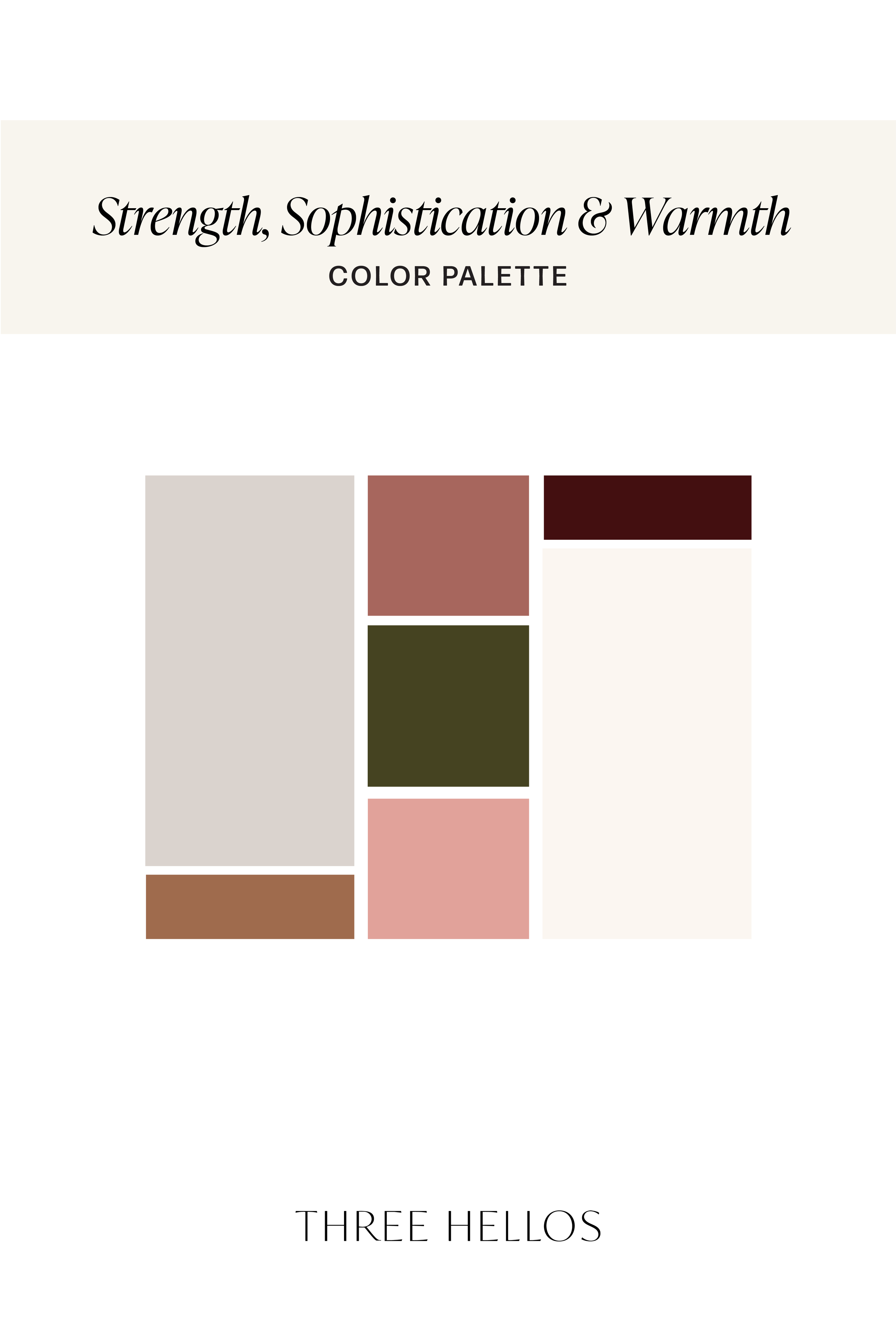
This palette is all about grounded strength and approachable sophistication. With earthy tones, warm pinks, and deep burgundy, it creates a brand presence that feels steady, warm, and timeless, perfect for creatives, lifestyle brands, and businesses that want to balance trust and personality.
The Palette
Warm Brown → grounded, stability, tradition
Deep Burgundy → luxury, passion, intensity
Dusty Rose → compassion, warmth, sincerity
Light Pink → kindness, playfulness, softness
Olive Green → resilience, wisdom, grounded energy
Warm Grey → neutrality, balance, calm
Soft Cream → simplicity, purity, softness
Why This Palette Works
This palette is a study in balance. On one side, the earthy, darker tones (brown, burgundy, olive, grey) provide depth and reliability. On the other, the soft pinks and cream bring lightness, kindness, and approachability.
Together, they create harmony — a brand that feels both strong and welcoming, timeless and creative.
How to Use These Colors in Your Brand
1. Logos & Identity
Anchor your logo or typography in the deep brown or burgundy for strength, then soften the edges with light pink or cream accents.
2. Web Design
Use cream or warm grey as a background, olive for grounding sections, and pinks for accents like buttons or callouts.
3. Marketing Materials
Pair burgundy with light pink for an elevated yet approachable feel. Use olive to introduce a natural, grounded element.
4. Photography & Styling
This palette shines in lifestyle imagery: think soft linens, natural woods, blush-toned florals, or heritage-inspired details.
Final Thoughts
If your brand is all about warmth, stability, and approachable sophistication, this palette may be the perfect foundation. It communicates trust, sincerity, and grounded creativity, everything you need to make your brand memorable and timeless.
Save this palette for inspiration or explore how these tones could bring your branding to life.
Let’s Build Your Brand Together
At Three Hellos, I help passionate business owners transform their ideas into intentional brand identities and websites that feel both elevated and approachable. If you’re ready to bring your brand vision to life, I’d love to help.
Work with me and let’s design a brand identity that feels as timeless as your business.


Color Codes
Left to Right:
#986E4C / #3F1714 / #9E6A5C / #D8A598
#464220 / #D8D3CF / #F6F2EC