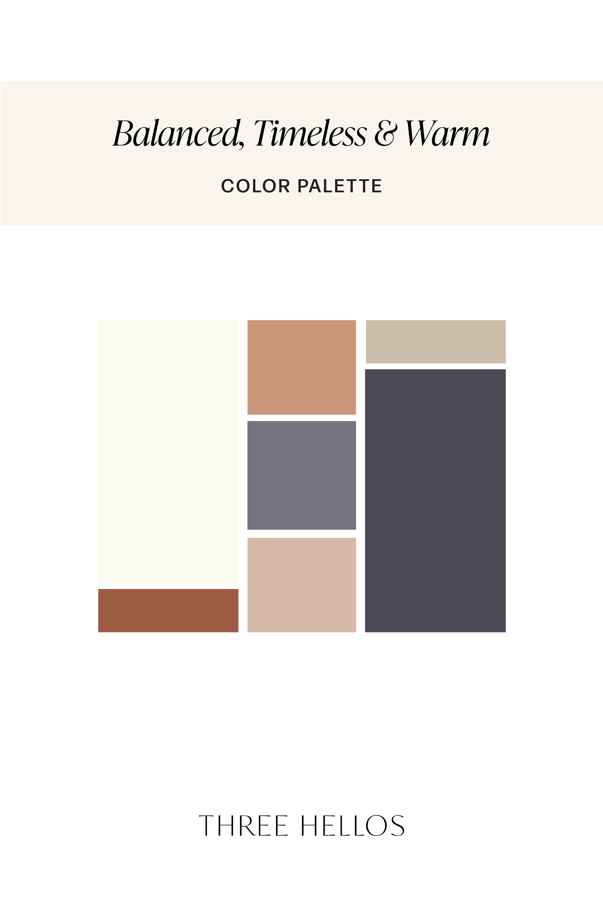
Balanced, Timeless & Warm: A Color Palette for Timeless Brands & Interiors
Colors tell a story before words ever do. This palette blends earthy warmth, calming blues, and soft neutrals to create a grounded, timeless mood. Perfect for branding, interiors, and weddings, these tones work together to convey stability, serenity, and refined elegance.
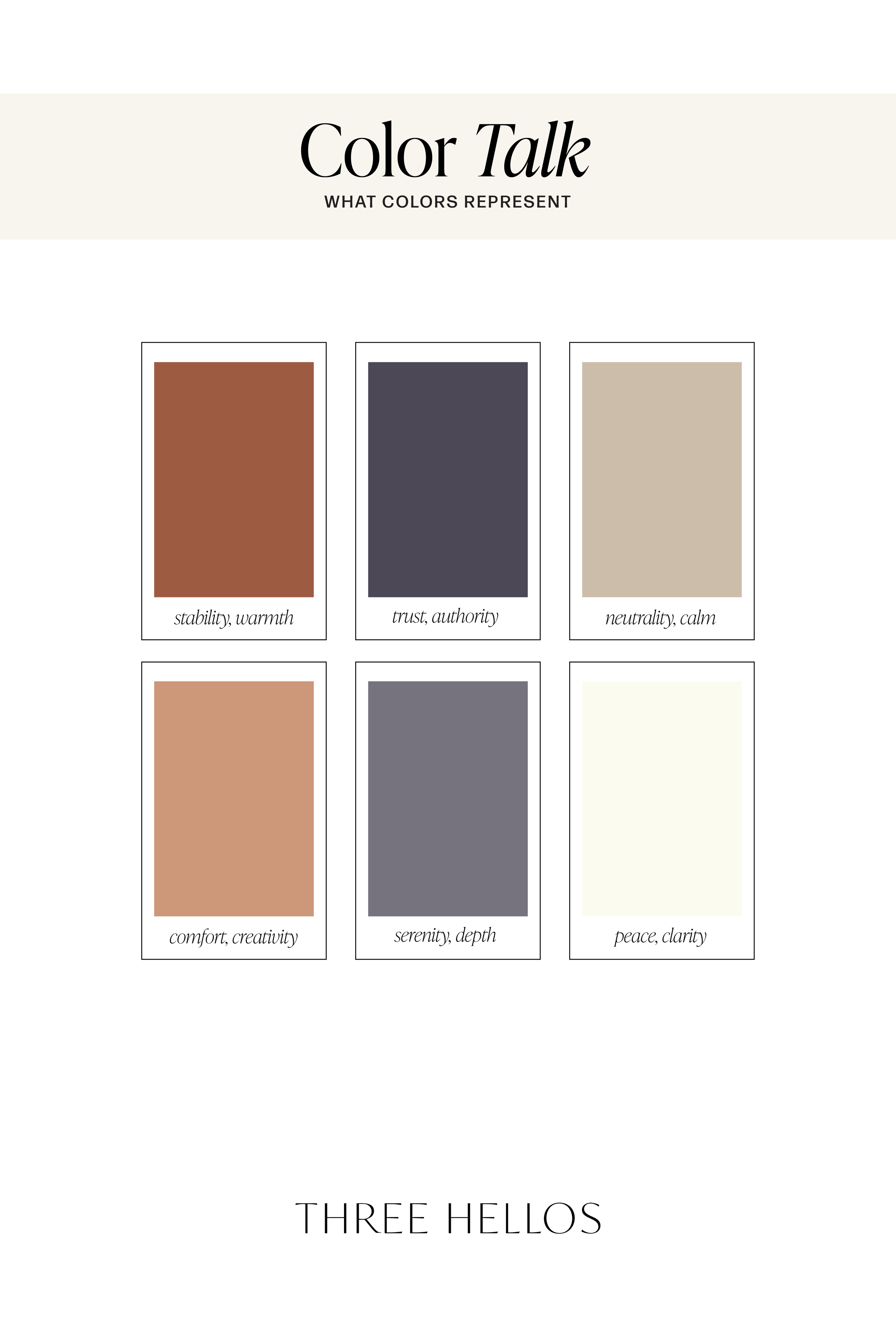
The Palette at a Glance
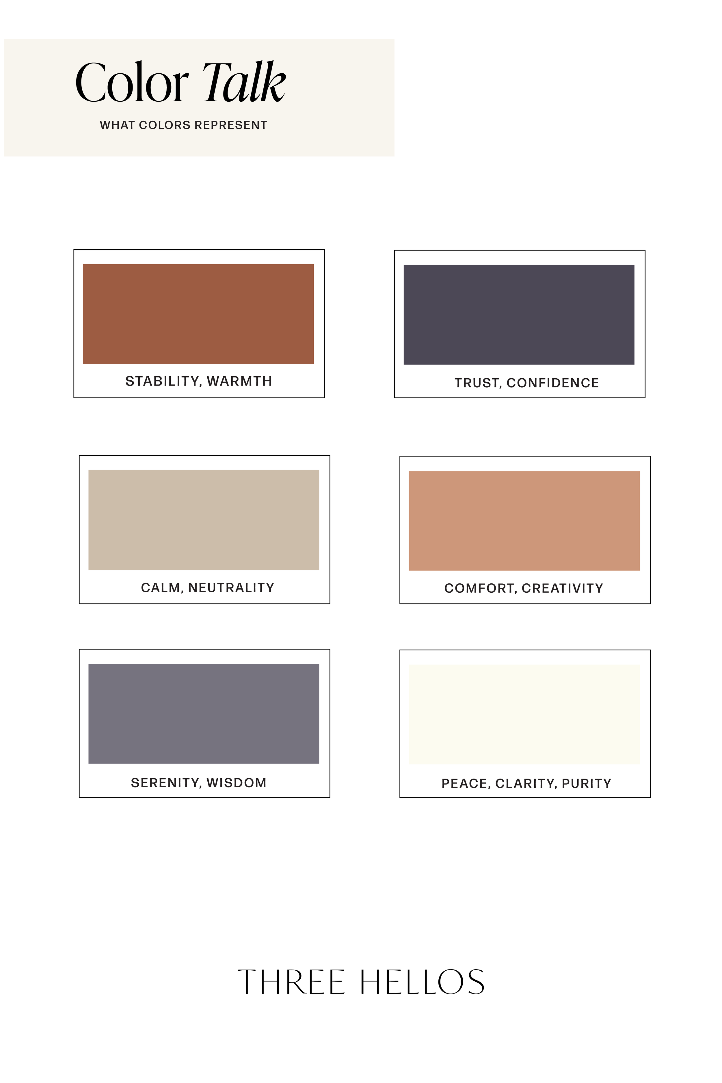
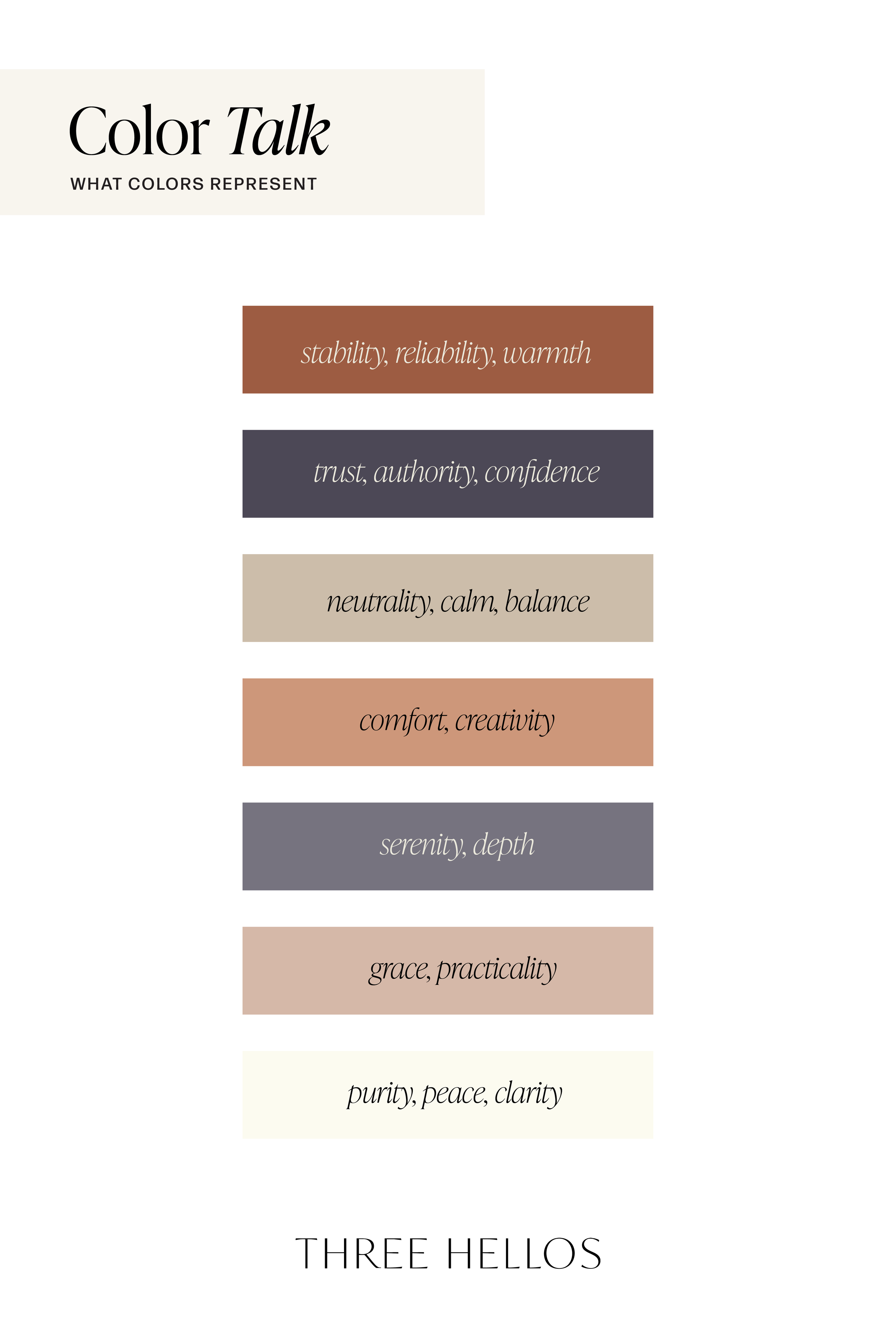
Warm Brown – Stability & Warmth
Rich and earthy, this shade feels grounding and dependable. It’s a color of trust and authenticity, often used to create a sense of comfort and reliability.Deep Navy Blue – Confidence & Intelligence
Navy is timeless and professional. It symbolizes authority, wisdom, and trust, making it an ideal choice for brands or designs that want to feel dependable yet elevated.Beige Taupe – Neutrality & Calm
Soft taupe tones bring balance and subtle sophistication. They allow stronger shades to shine while keeping the overall palette feeling polished and harmonious.Soft Terracotta – Creativity & Warmth
This clay-inspired shade adds energy and approachability. It’s warm, creative, and brings a touch of vibrancy without overpowering the rest of the palette.Slate Blue – Serenity & Wisdom
A calming shade of blue that feels steady and sophisticated. It enhances feelings of trust and peace, making it a natural complement to earthy neutrals.Taupe – Security & Grace
Neither too warm nor too cool, taupe embodies balance. It communicates security, practicality, and understated elegance, grounding the palette beautifully.Cream – Purity & Clarity
Light and airy, cream tones bring peace and minimalism. They add contrast without harshness, keeping the palette open, fresh, and timeless.
How to Use This Palette
Branding → Ideal for businesses that want to balance professionalism with approachability. Think lifestyle brands, creative studios, or consultants who want to project trust and warmth.
Interiors → A beautiful choice for home design. Imagine slate blue walls, taupe textiles, terracotta accents, and cream details to create a calming, elevated space.
Weddings → A chic alternative to traditional palettes. Cream and taupe as neutrals, with navy and terracotta accents, create a romantic yet refined look.
Why This Palette Works
This collection is all about balance. The earthy browns and taupes ground the palette, the blues bring serenity and trust, while the terracotta and cream add warmth and light. Together, they create a refined harmony that feels timeless, versatile, and deeply calming.
Whether you’re designing a brand, styling a home, or planning a wedding, this palette brings a story of grounded elegance and serene sophistication to life.
Inspired by this palette? Pin it to your design board and explore more color psychology insights with Three Hellos.
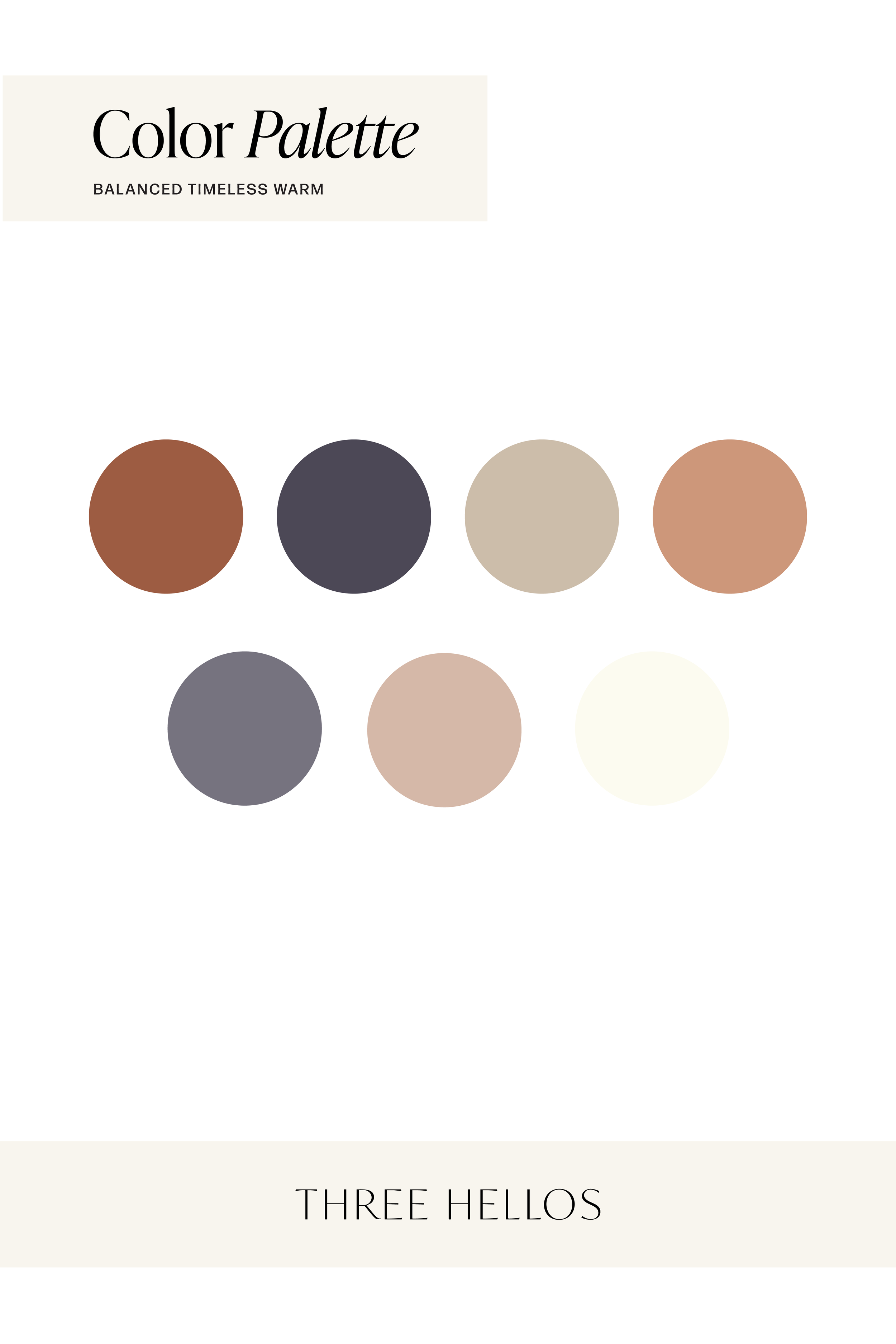
Color Codes
Left to Right:
#9D5C42 / #4C4856 / #CCBDAA / #CD977A
#FCDFD6 / #D5B8A8/ #FCFBF0