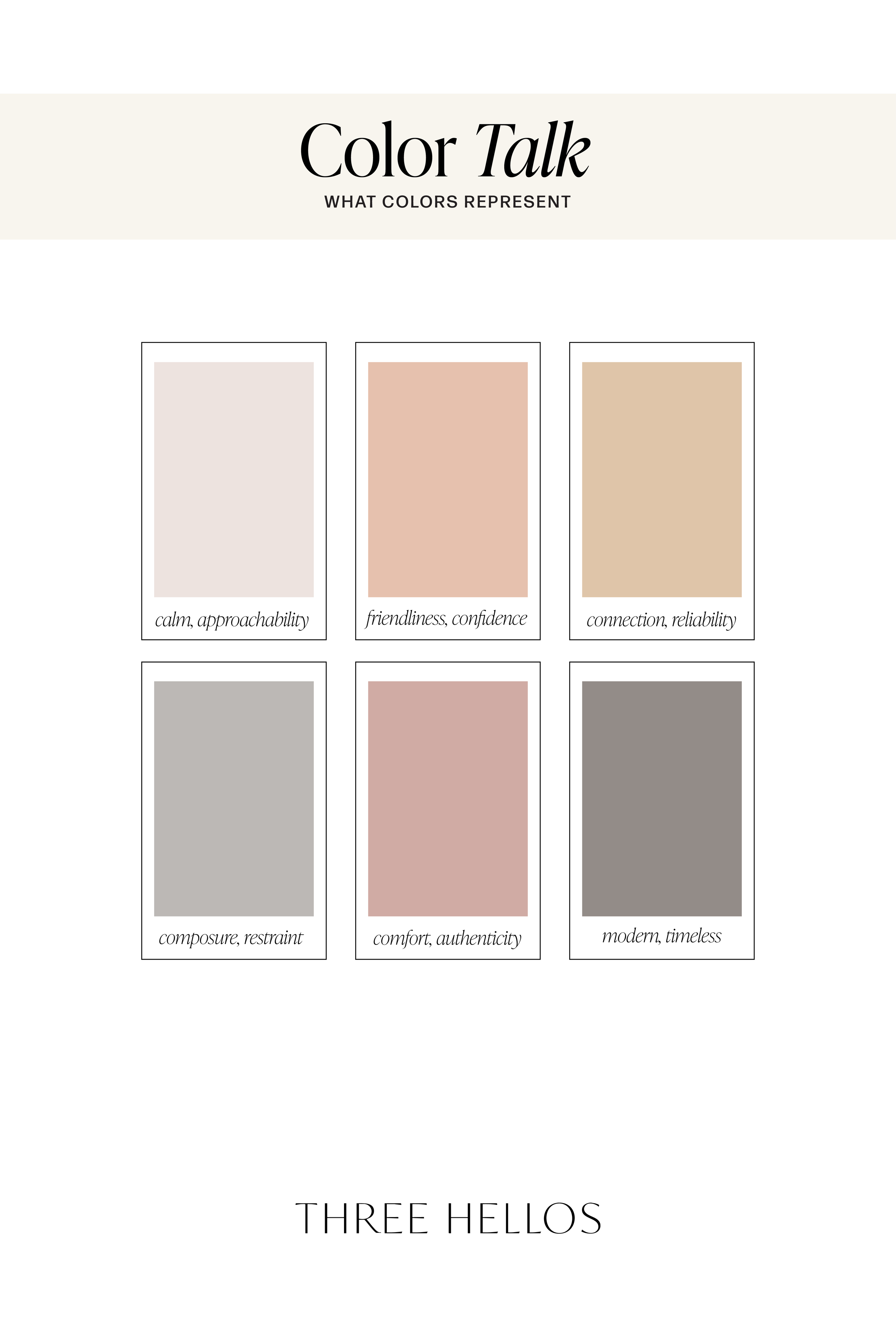
Soft Intention: A Palette of Warm Neutrals and Subtle Contrast
If you’re drawn to colors that feel calm, connected, and quietly intentional, this palette is for you. Soft Intention blends warm neutrals with a hint of modern contrast — tones that feel approachable yet elevated.
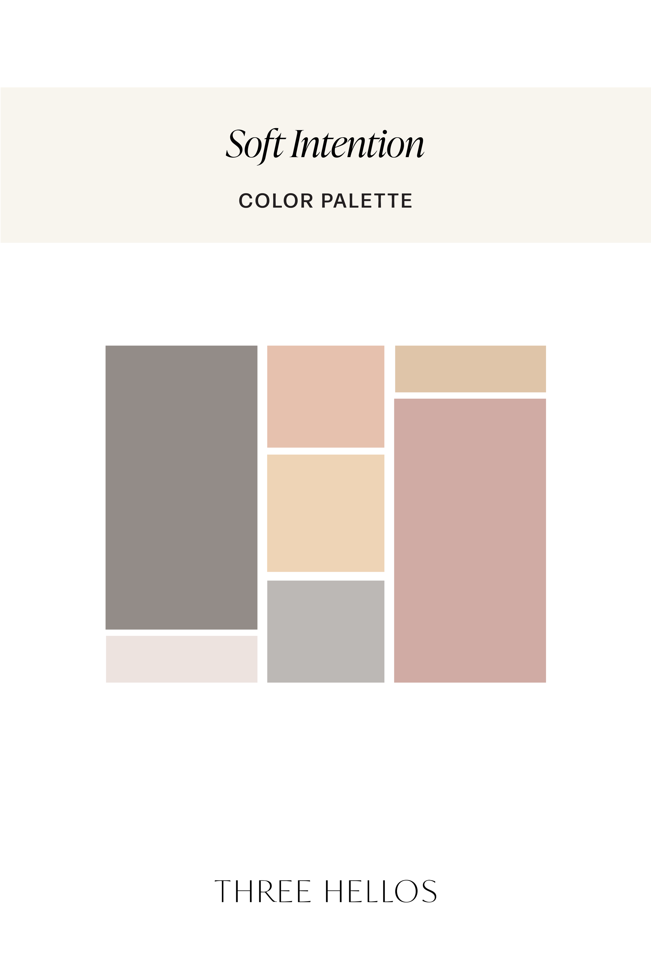
Each hue in this collection balances emotion and restraint. Creamy apricot and honey tones create gentle warmth, while mushroom gray and stone taupe introduce quiet strength. Together, they create a color story that feels both emotional and composed — human, timeless, and beautifully versatile.
The Psychology Behind the Palette
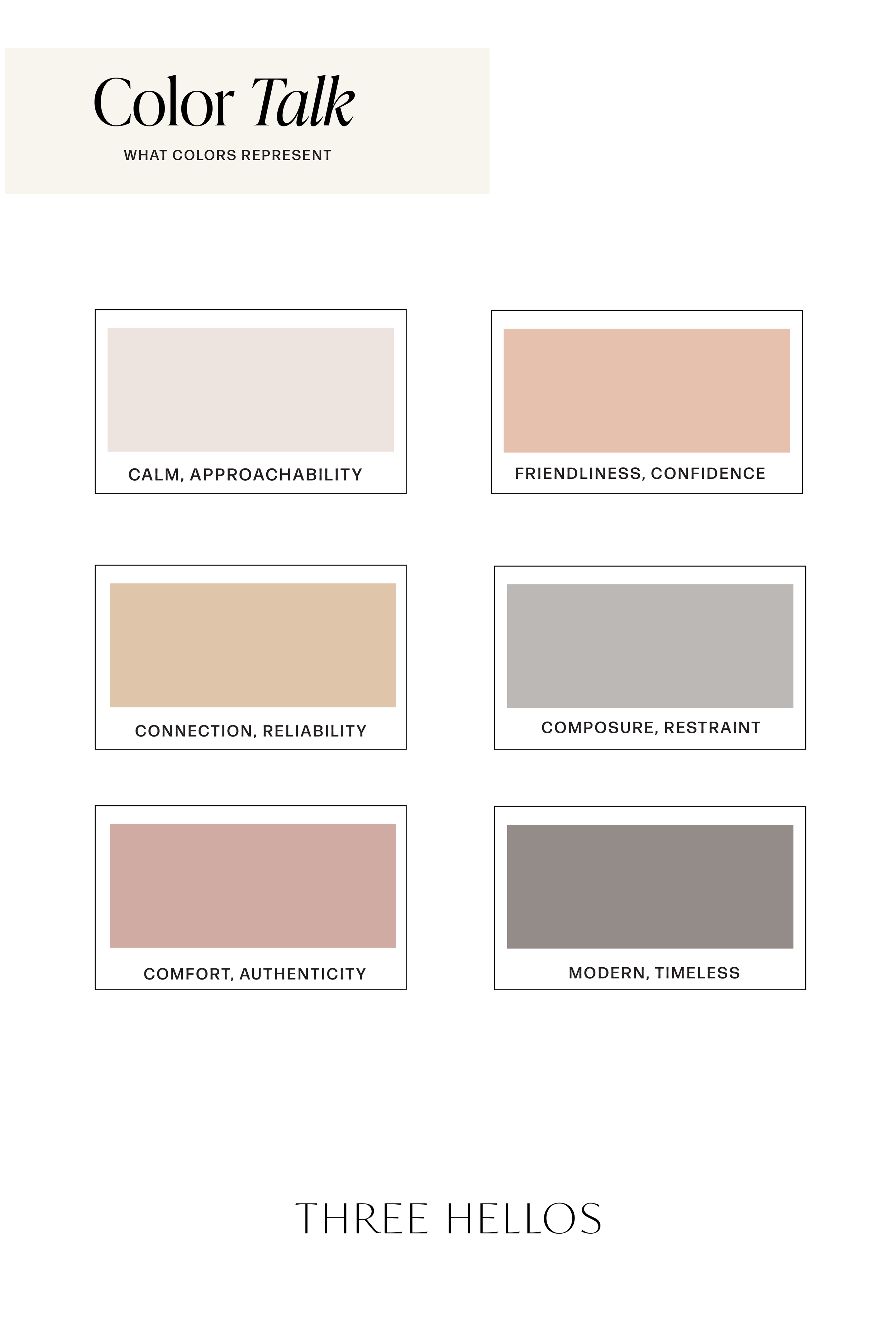
Warm neutrals like apricot, blush, and butter linen are rooted in comfort, care, and connection. They make a brand feel approachable, personal, and thoughtfully designed. The cooler gray and taupe notes bring stability and professionalism, keeping the palette balanced and modern.
This combination is perfect for brands that want to feel refined but not cold, warm but not whimsical — a visual identity that communicates empathy, trust, and ease.
Where to Use This Palette
This color story works beautifully across creative and professional spaces alike:
Branding: Ideal for boutique studios, wellness professionals, or lifestyle brands that want quiet warmth with structure.
Web Design: These tones create softness online — a subtle contrast that photographs and reads beautifully.
Interiors: Perfect for layered neutrals, natural materials, and textural contrast — elegant but livable.
Social Media: Versatile and cohesive for curated, calming feeds that evoke ease and consistency.
The Feel
Psychology Keywords:
Warmth, Connection, Calm, Sophistication, Approachability
This palette feels like slow mornings and soft linen light — timeless, tender, and intentionally composed. It’s approachable but intelligent, designed for brands that speak through subtlety rather than saturation.
Color Breakdown
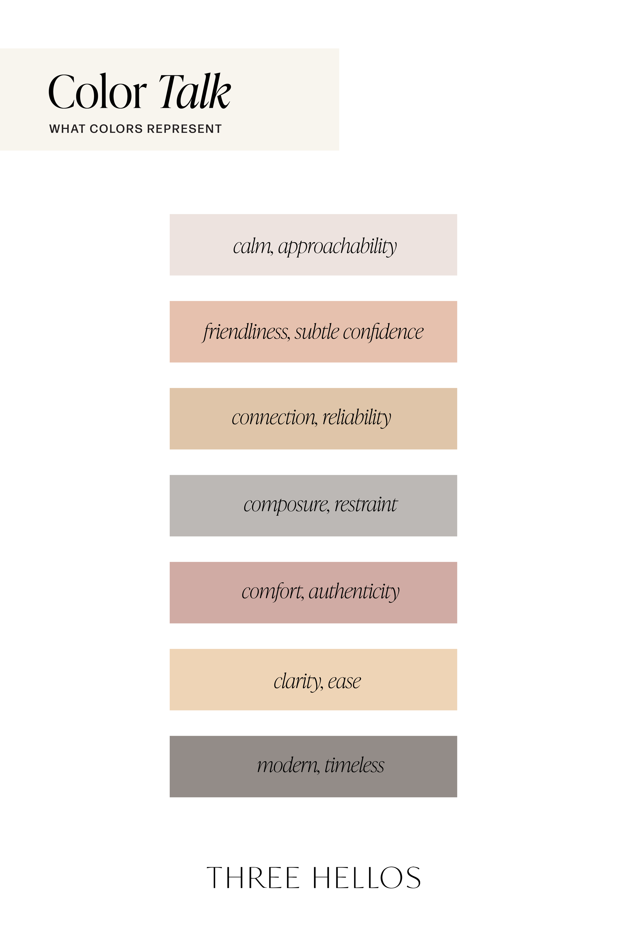
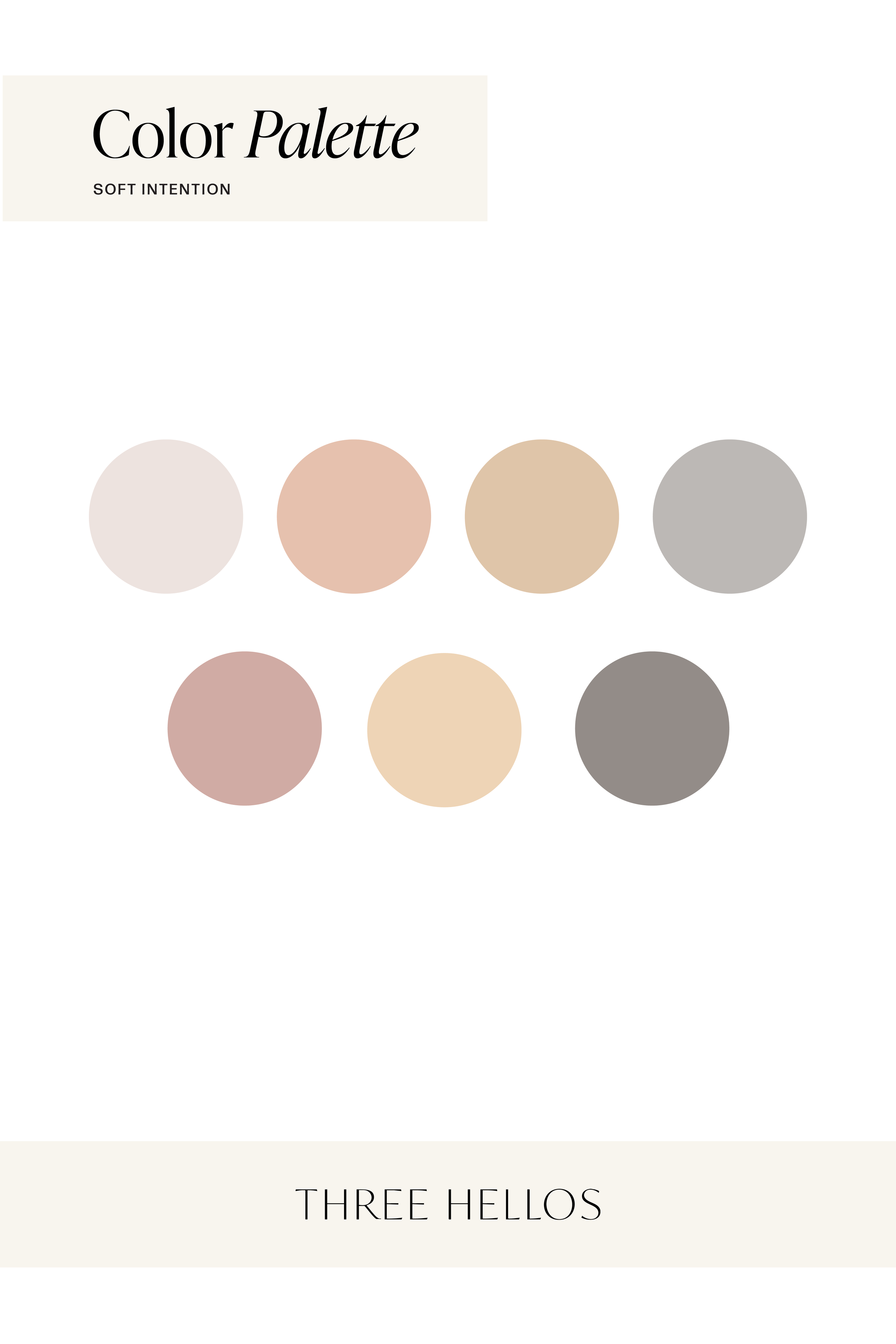
Porcelain Blush (#EDE3DF) – Calm, approachable, nurturing
Apricot Cream (#E6C1AE) – Friendly, inviting, optimistic
Honey Sand (#DFC5A9) – Reliable, grounded, cozy
Mushroom Gray (#BCB8B5) – Balanced, composed, professional
Rose Clay (#D0ABA4) – Emotional, feminine, authentic
Butter Linen (#EED4B6) – Light, airy, optimistic
Stone Taupe (#938C88) – Structured, modern, timeless
Inspiration
Think of soft light across clay walls, a linen dress in late afternoon sun, or warm coffee on a quiet morning desk. Soft Intention embodies that feeling — gentle warmth meeting quiet structure.

