Ember & Ink: A Palette of Depth and Warmth
If you’re drawn to color stories that feel rich, tactile, and quietly powerful, this one’s for you. Ember & Ink combines deep midnight and espresso hues with warm metallics and soft clay undertones — a perfect harmony of structure and emotion.
This palette balances the seriousness of cool shadow tones with the human warmth of bronze, blush, and copper. Together, they tell a story of sophistication and creative depth made for brands that value craftsmanship, authenticity, and presence.
The Psychology Behind the Palette
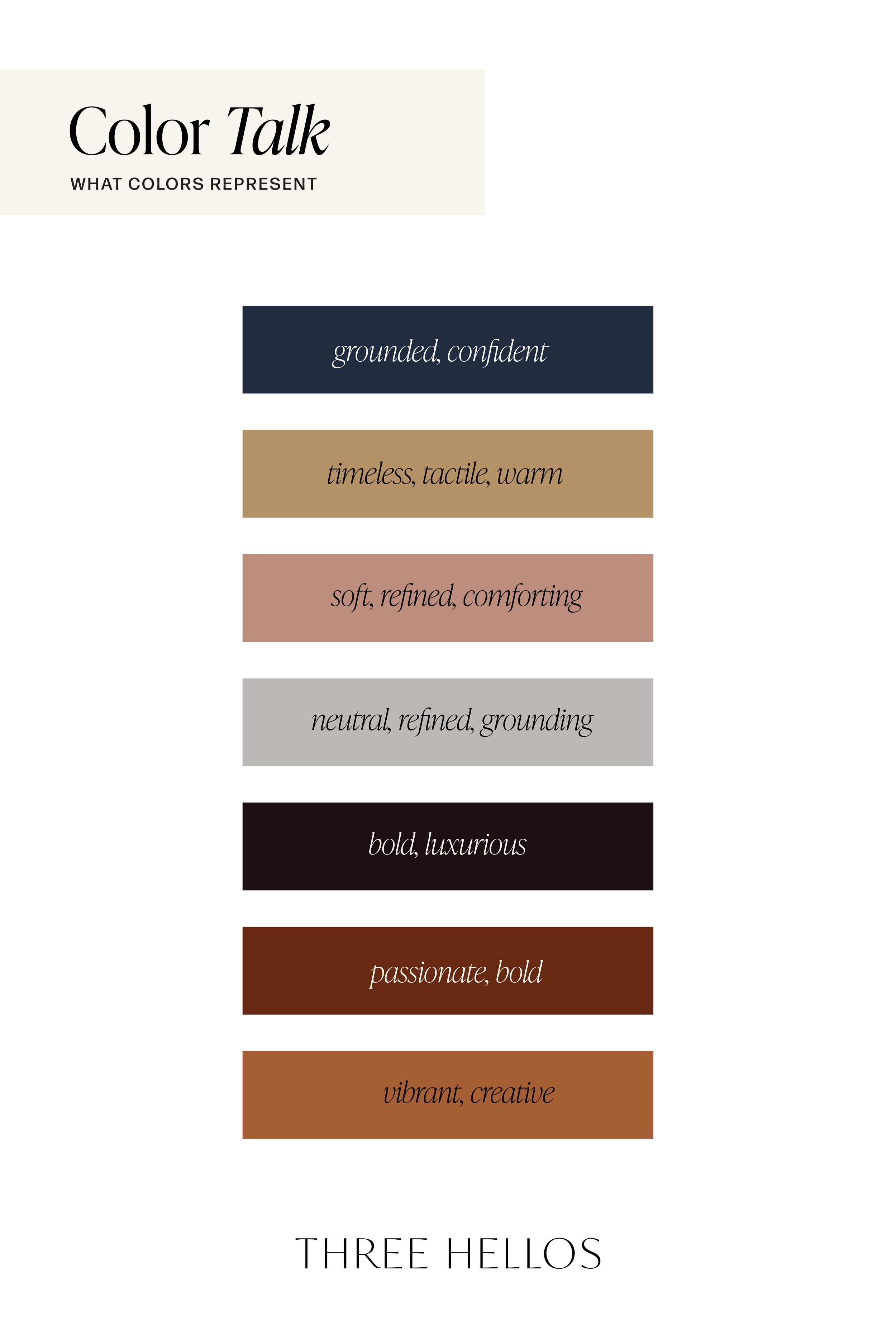
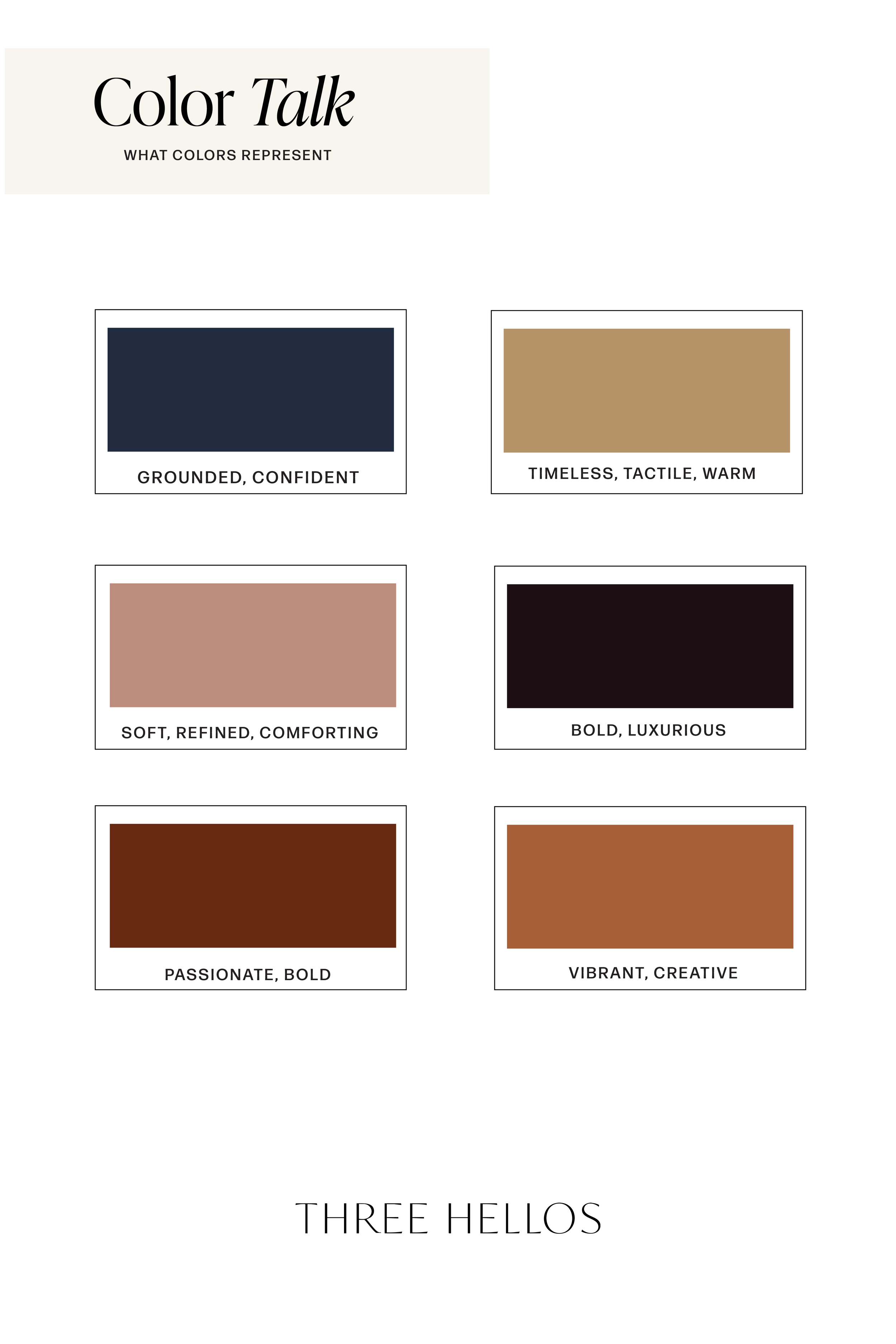
Dark hues like Midnight Slate and Espresso Noir communicate trust, depth, and quiet confidence — foundational traits for established, grounded brands. Warm metallics such as Aged Bronze and Copper Ember evoke approachability and emotional richness, while Mist Gray (#BCB8B5) adds balance and restraint, softening the visual weight of the darker shades.
The result is a palette that feels timeless yet modern, structured yet soulful — ideal for brands that blend creative expression with thoughtful design.
Where to Use This Palette
Branding: Perfect for creative studios, hospitality, or lifestyle brands that want to feel both elevated and grounded.
Web Design: Creates visual warmth and strong contrast while maintaining readability and balance.
Interiors: Works beautifully with natural materials — think dark wood, aged brass, and textured linen.
Social Media: These tones photograph beautifully and create depth across cohesive brand imagery.
The Feel
Psychology Keywords: Warmth · Depth · Sophistication · Balance · Confidence
This palette feels like old books, candlelight, and craftsmanship — nostalgic yet modern, emotional yet composed. It’s a reminder that luxury doesn’t have to be loud — it can live quietly, in tone and texture.Color Breakdown
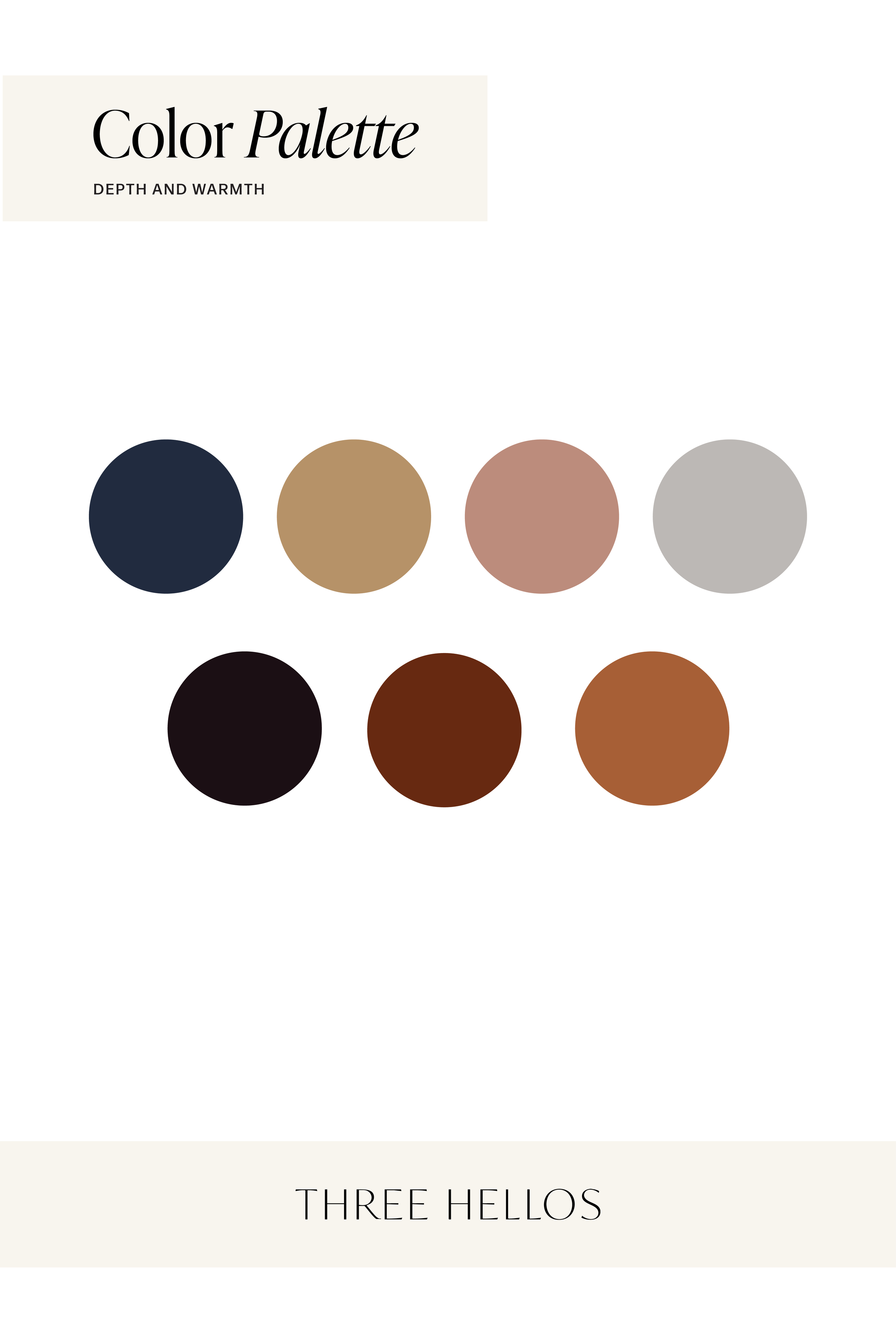
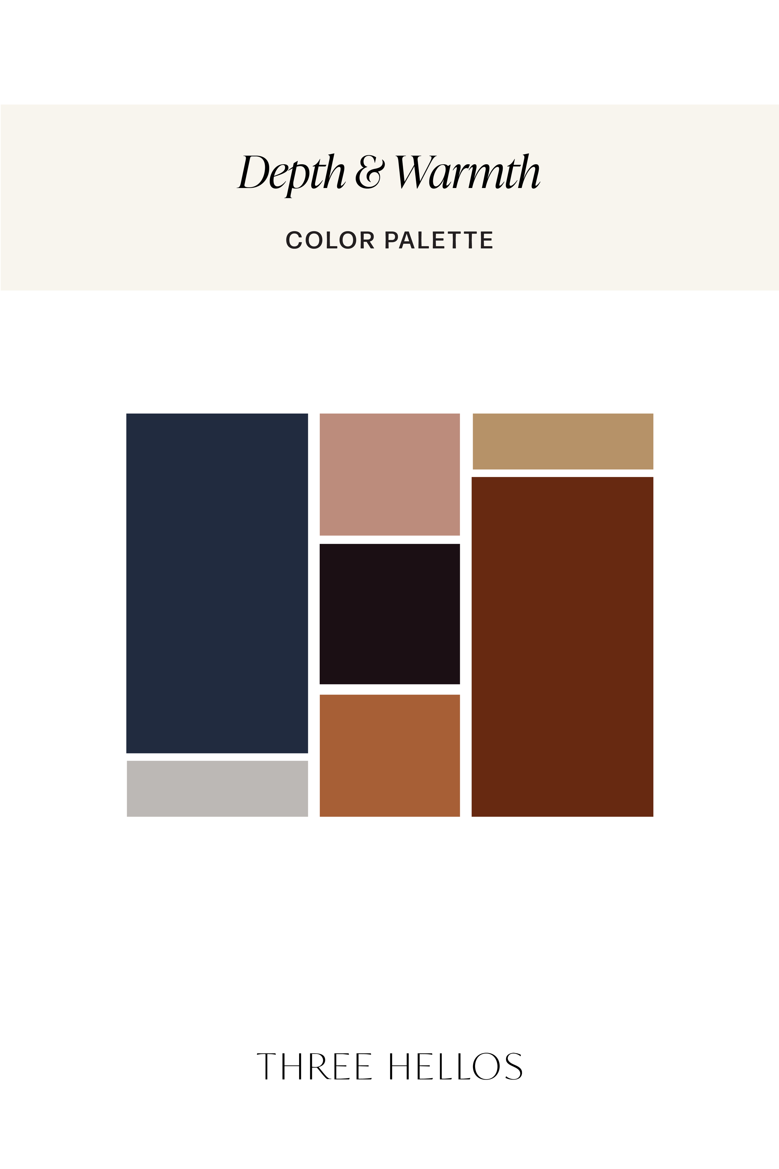
Midnight Slate (#212B3F) – Depth and composure
Aged Bronze (#B69268) – Timeless warmth
Clay Blush (#D3B7A8) – Soft sophistication
Dusty Rosewood (#BC8C7C) – Emotional balance
Mist Gray (#BCB8B5) – Stability and refinement
Espresso Noir (#1B0F14) – Strength and luxury
Burnt Umber (#672911) – Earthy creativity
Copper Ember (#A75F36) – Vibrant warmth
Inspiration
Think candlelight flickering on aged wood, copper mugs on dark marble, or ink drying on parchment. Ember & Ink embodies that feeling — timeless, tactile, and deeply intentional.