Fresh, Warm & Vibrant: A Color Palette for Bold, Creative Brands
Color has the power to shape how your audience experiences your brand. While some palettes whisper calm and subtlety, others bring energy, vibrancy, and confidence. If your brand is about showing up boldly, sparking connection, and inspiring action this Fresh, Warm & Vibrant palette might be the perfect fit.
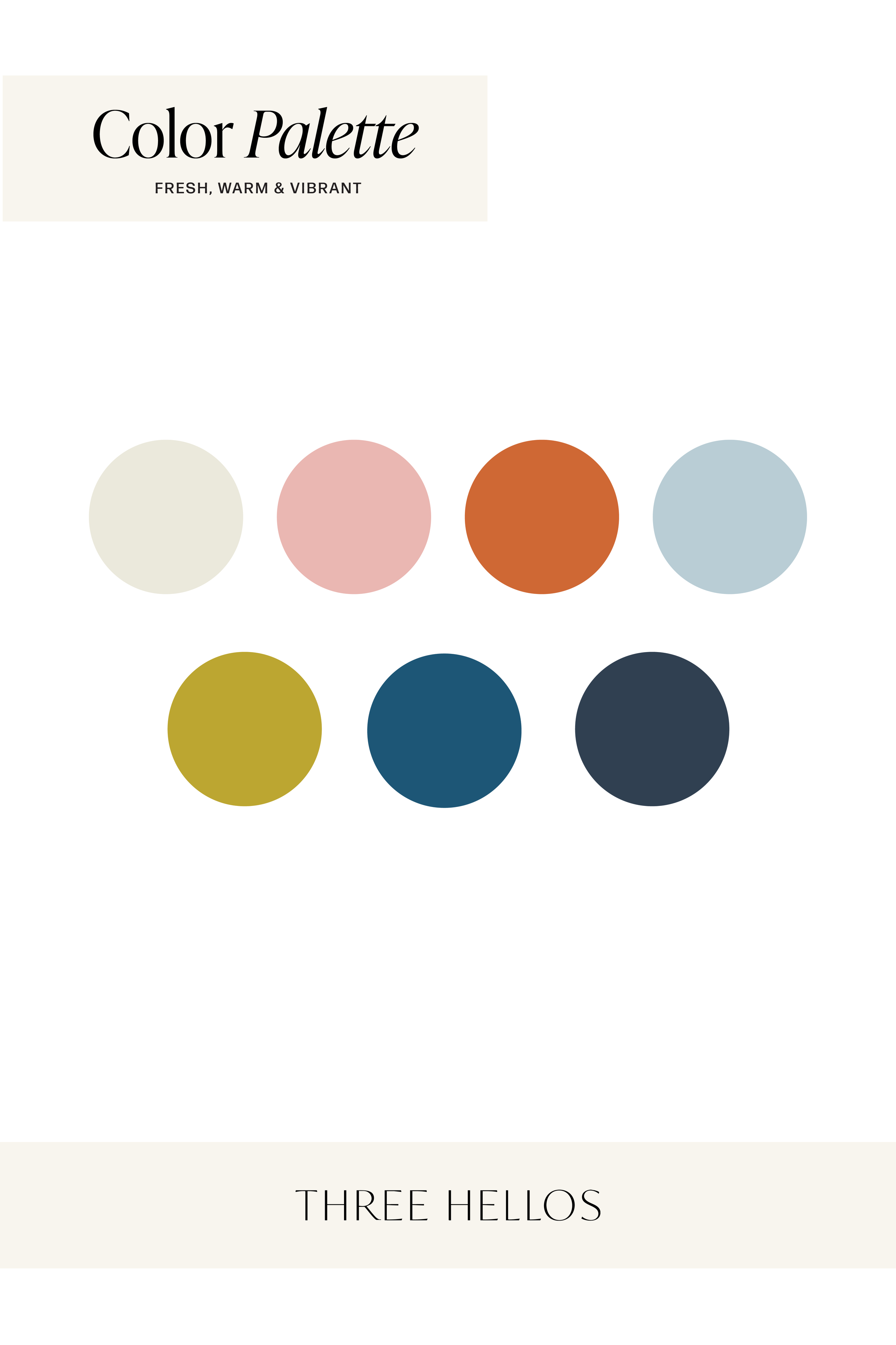
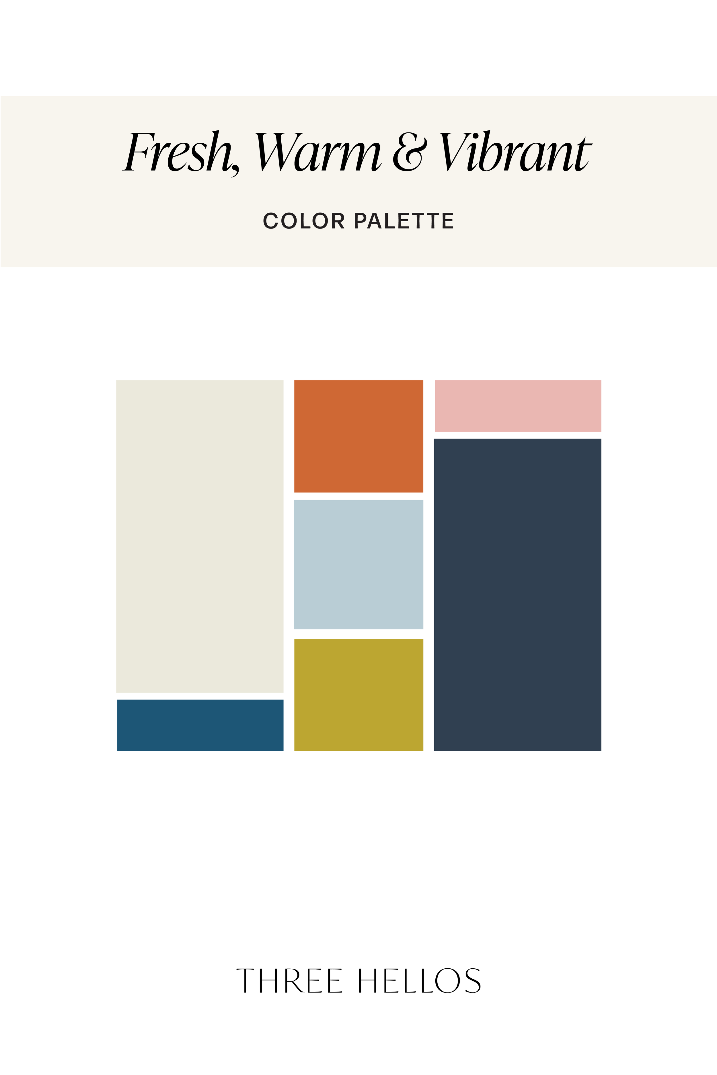
The Palette
This collection combines uplifting brightness with grounded depth, creating a balance that feels modern and approachable while still carrying sophistication.
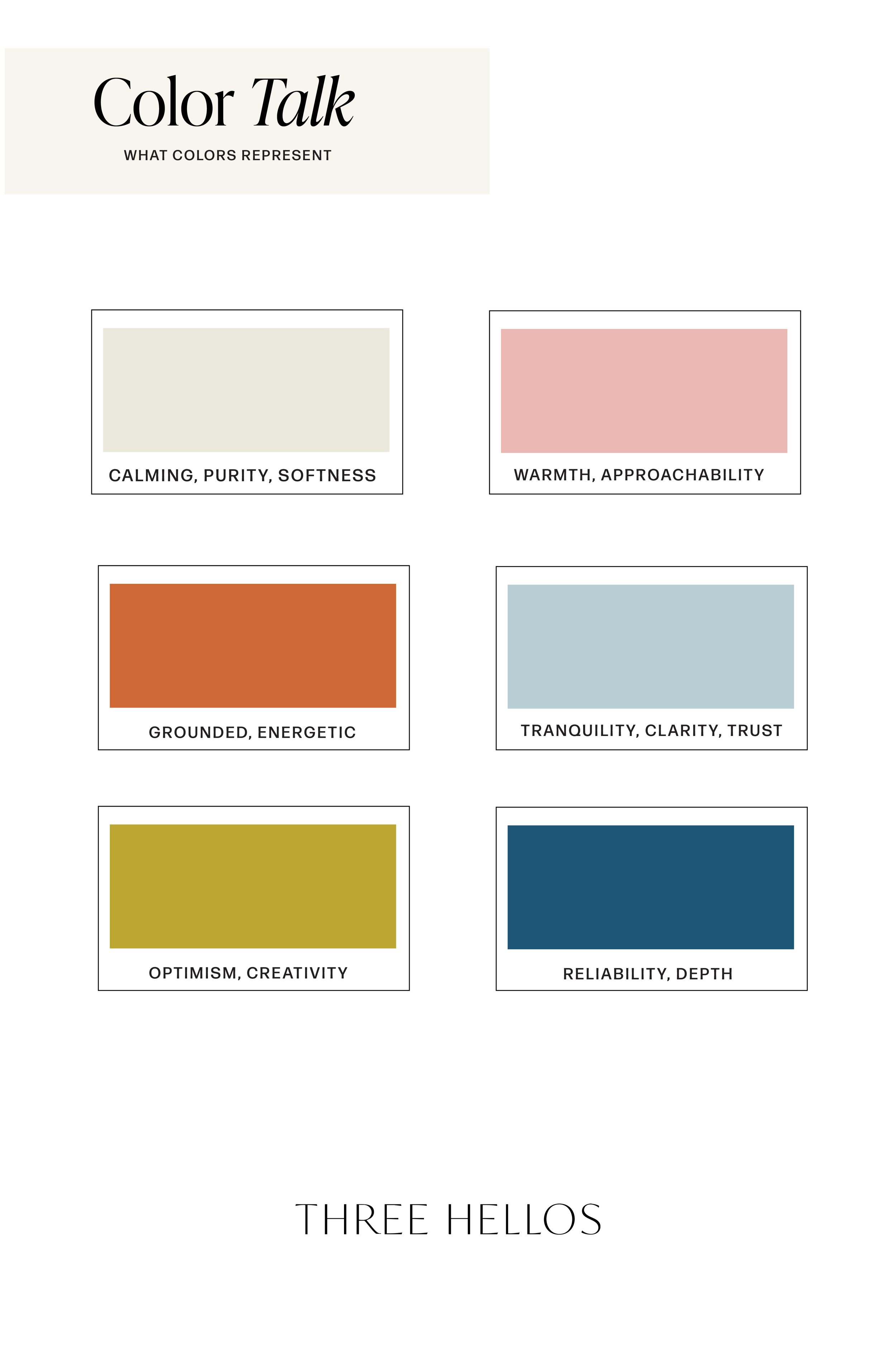
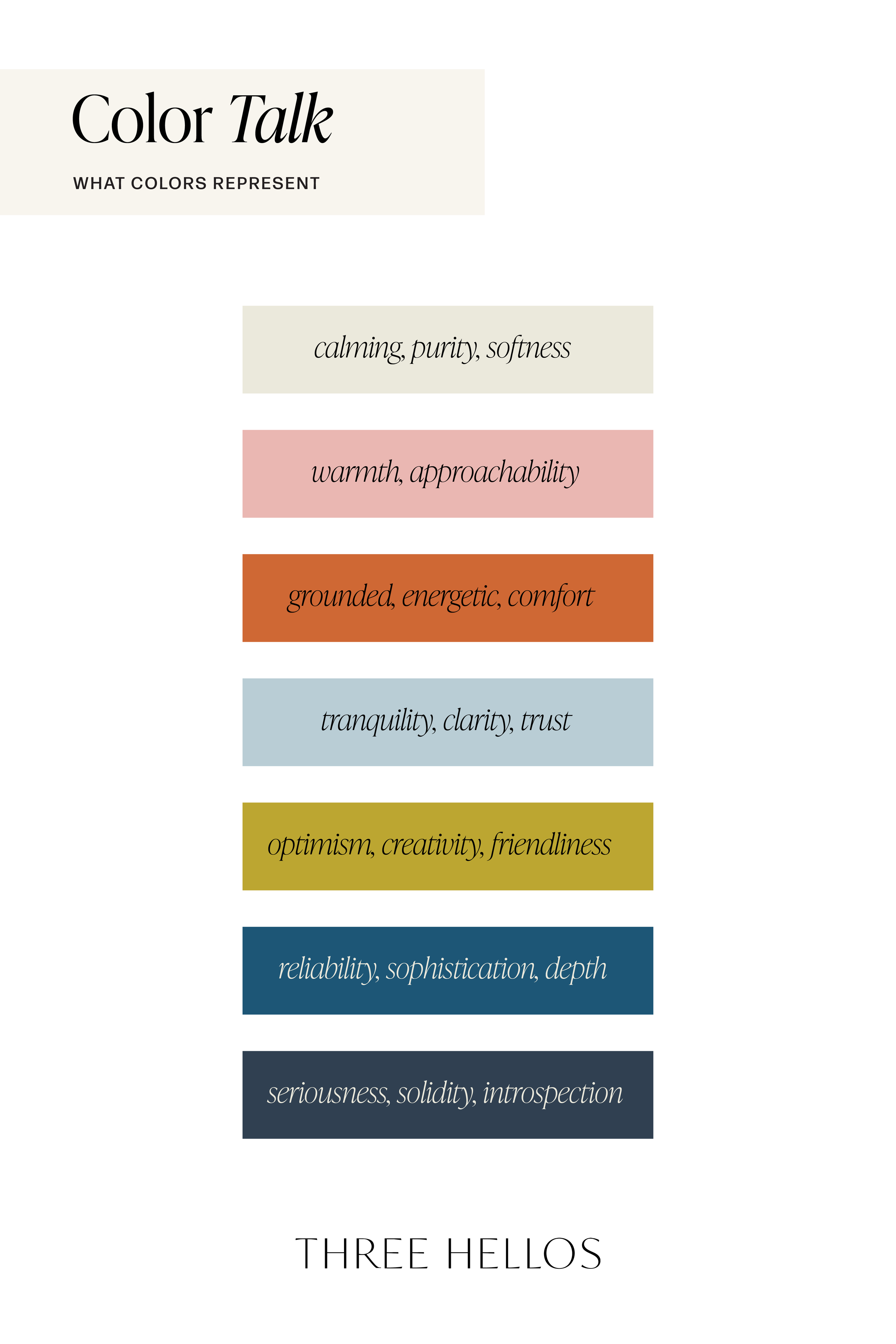
Soft Cream → calming, purity, softness
Blush Pink → warmth, approachability
Terracotta Orange → grounded, energetic, comfort
Powder Blue → tranquility, clarity, trust
Golden Chartreuse → optimism, creativity, friendliness
Teal Blue → reliability, sophistication, depth
Charcoal Navy → seriousness, solidity, introspection
Together, these tones tell a story of confidence, warmth, and vibrant creativity which is perfect for brands that want to feel both friendly and strong.
Why This Palette Works
This palette creates a dynamic push and pull: light neutrals and pastels soften the mood, while bold oranges, yellows, and deep blues provide energy and authority.
It’s a color story that appeals to modern brands that want to:
Stand out without feeling overwhelming
Communicate trust and clarity through blues
Add energy and optimism with warm oranges and yellows
Stay approachable through pinks and neutrals
The result is a brand presence that feels fresh, creative, and grounded, an ideal mix for businesses ready to be noticed.
How to Use These Colors in Your Brand
1. Logos & Brand Marks
Use the deeper teal and navy shades to anchor your brand’s logo and typography. Layer in terracotta or golden chartreuse for a bold accent.
2. Website & Digital Design
Create contrast with light backgrounds and pops of energetic color for buttons, calls-to-action, or hover states.
3. Marketing Materials
Balance vibrant tones with soft neutrals to keep designs elevated. For example, a terracotta headline with powder blue details feels bold but still refined.
4. Lifestyle & Photography
This palette translates beautifully to photography: think coastal backdrops, citrus tones, beachy textures, and energetic pops of color in wardrobe or props.
Final Thoughts
The Fresh, Warm & Vibrant palette is all about energy and approachability. It’s perfect for creative entrepreneurs, lifestyle brands, and businesses that thrive on bold ideas, fresh perspectives, and meaningful connection.
If you want a brand that feels confident, modern, and unforgettable, this palette might just be your starting point.
Let’s Build Your Brand Together
At Three Hellos, I help passionate business owners transform their ideas into intentional brands and websites that feel both elevated and approachable. If you’re ready for a brand identity that captures attention and creates trust, I’d love to help.
Work with me and let’s design a brand that feels as fresh and vibrant as your vision.