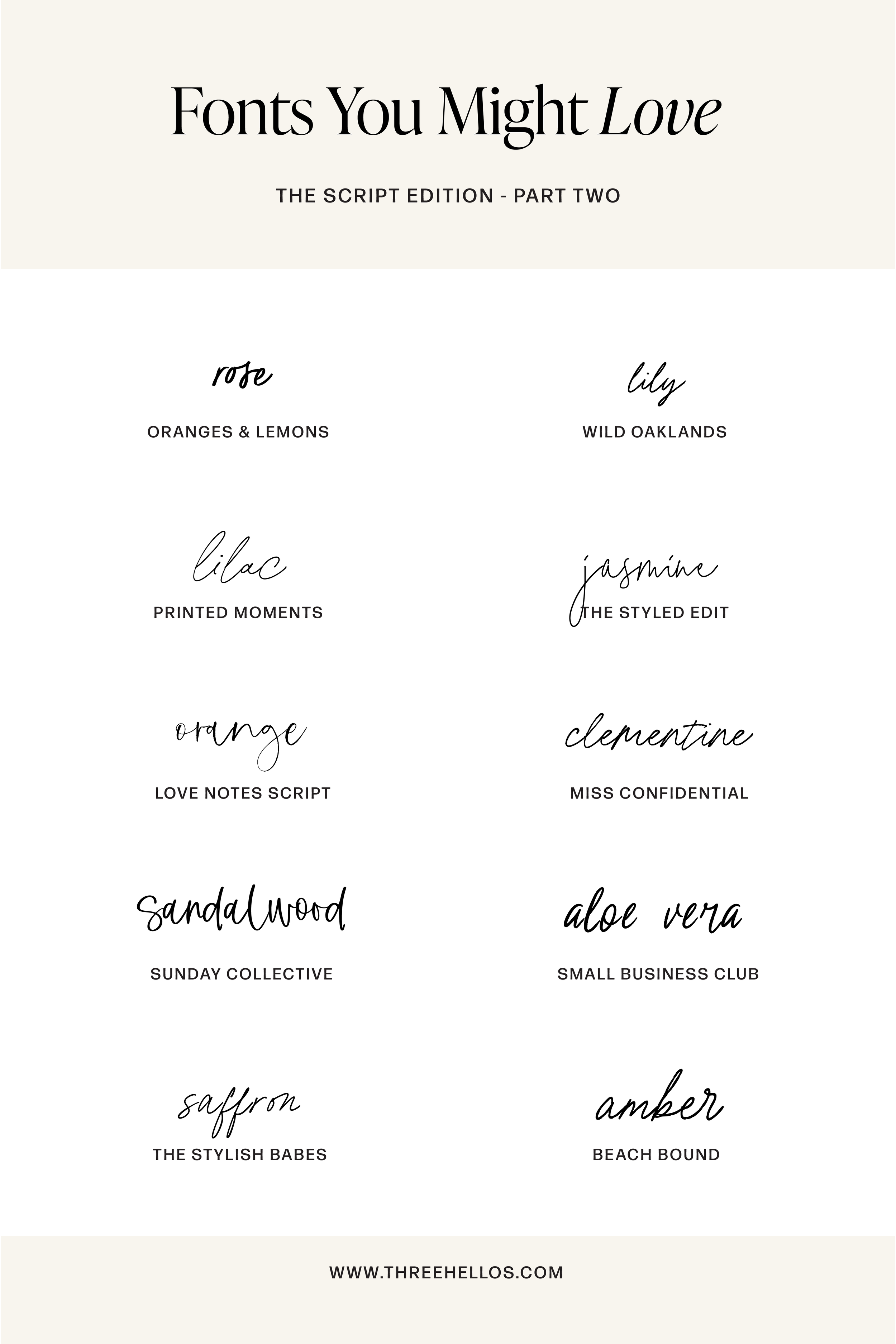
Fonts You Might Love: Handwritten Script Edition - Part Two
If you love fonts that feel natural, expressive, and beautifully personal, this collection was made for you. The Script Edition — Part Two continues the series with ten modern handwritten typefaces — each one warm, human, and effortlessly stylish.
These scripts pair organic motion with refined detail. Whether you’re building a brand identity, designing packaging, or crafting a social media aesthetic, these fonts bring just enough imperfection to make your design feel alive. They balance personality with polish — and that’s what makes them timeless.
The Collection
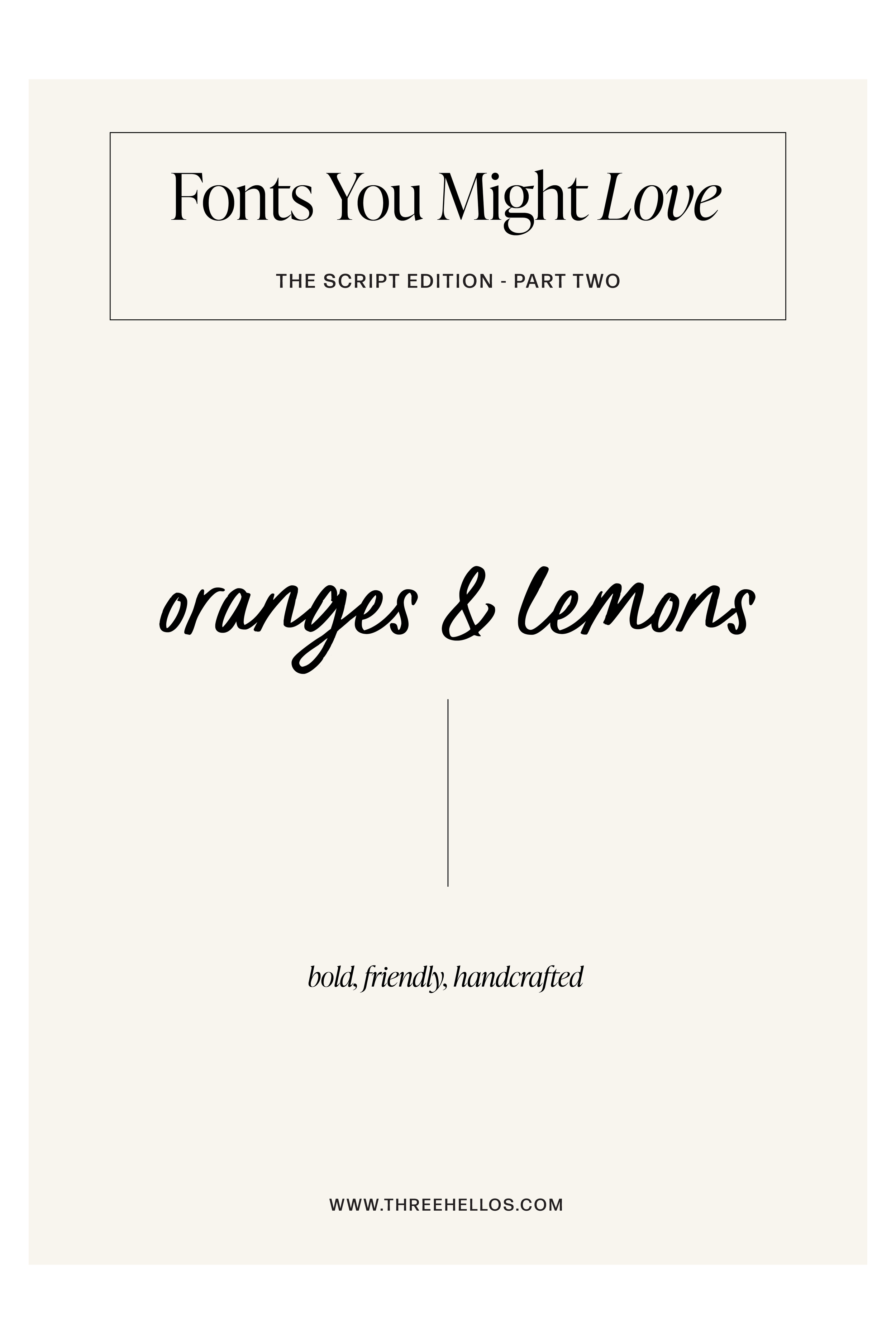
Oranges & Lemons — bold · friendly · handcrafted
A confident brush script with approachable texture and charm. Perfect for lifestyle brands, packaging, and playful, personality-driven design.
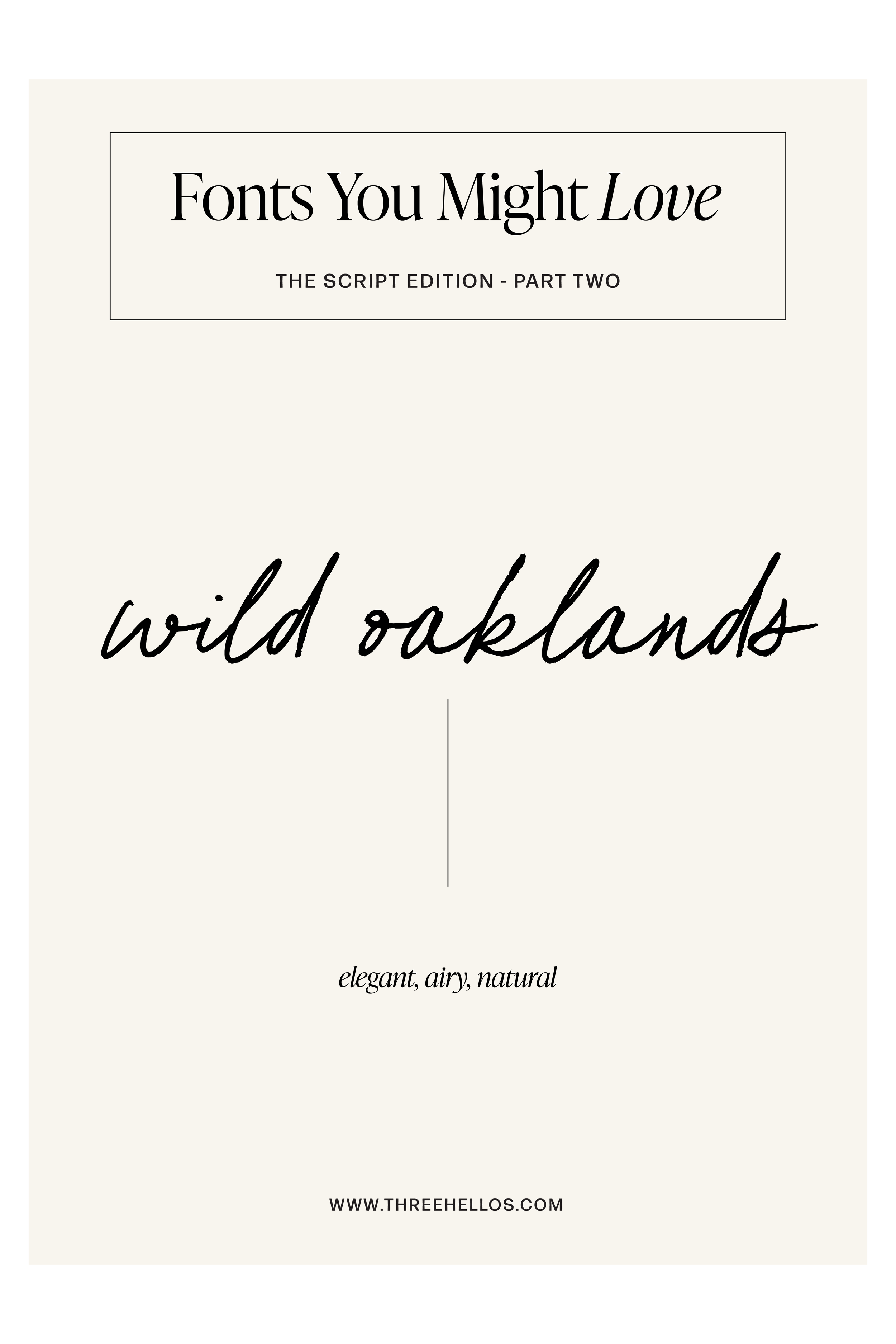
Wild Oaklands — elegant · airy · natural
A refined, open script that feels modern and editorial. Its tall rhythm and effortless loops bring an understated sophistication.
Printed Moments — minimal · delicate · balanced
Soft and graceful with perfect simplicity. Printed Moments works beautifully across modern branding and product design.
The Styled Edit — effortless · modern · graceful
Inspired by editorial fashion, this signature-style script delivers chic professionalism with approachable curves.
Love Notes Script — romantic · whimsical · authentic
Loose and heartfelt, this handwritten type feels like a note left behind — genuine, feminine, and timeless.
Miss Confidential — sleek · elevated · editorial
Refined structure meets subtle motion — perfect for luxury brands and creative professionals who want presence with restraint.
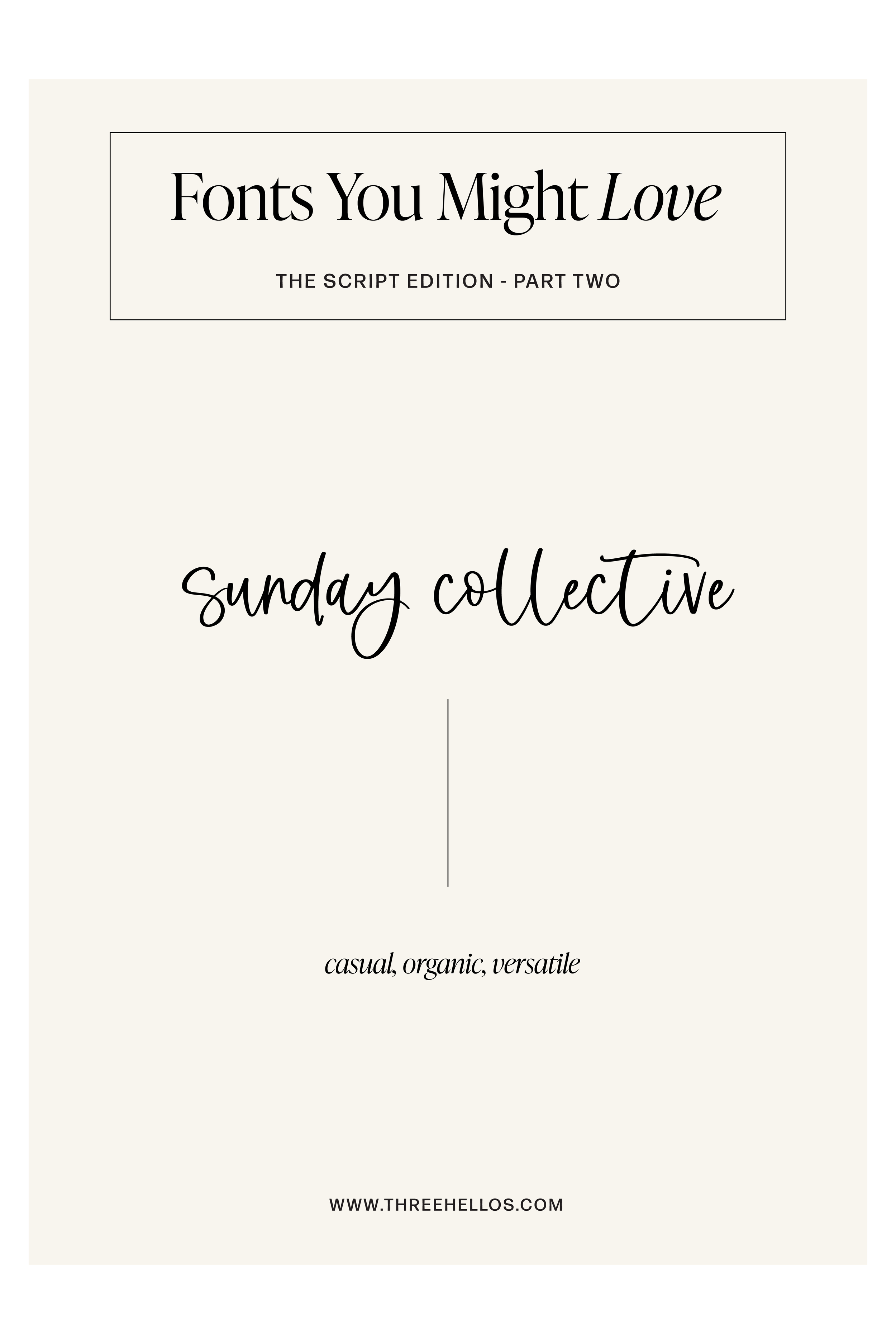
Sunday Collective — casual · organic · versatile
Warm, genuine, and naturally balanced — this script adds approachability to clean, modern designs.
Small Business Club — approachable · bold · contemporary
A confident script that feels friendly but professional — ideal for small businesses, packaging, or signage that needs personality.
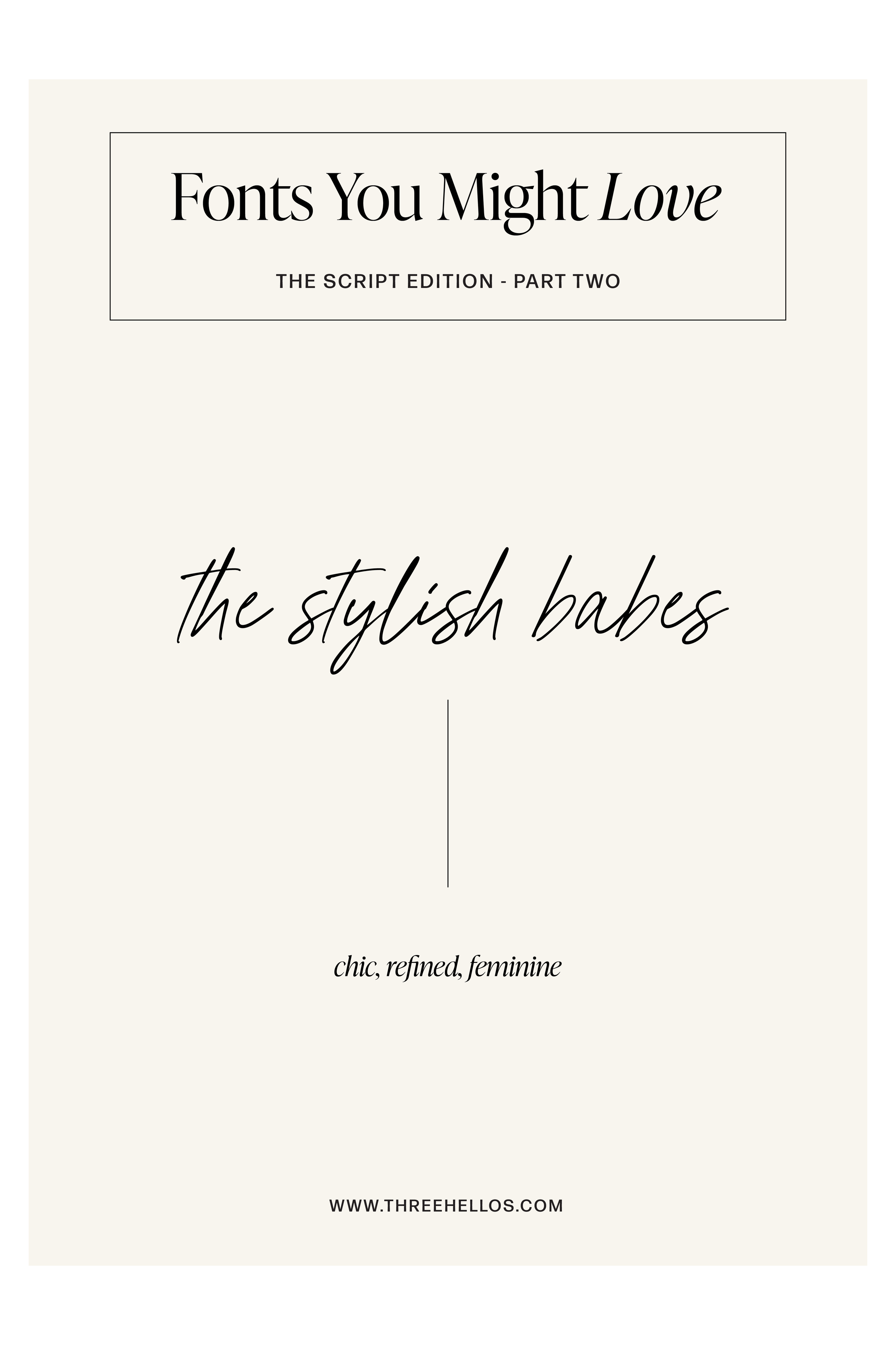
The Stylish Babes — chic · refined · feminine
Elongated, polished strokes give this typeface a modern-luxury edge — great for beauty, fashion, and lifestyle brands.
Beach Bound — relaxed · fluid · coastal
A soft, effortless script that captures natural rhythm and calm — perfect for brands with easygoing sophistication.
When to Use These Fonts
Branding: Perfect for lifestyle brands, creative studios, and entrepreneurs who want warmth and personality with modern refinement.
Web & Social: Use as accent headlines, callouts, or signature-style elements to create emotion and connection.
Packaging & Print: Adds humanity and depth to modern product lines or editorial design.
The Feel
Keywords: Expressive · Organic · Warm · Modern · Refined
These fonts remind us that handwriting carries personality — it’s the smallest details that make a brand feel human. The Script Edition — Part Two celebrates that balance of polish and imperfection — the sweet spot between emotion and design.
Inspiration
Think handwritten labels on a curated shelf, sunlit paper goods, or the quiet artistry of a signature. These fonts bring warmth to modern minimalism — each one a little love letter to personal design.

GRAB THE FONTS HERE:
ORANGES AND LEMONS / WILD OAKLANDS / PRINTED MOMENTS / THE STYLED EDIT / LOVE NOTES SCRIPT / MISS CONFIDENTIAL / SUNDAY COLLECTIVE / SMALL BUSINESS CLUB / THE STYLISH BABES / BEACH BOUND