BRAND IDENTITY AND NAMING / WEBSITE DESIGN / COPYWRITING / COLLATERAL
Dr. Brooke Collective
Building a brand from scratch for a nurse practitioner launching a wellness platform rooted in both science and soul.
Dr. Brooke Rogers Hutchins is a nurse practitioner and Doctor of Nursing Practice with a background in dermatology and a deeply personal history with chronic illness. After years of being dismissed by traditional medicine herself, she built a path to real healing and wanted to share everything she learned with other women going through the same thing.
When she came to Three Hellos, she was not rebranding an existing business. She was launching something entirely new: a holistic wellness platform designed to bridge clinical expertise with the kind of honest, human support that most medical spaces do not offer. She needed a brand that could hold all of that at once.
The Challenge
Launching a brand new venture in the wellness space is one of the hardest branding problems there is. The market is saturated, trust is hard to earn, and the line between credible and clinical versus warm and approachable is genuinely difficult to walk.
Dr. Brooke needed her brand to do several things simultaneously. It needed to communicate real medical credentials so that women would trust her expertise. It needed to feel warm, personal, and human so that women who had been dismissed by the medical system would feel safe here. It needed to stand apart from the sea of generic wellness aesthetics. And it needed to launch with confidence despite having no existing visual identity to build from.
There was no before. Everything had to be built from the ground up.


“You extremely excelled! You brought everything to life for me in a way I never could have imagined. The process was seamless and every detail came together better than I expected. Hands down, it's a great investment.”
- Dr. Brooke Rogers Hutchins, DNP


The Solution
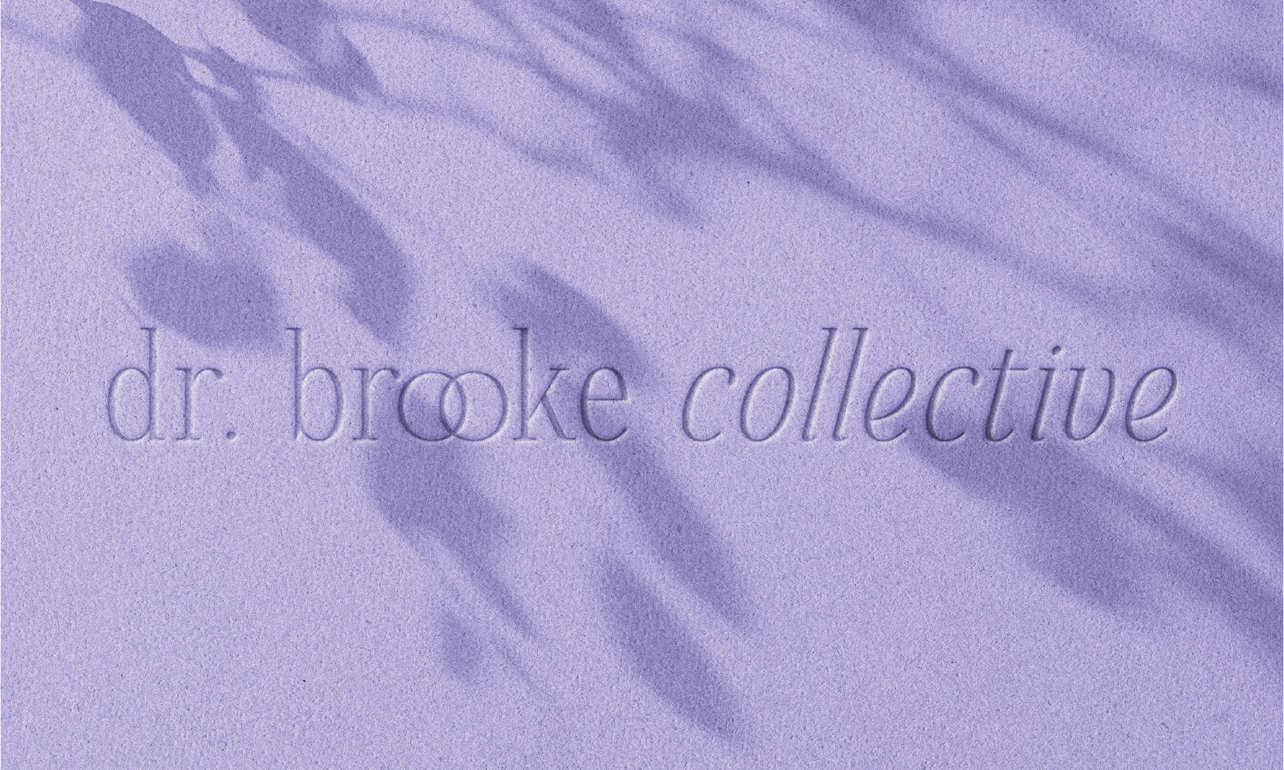
The work began before a single visual was created. Dr. Brooke came with some initial name ideas and a clear sense of her mission, but together we researched what would actually perform well in search and resonate with the audience she was trying to reach. The name Dr. Brooke Collective was chosen deliberately, balancing personal identity with the sense of community and belonging she wanted her platform to represent. Starting with a name that was strategic, not just appealing, set the tone for everything that followed.
The strategy then built outward from her own story. Her journey from chronic illness to genuine healing is what makes her different from every other wellness platform online, and the brand needed to lead with that authenticity rather than hide behind clinical authority.
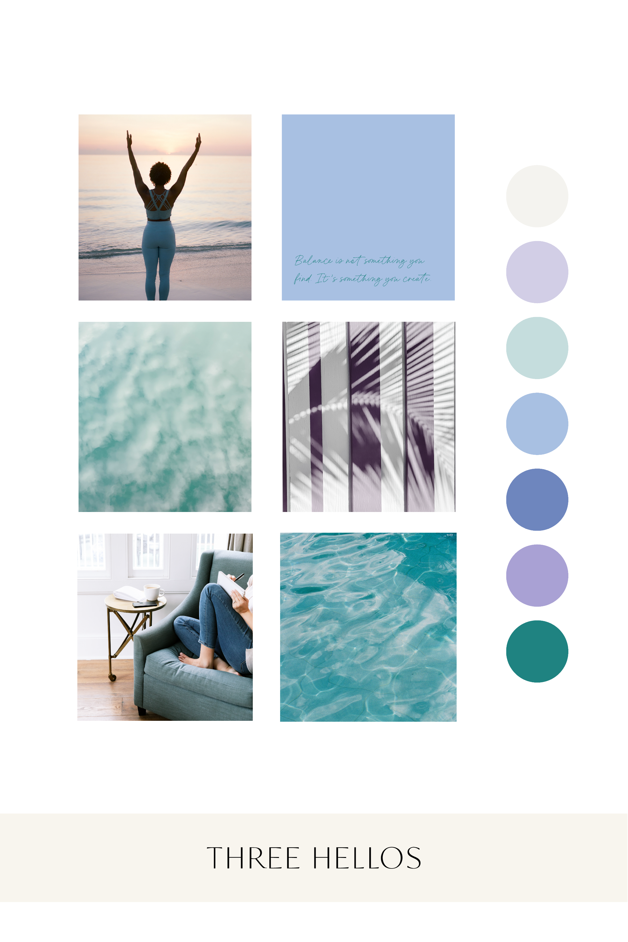
The color palette of teal, lavender, and warm cream was built to hold that dual identity. Teal communicates trust, professionalism, and clarity. Lavender brings softness, intuition, and calm. The cream grounds everything in warmth. Together they feel medical enough to be credible and human enough to be welcoming, which is exactly the balance Dr. Brooke needed.
The logo system was built around custom botanical and wave elements that reinforce the idea of natural healing and flow without leaning into the overused minimalist wellness aesthetic. The result is something recognizable and distinctive, a brand that looks like no one else in the space.
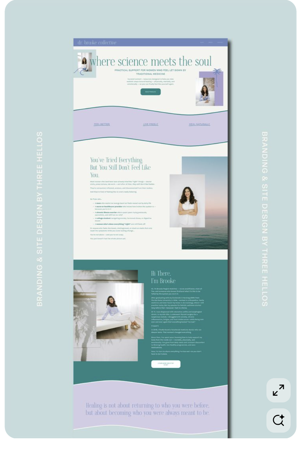
The website copy was written to speak directly to the woman who has tried everything and still does not feel well. The headline where science meets the soul captures the entire brand positioning in five words. Every page was written to make that woman feel seen before she is asked to do anything.
The full website was built on Squarespace with custom design elements woven throughout, including the wave motif, layered logo treatments, and a content structure that guides visitors naturally from feeling understood to feeling hopeful to taking action.
Brand System Integration


The Dr. Brooke Collective brand launched as a complete, cohesive system from day one. The identity includes business naming research and strategy, a full logo suite with primary, secondary, and submark variations, custom botanical and wave illustration elements, a complete color and typography system, and a fully custom Squarespace website with copywriting across all pages.
What makes this project particularly meaningful is that Dr. Brooke launched with the kind of brand presence that most businesses spend years trying to build. From the moment her site went live, it communicated exactly who she is, who she serves, and why she is different. That foundation gives her the credibility to grow.