BRAND IDENTITY / COLLATERAL
Keller & Wainwright Orthodontics
From outdated to elevated: a modern orthodontic brand that feels warm, professional, and trustworthy
Keller & Wainwright Orthodontics is a boutique practice in Sunnyvale, California, led by Dr. Gabrielle Wainwright. When Dr. Wainwright purchased the practice from Dr. Rebecca Keller, she wanted to modernize its identity while maintaining its reputation for warmth and excellence.
The rebrand needed to appeal to two distinct audiences: families with younger patients seeking a fun, welcoming environment, and adults wanting sophisticated, professional care. The challenge was creating a brand that felt fresh and approachable without sacrificing clinical credibility.

before
after
The existing practice identity created years prior no longer reflected the level of care Dr. Wainwright wanted to convey. She needed a complete rebrand that could attract both pediatric patients (requiring playful, welcoming design) and adult patients (requiring polished professionalism) without alienating either demographic. The brand needed to feel modern and distinctive while honoring the practice's long-standing community reputation.
The Challenge

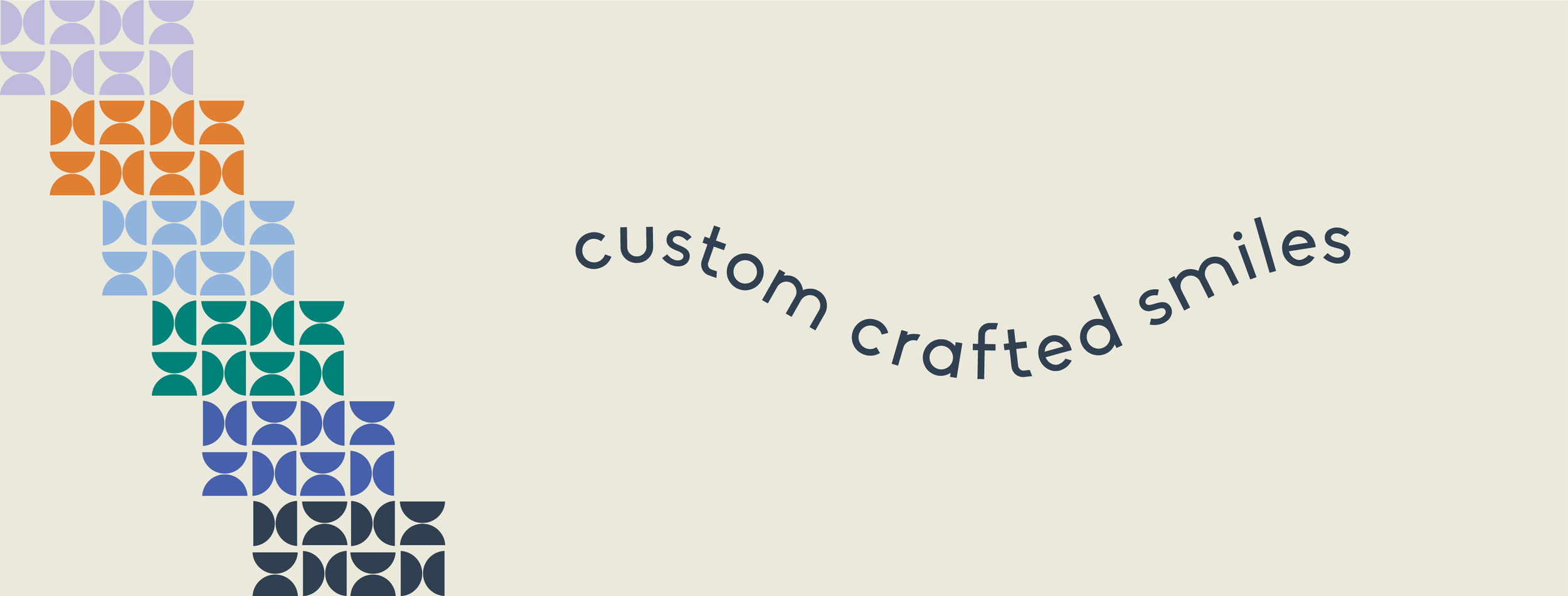
We built a comprehensive brand system that captures warmth, precision, and professionalism. The new logo suite introduces clean typography and approachable forms, paired with a vibrant yet balanced color palette that blends muslin neutrals, cobalt, pine, and lilac for a mix of fun and refinement. Submarks, brand patterns, and tagline treatments add flexibility across signage, stationery, and digital platforms. The brand guidelines ensure consistency across every patient touchpoint — from the practice website to in-office materials.


“From the start, Lauren made me feel comfortable and truly understood my vision. She brought so much more creativity and strategy than I expected."
- Dr. Gabrielle Wainwright
Logo suite balances friendliness with professionalism to appeal to both kids and adults
Color palette combines calming neutrals with vibrant accents for versatility across touchpoints
Typography system communicates clarity, trust, and modern authority
Comprehensive brand guidelines ensure cohesion across signage, stationery, website, and social media