
BRAND IDENTITY AND NAMING / STRATEGY / PACKAGING / COLLATERAL
Noir Fleur
From vision to reality: a spec brand exploring what thoughtful gifting could feel like if it were treated as its own art form
Noir Fleur began as a question: what would it feel like if sending something small, a note, a gift, a scent, carried the same weight as receiving it? Rather than build for an existing client, this concept was developed from the ground up as a full exploration of luxury gifting, from the first envelope to the last ribbon.
That vision needed a brand to match.
The Challenge
A gifting brand lives or dies by touch. Unlike a website or a storefront, its most important surfaces are things a person holds in their hands, paper, wax, fabric, ribbon, for only a few seconds before they're unwrapped and gone. The brand needed to feel dramatic and romantic enough to be memorable in that brief moment, without ever tipping into anything costume-like or overdone. It also needed to hold together across genuinely different materials without ever feeling like separate products loosely sharing a name.
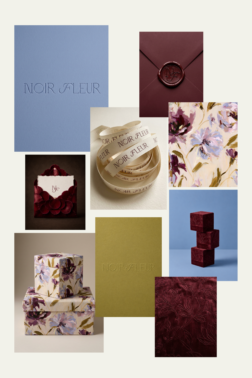
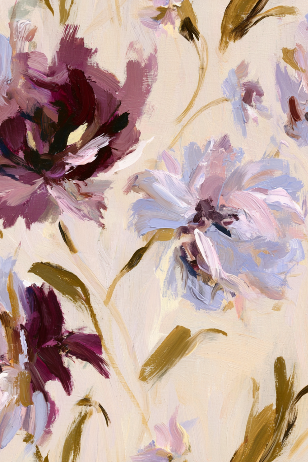
I built a brand identity rooted in restraint and material honesty, a reflection of the idea that true luxury doesn't need to shout. A hand-built primary wordmark, drawn rather than generated, communicates both confidence and craftsmanship. An interlocking monogram gives the brand a second mark flexible enough to scale from a wax seal to a shipping box, while a soft supporting script beneath the wordmark adds warmth to an otherwise structured identity. A single restrained color story, deep oxblood, dusty periwinkle-blue, warm cream, and muted olive-gold, carries the brand across every surface it touches.
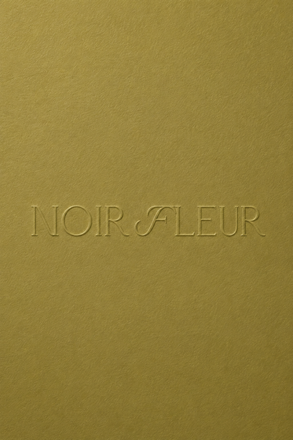
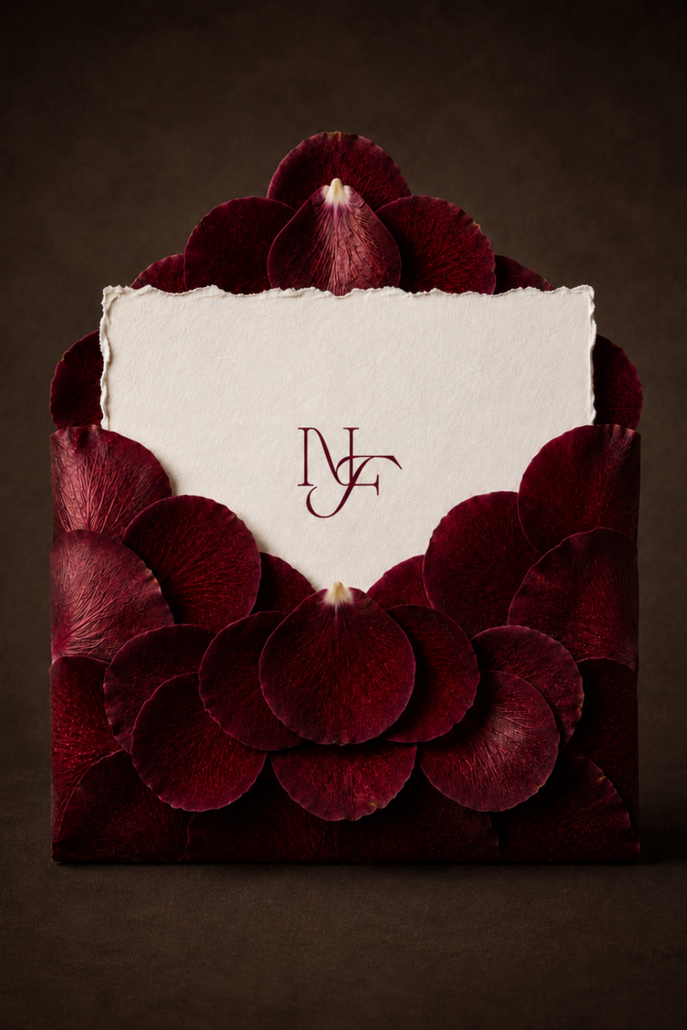
The brand didn't stop at a logo. It extended into a full system: a rose-petal envelope with hand-torn deckled stationery, a debossed velvet packaging line, a floral fabric box collection, a wax-sealed monogram closure, and branded grosgrain ribbon. Each material was given its own considered finish, from blind deboss to raised emboss to flat ink, so the mark always feels native to what it's printed on rather than layered on top of it.
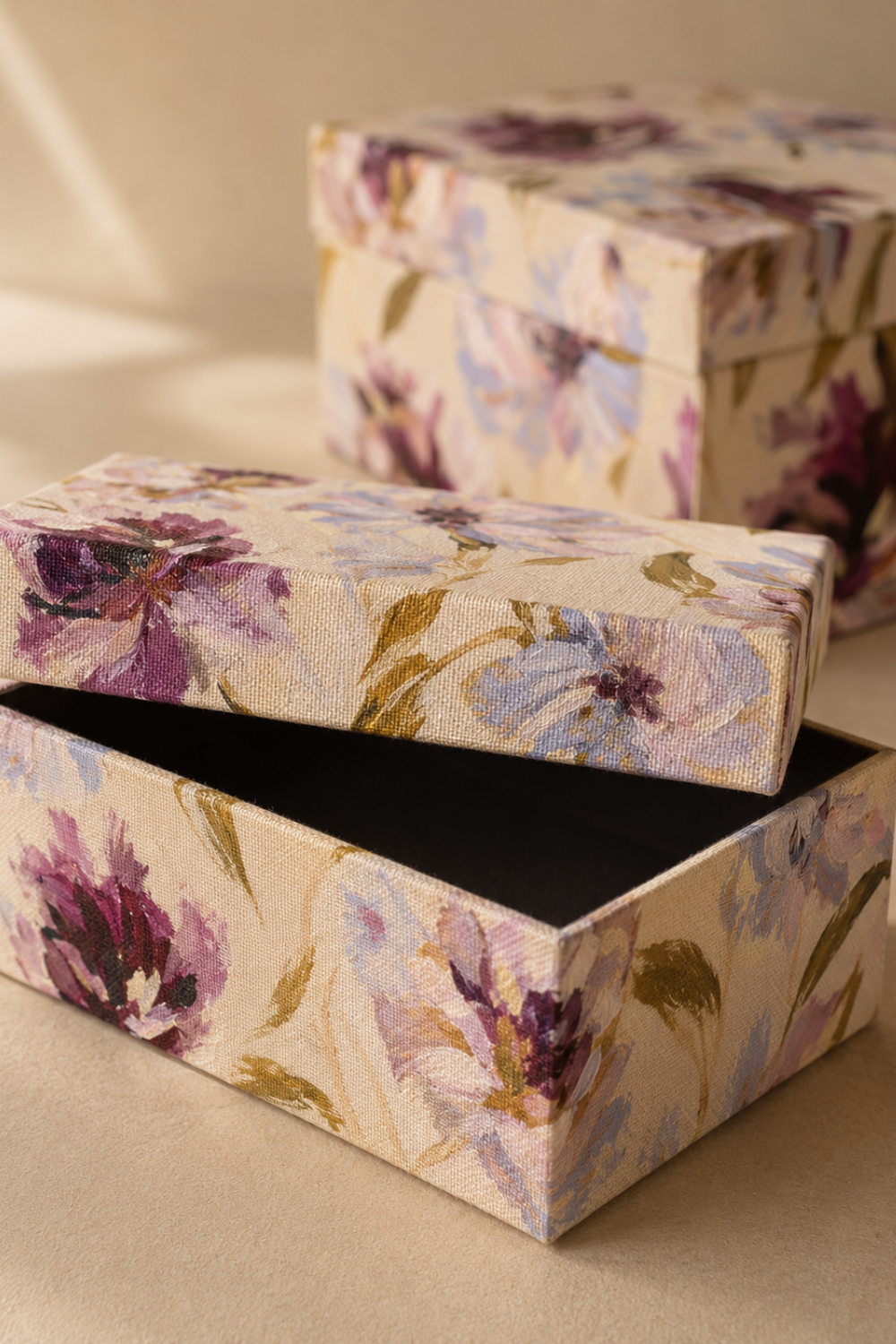
Brand System Integration
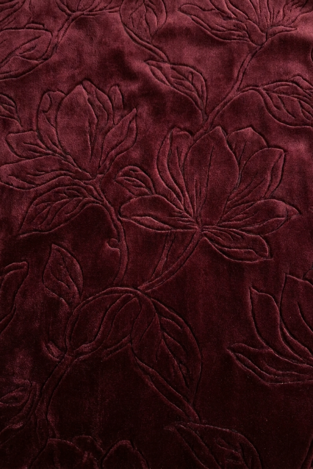
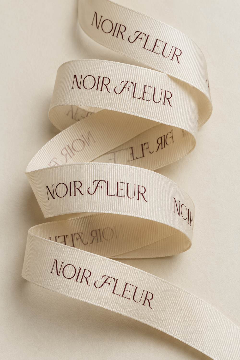
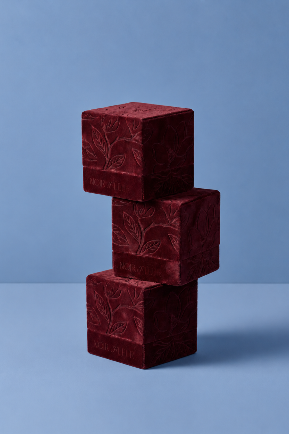
The Noir Fleur system was built to function across materials that behave nothing alike: paper, velvet, wax, glass, fabric, while still reading as one hand throughout. The wordmark and monogram were designed with that range in mind from the start, so that whether debossed into velvet or pressed into wax, the mark stays recognizably, quietly itself.