BRAND IDENTITY / COLLATERAL / WEBSITE DESIGN
Tulipa Therapy
A brand built for women ready to bloom - rooted in legacy, warmth, and a different kind of care.
Tulipa Therapy is a private practice in Solana Beach, California founded by Andrea Guttman, a Licensed Marriage and Family Therapist specializing in therapy for women and moms. After working within an established practice, Andrea was ready to build something entirely her own. A space that reflected not just her clinical approach, but the values and lived experiences that shaped her as a person and as a therapist.
She came with a name already full of meaning. Tulipa is named for her grandmother Gloria, whose unconditional love, non-judgmental presence, and deep compassion became the model for how Andrea shows up with every client. The tulip itself — resilient, blooming even in rocky terrain, a symbol of rebirth — reflected exactly what she wanted her clients to experience. The brand had to honor all of that.




"She really took the time to get to know me and my vision, which is so important when you are your brand."
- Andrea Guttman
The Challenge
Andrea's vision for Tulipa was specific and deeply personal. She wanted a brand that felt calm, safe, and warm. The kind of presence that communicates to a woman who is overwhelmed or anxious that she has found the right place before she reads a single word.
The brand also needed to hold space for the full range of how Andrea practices. From traditional in-person sessions to online therapy to her Walk and Talk sessions, where she meets clients at a park and walks alongside them rather than sitting across from them in an office. It also needed to speak credibly to other professionals, since Andrea offers therapy specifically for therapists and professional consultation as well. A brand built only around softness wouldn't hold all of that. It needed both heart and substance.


The Solution
We built a complete brand identity and website rooted in warmth, meaning, and quiet confidence. The tulip illustration sits at the center of the mark, with the stem woven through the letterforms of the wordmark itself. It is not decorative. It is intentional, a direct nod to grandmother Gloria and the legacy she left behind. The arched logo treatment gives the brand an organic, grounded quality that feels approachable without losing polish. A soft, botanical palette of sage, muted purple, and warm neutrals communicates calm and safety across every touchpoint.
The collateral suite includes business cards in multiple brand colorways, a branded notepad, and a full tulip pattern that serves as the visual foundation across stationery and digital applications. Every piece feels cohesive because it was all designed as a system from the start.
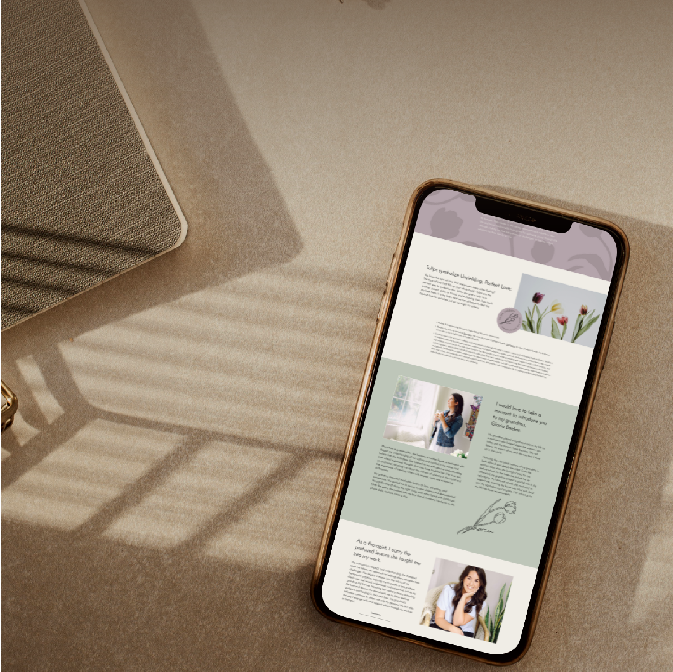
The website we designed together extends that same feeling throughout. Clear, warm, and direct. It speaks honestly to the women Andrea serves and makes the path to reaching out feel simple and safe.
While building the website, Andrea scheduled brand photography timed intentionally to align with the palette and aesthetic we had developed together. The result is a site where every element, the colors, the imagery, the typography, feels like it belongs together because it was all considered together. That kind of cohesion does not happen by accident.

Brand System Integration
The Tulipa brand system was built to support a practice that meets clients wherever they are. The full logo suite, circular submark, pattern, and digital templates give Andrea the tools to show up consistently whether a potential client finds her on Psychology Today, Instagram, or through a late night Google search when she finally has a quiet moment to herself. Every version of the brand says the same thing: you are in the right place.