
BRAND IDENTITY AND NAMING / STRATEGY / PACKAGING / ART DIRECTION
Verre
From vision to reality: a spec brand exploring a fragrance built around duality: two scents, one striking object, worn alone or combined.
Verre began with a single question: what does a fragrance bottle look like when the product itself tells the story. The name means glass, and the entire identity grew from that idea. Nothing hidden, nothing decorated past necessity. Just form, light, and two colors meeting in the middle.
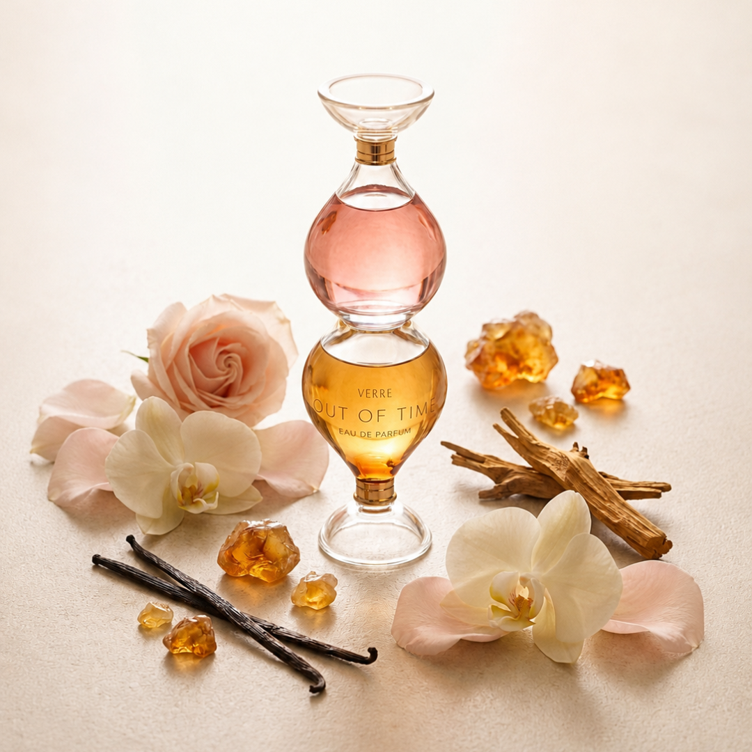
The result is Out of Time, a dual chamber eau de parfum housed in a symmetrical hourglass bottle. Rose on top. Amber and vanilla below. Two scents, worn separately or together, and a shape that makes the name literal rather than poetic.
The Challenge
A fragrance concept needed a complete visual identity and campaign built entirely through AI image and video generation, with no physical product ever produced. That meant solving for consistency across an unusually demanding set of constraints: a symmetrical, dual chamber bottle unlike any existing reference, a full campaign carousel with genuine photographic realism, a supporting brand system that read as considered rather than generated, and narrative video work involving human hands and faces, one of the hardest categories for any current AI model to render convincingly.
Early attempts at the bottle form kept collapsing into familiar shapes. Single stopper bottles. Asymmetrical silhouettes. Caps that looked decorative rather than functional. Getting from concept to a locked, structurally believable product took more than a dozen rounds of iteration across two different generation tools before the form held.
The Approach
Every asset followed the same underlying discipline: lock what works, change one variable at a time, and match the tool to the task rather than forcing one tool to do everything.
The bottle itself was ultimately built by giving the model a strong single reference image and plain language instructions rather than trying to describe an unfamiliar compound shape in words alone. Once the form was locked, campaign photography followed a repeatable realism formula: off center composition, imperfect specular highlights, one small natural flaw, dust motes catching light, and a named film stock grain, bundled into a single prompt pass rather than chased one correction at a time.
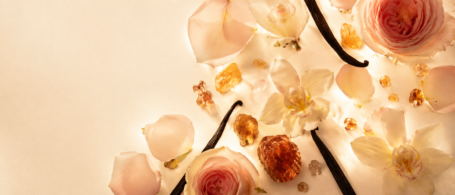
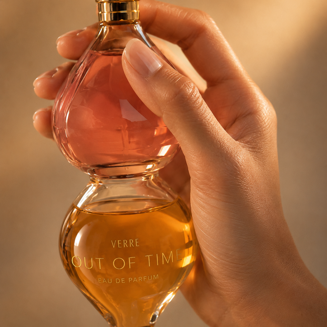
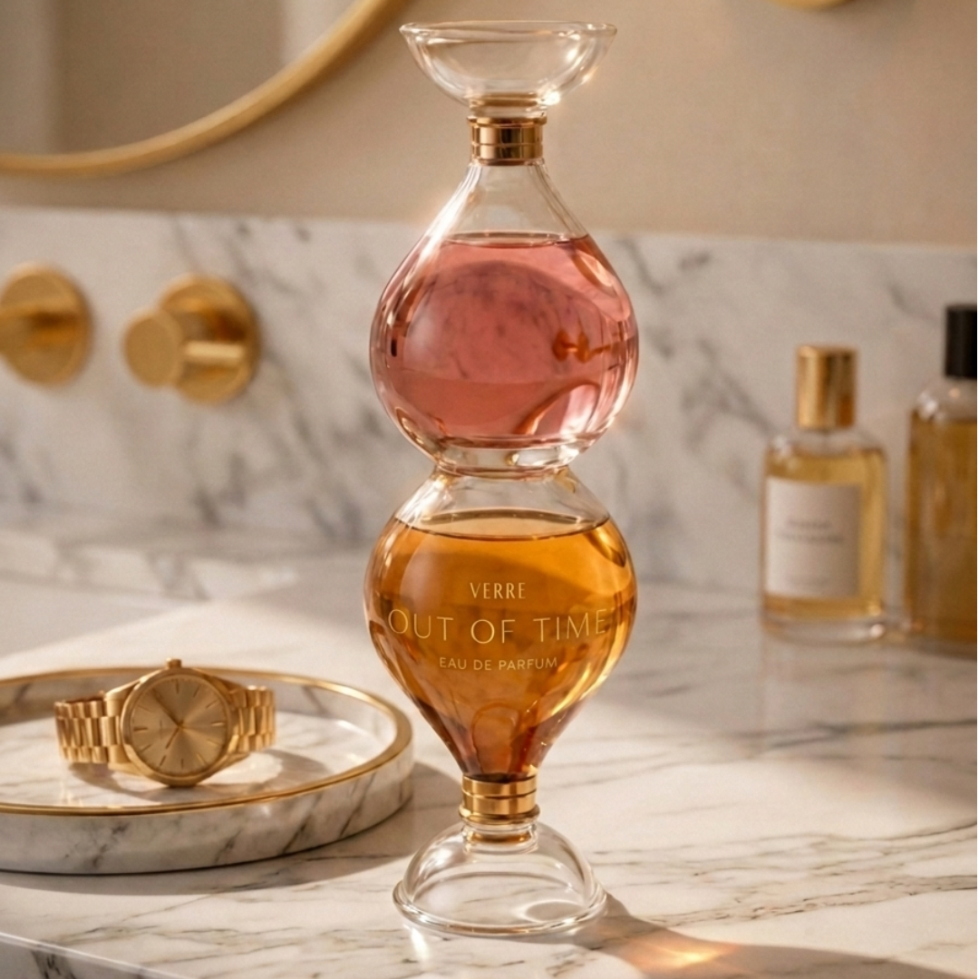
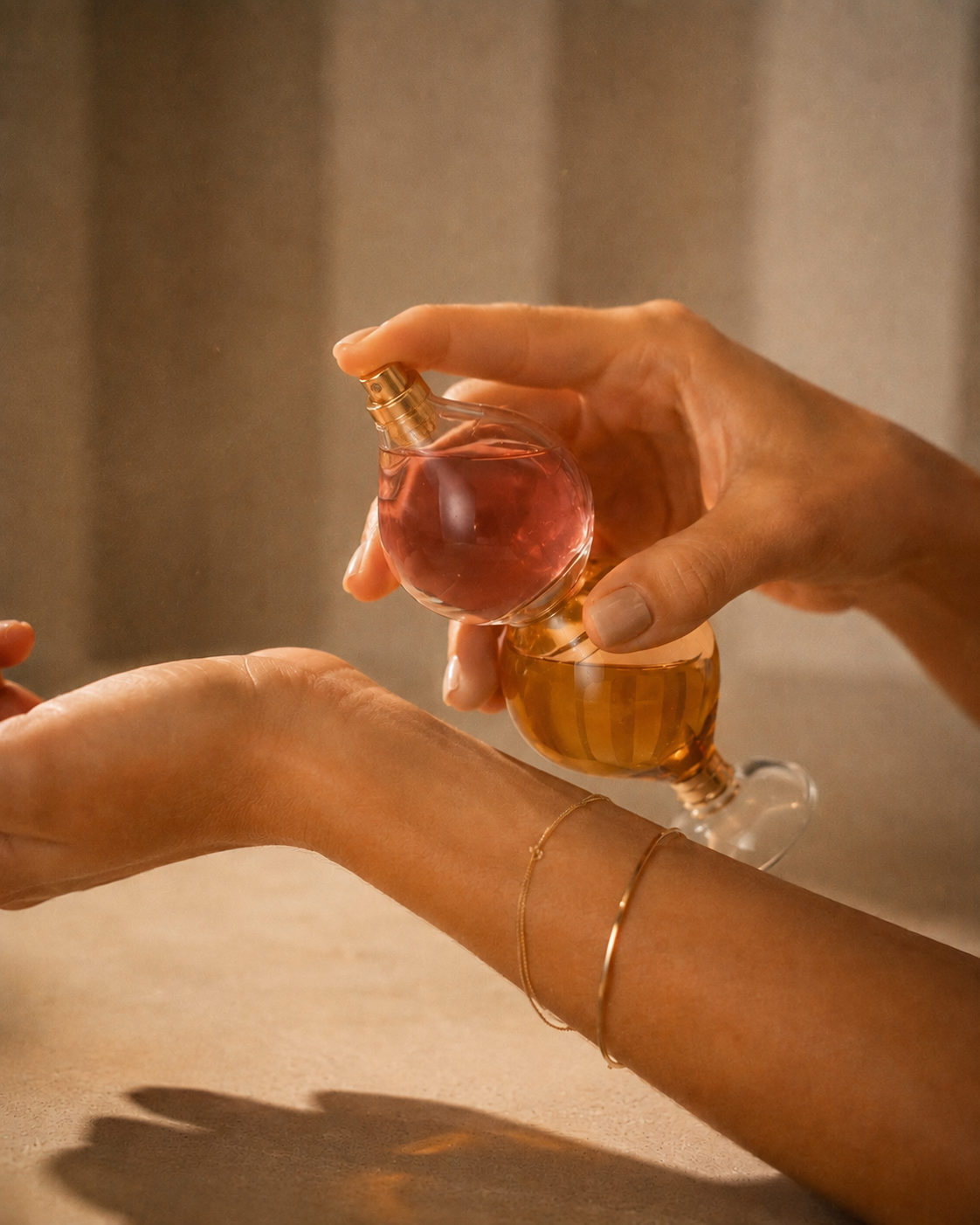
The full campaign carousel grew to include a macro hardware detail, an application shot, two lifestyle placements, an ingredient and mood composition, and two model portraits pairing the product with a human presence, each one built to hold up under close inspection, not just at a glance.
The brand system followed the product's own logic. An early direction leaned too heavily on solid gold seals and lattice patterning, elements that read closer to a heritage wine label than a modern fragrance house. The system was rebuilt around transparency instead: an outline only mark that reads as etched glass rather than stamped metal, a wordmark with a serif house name and a companion product name given room to breathe, and a brand gold sampled directly from the bottle's own hardware rather than chosen from a swatch.
Brand System Integration

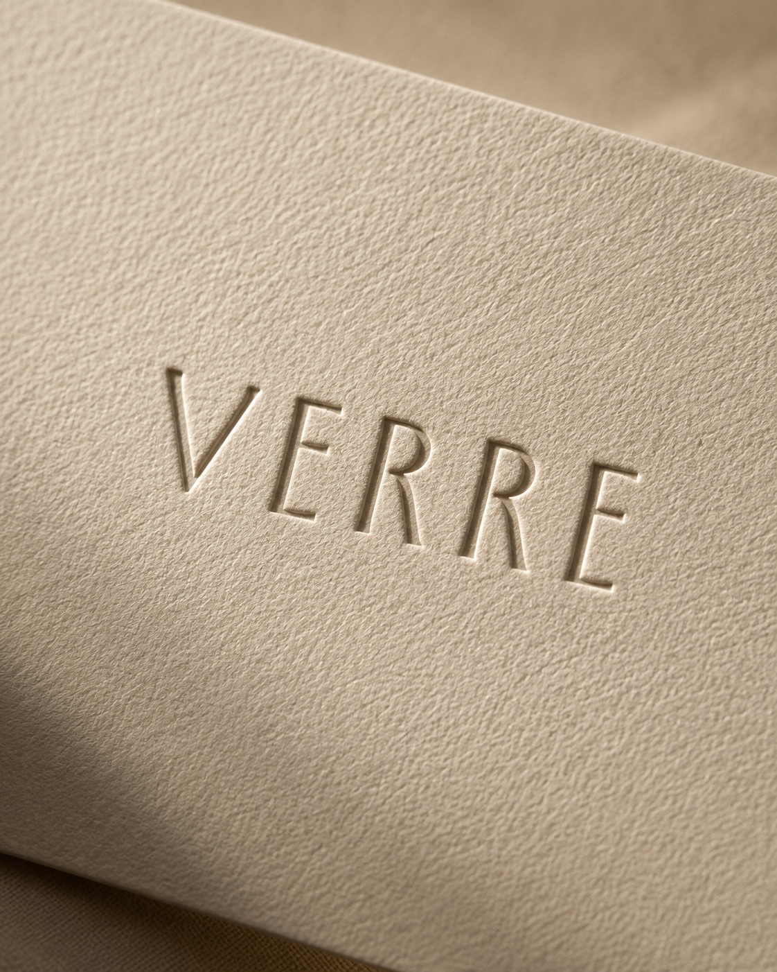
The final identity carries through every surface. The wordmark, VERRE set above OUT OF TIME and EAU DE PARFUM, is etched directly into the bottle's lower chamber, warmed by the amber liquid behind it. The same gold appears in the collar hardware, the standalone icon mark, and the supporting pattern work, an abstracted echo of light moving through liquid rather than a repeated logo.
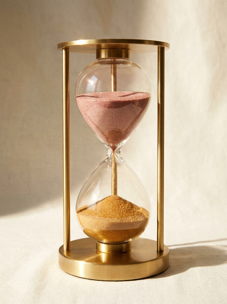
Campaign video extended the same restraint. A macro texture piece orbits the bottle's center collar, tracking light and refraction with no cuts. A narrative sequence pairs an hourglass in motion with the bottle's own reveal, closing on a single spoken line: Out of Time, the new eau de parfum from Verre.