INTERWOVEN
WHY INTERWOVEN?
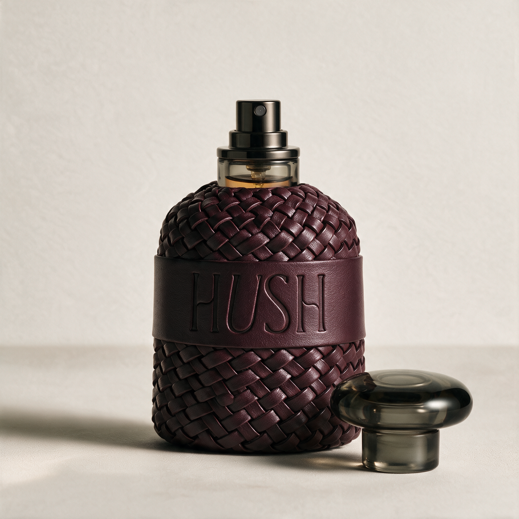
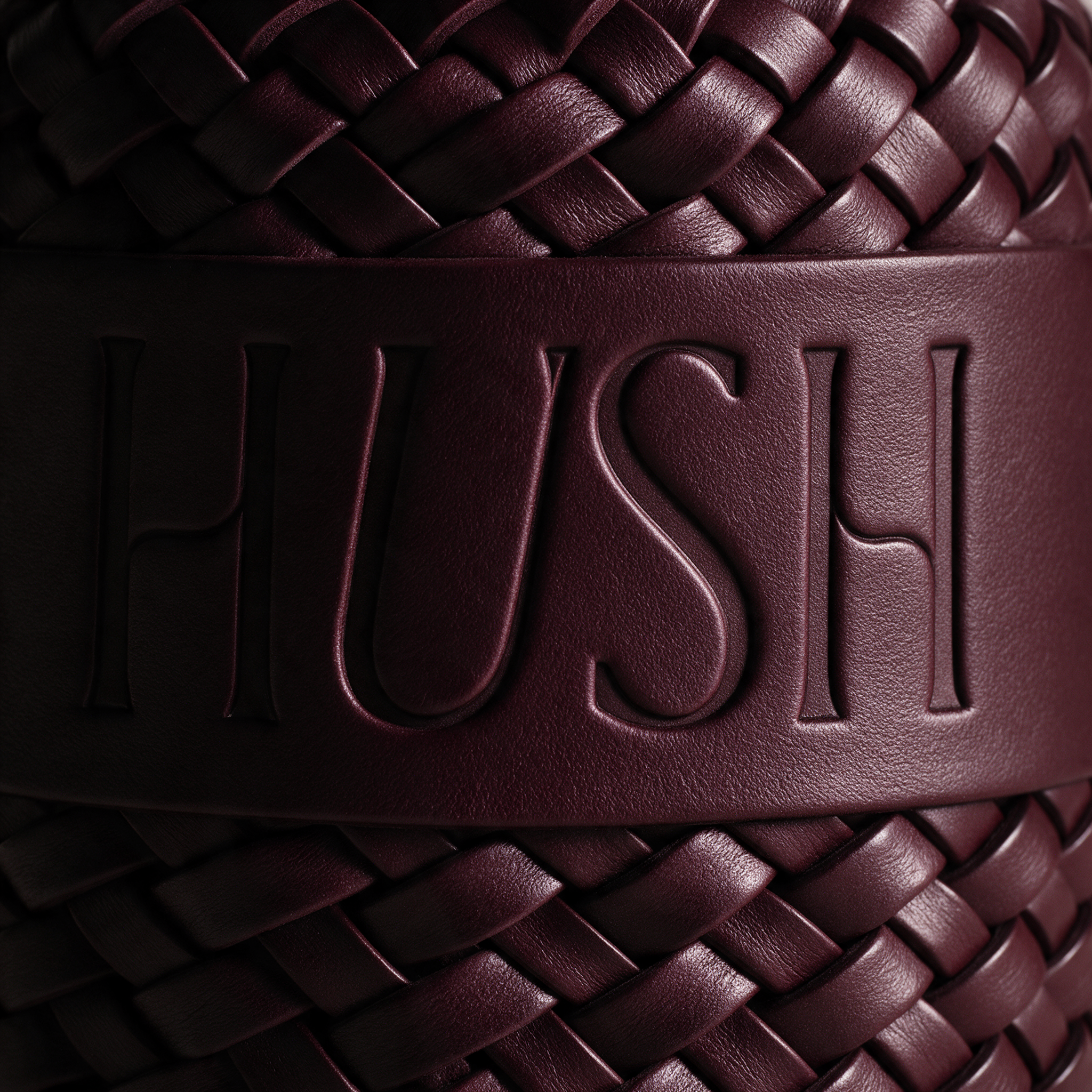
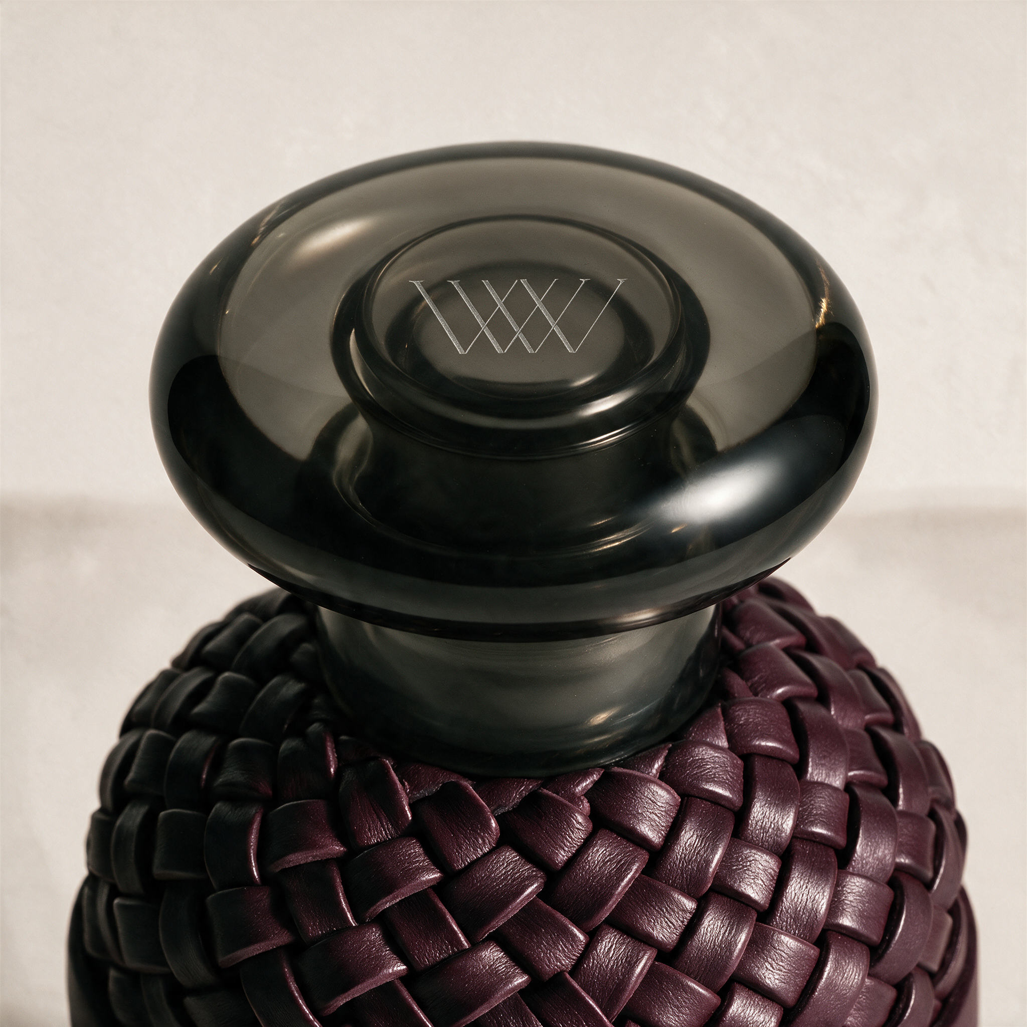
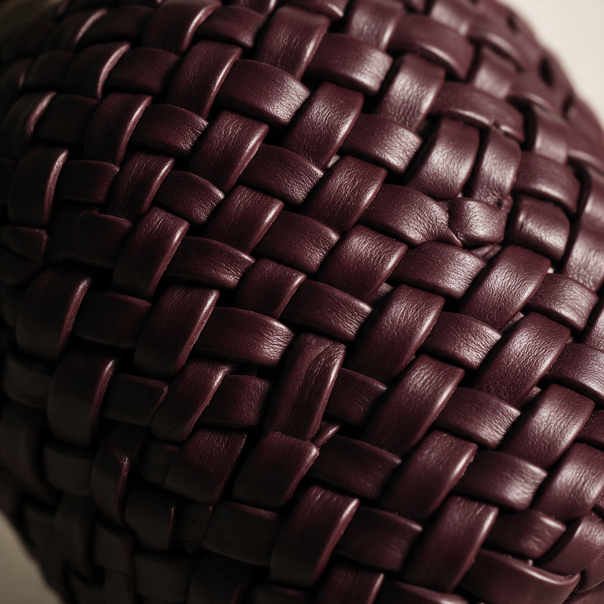
Scent is the most direct path to memory. One note can return you to a room, a night, a person, long after everything else has faded. Interwoven was named for that idea: the scents we wear become threads in the story of our lives. The name also lives in the product itself. Every bottle is wrapped in hand-woven leather, and the house mark is a pair of serif W's passing over and under one another, a literal interweaving at the heart of the brand. That same woven mark appears across the house, etched into each smoked glass stopper, pressed into wax seals, and debossed into paper and brass.
THE STRATEGY
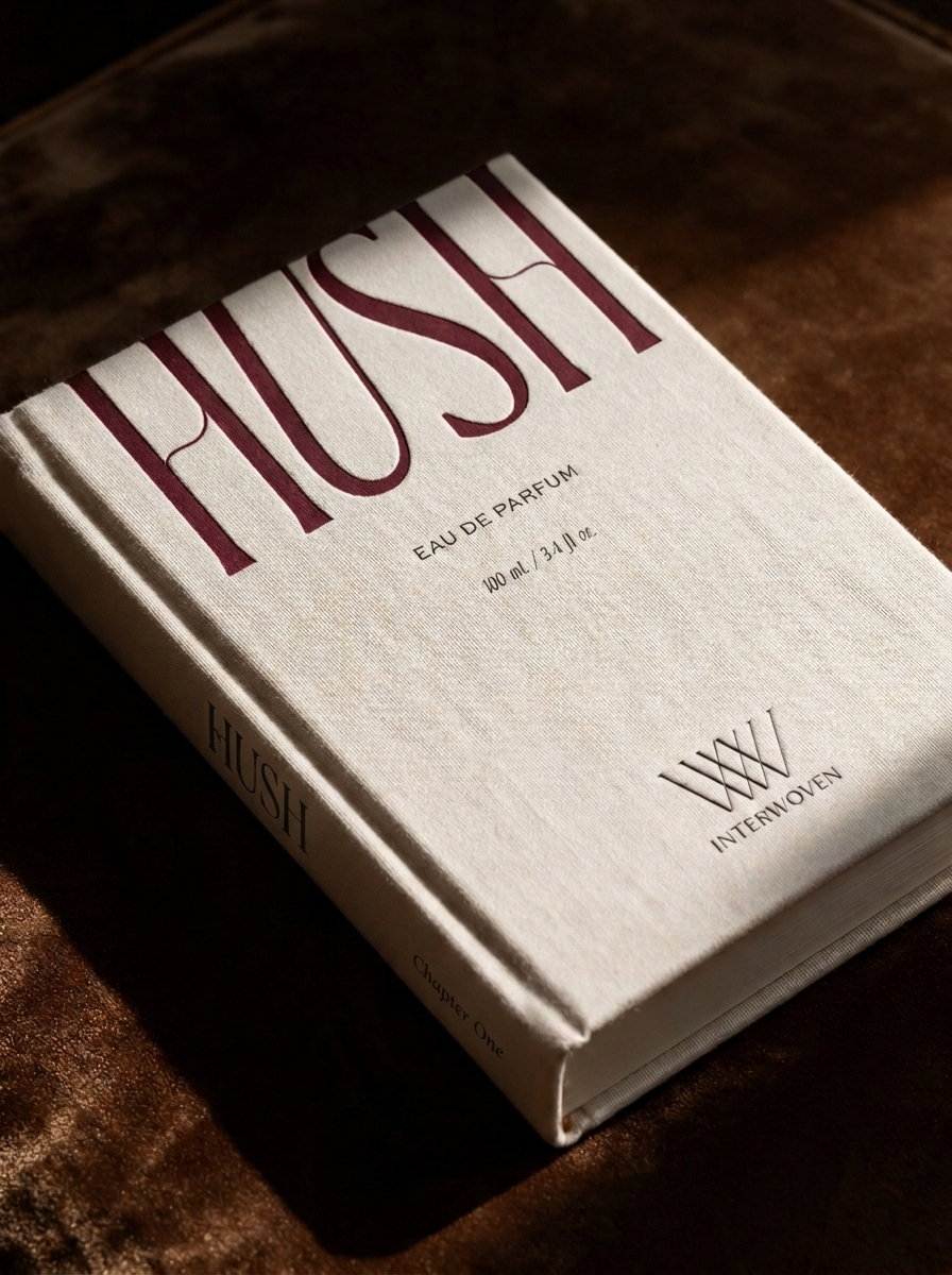
Interwoven needed to feel like a house with a point of view, not just a product line. Rather than selling scents by their notes alone, it sells them as moments. Each fragrance is written as a chapter in a single story, so the collection reads as one night, from the first unspoken glance to what lingers the morning after. This shows up in the tagline, "scent and memory, interwoven," and in the packaging itself: every bottle arrives in a box designed as a hardcover book, meant to be kept long after the bottle is empty.

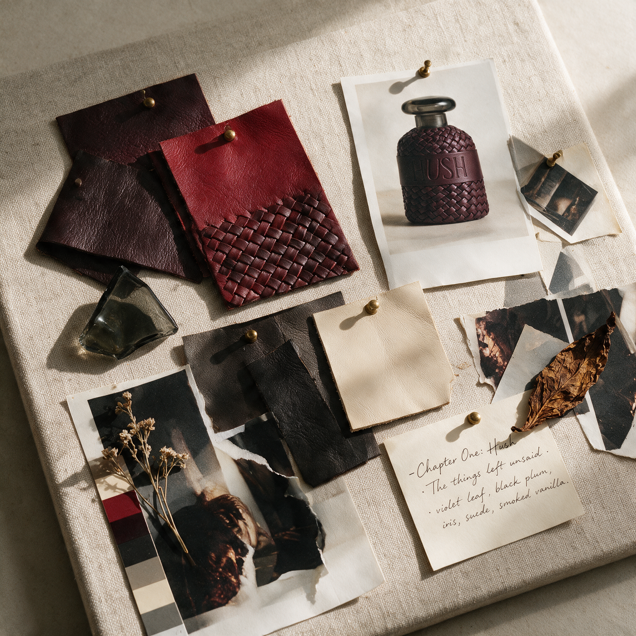
THE COLOR PALETTE
Every color in Interwoven's palette carries part of the story: oxblood and espresso set the mood of the night, lipstick red gives it its loudest moment, and bone ivory softens it into memory. Cotton cream and warm charcoal hold everything together, so even the boldest chapter still feels like it belongs to the same book.
Oxblood: depth, intimacy, quiet intensity
Espresso Black: confidence, nerve, the unexpected
Lipstick Red: energy, celebration, abandon
Bone Ivory: softness, memory, what remains
Cotton Cream: warmth, texture, understated luxury
Smoked Gray: mystery, restraint, the unseen
Warm Charcoal: grounded, timeless, editorial
THE GRID VIEW
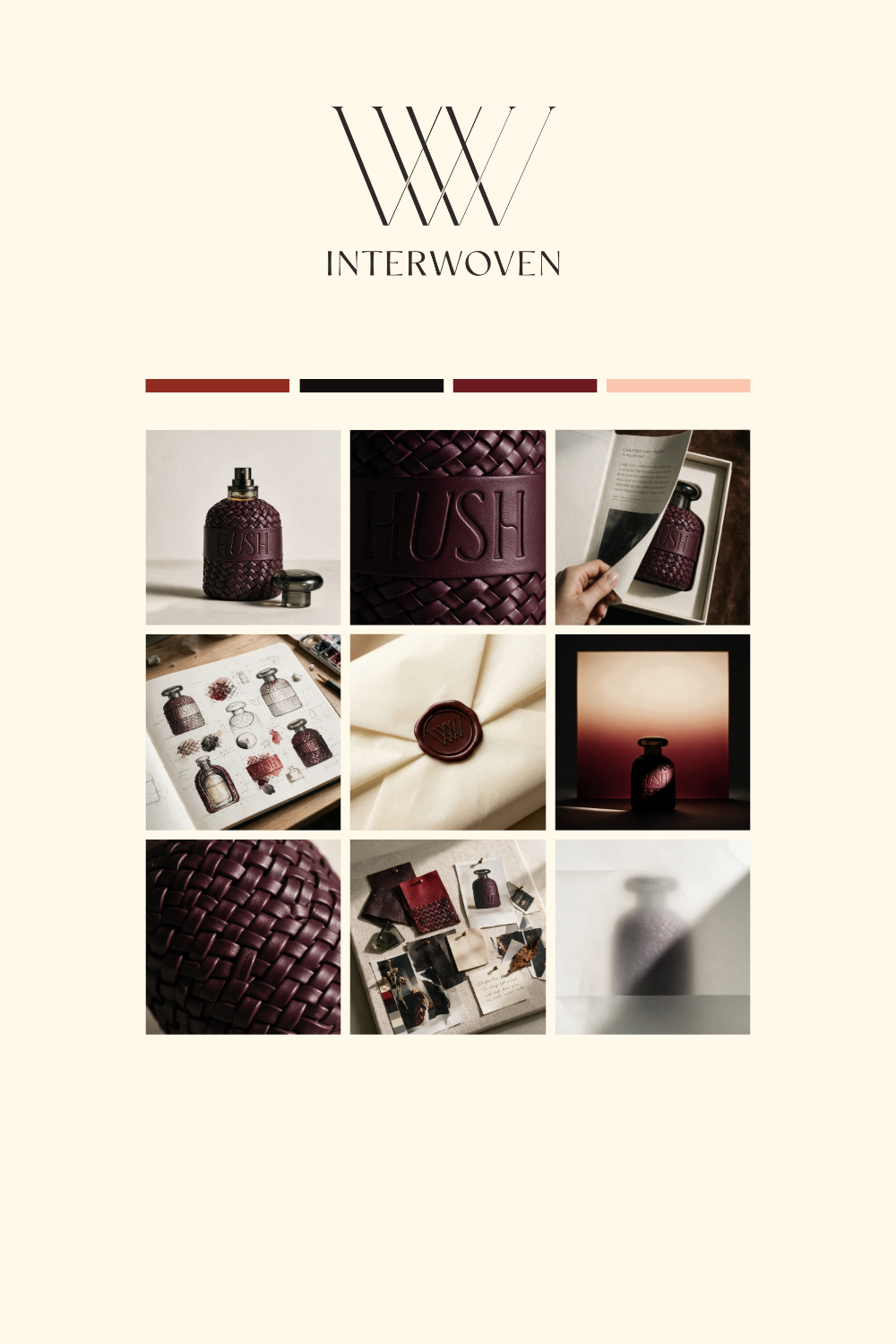
I think imagery plays a huge factor, which is why I love to provide a grid view of what the brand’s socials could look like. I think it’s important to visualize your brand and I love designing the imagery once the branding is established.
THE CONCEPT
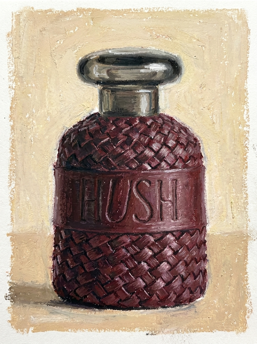
Interwoven started with a single word: Hush. I wanted to explore a darker, moodier, more editorial world than anything else in my portfolio, somewhere between the quiet neutrals I'm known for and the playful color of Bien. What began as one perfume about the things left unsaid grew into a full house, and the question became how to build a collection with real emotional range while keeping it unmistakably restrained.
THE SYSTEM
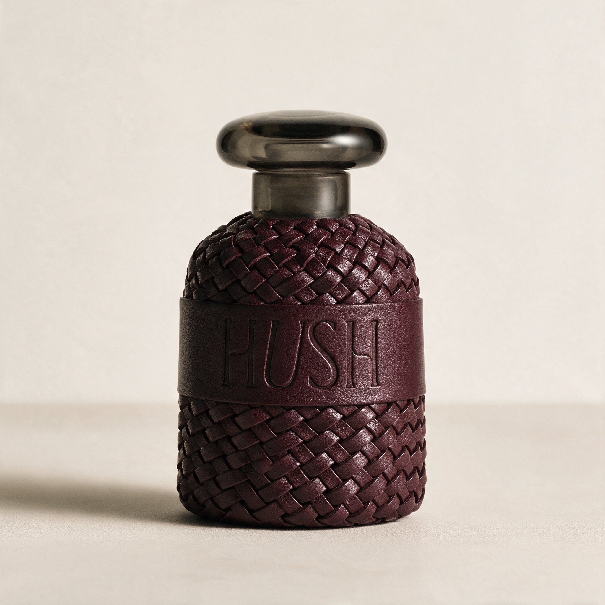
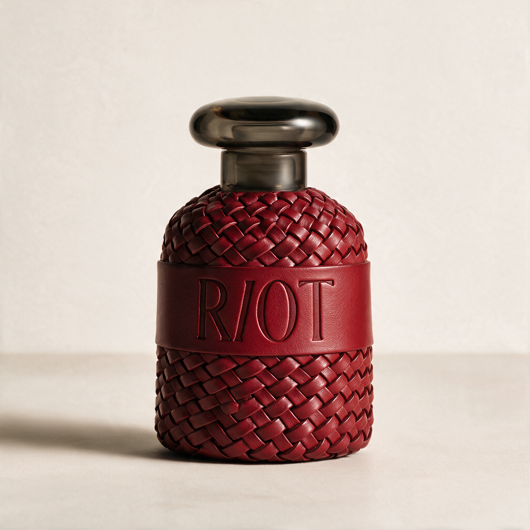
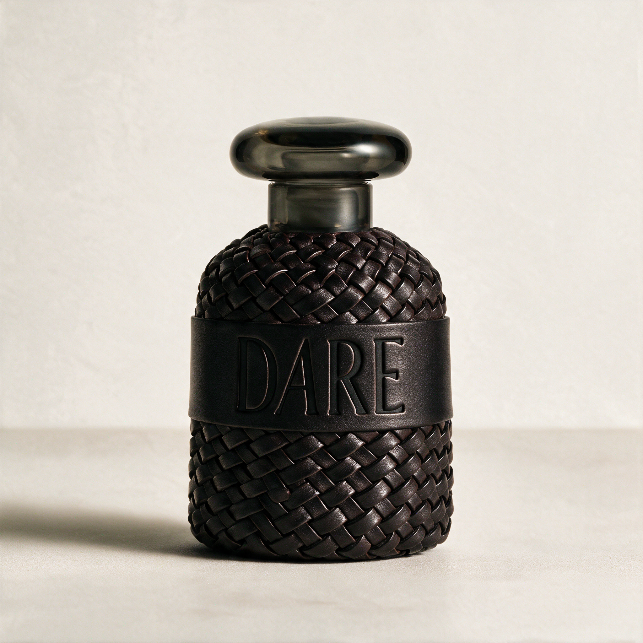
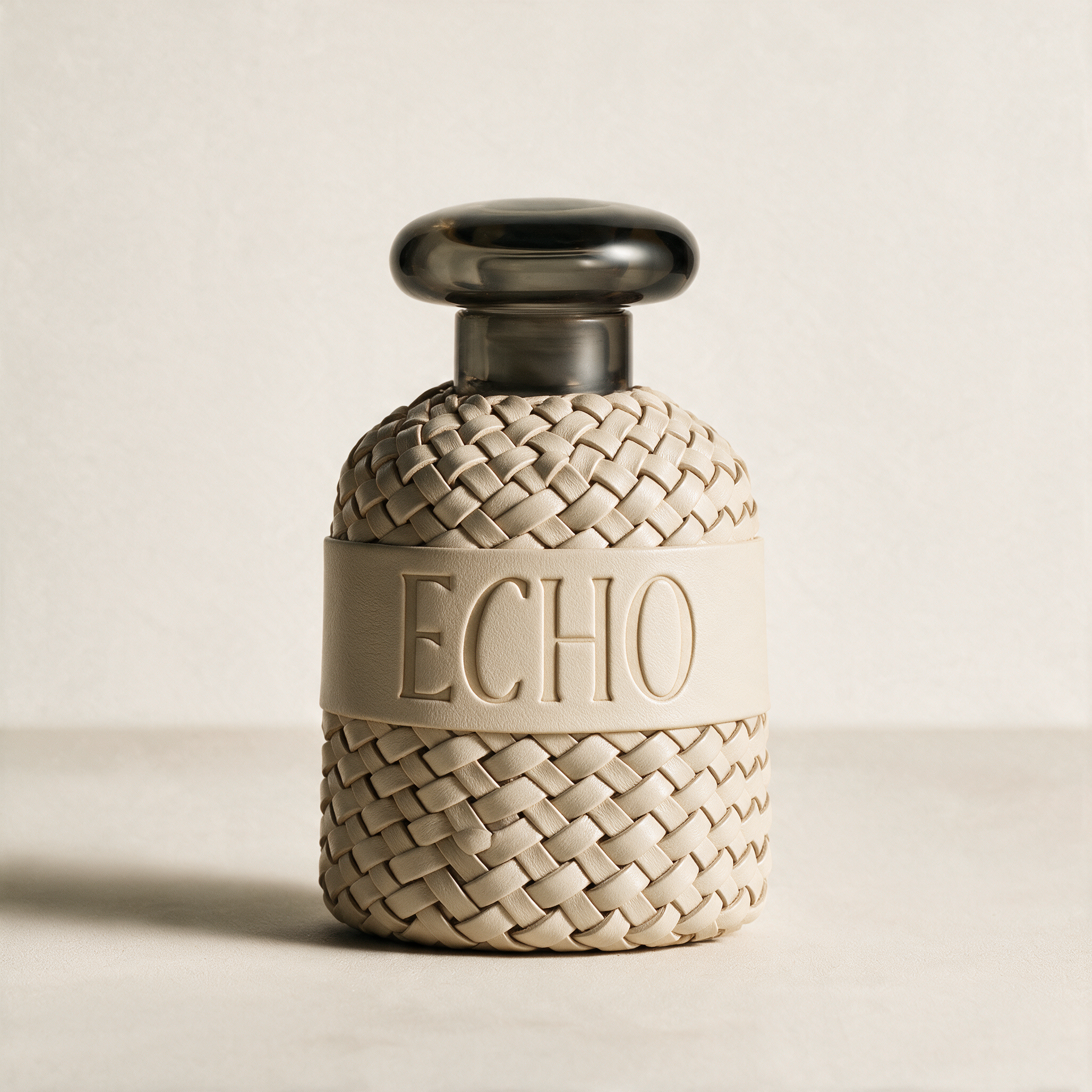
Four scents, four letters, one shared form: Hush in oxblood, Dare in espresso black, Riot in lipstick red, and Echo in bone ivory. Every bottle shares the same weighty glass body, woven leather wrap, debossed band, and heavy smoked glass stopper. Only the leather changes. In each name, one letter leans forward, a quiet signature that draws you closer.
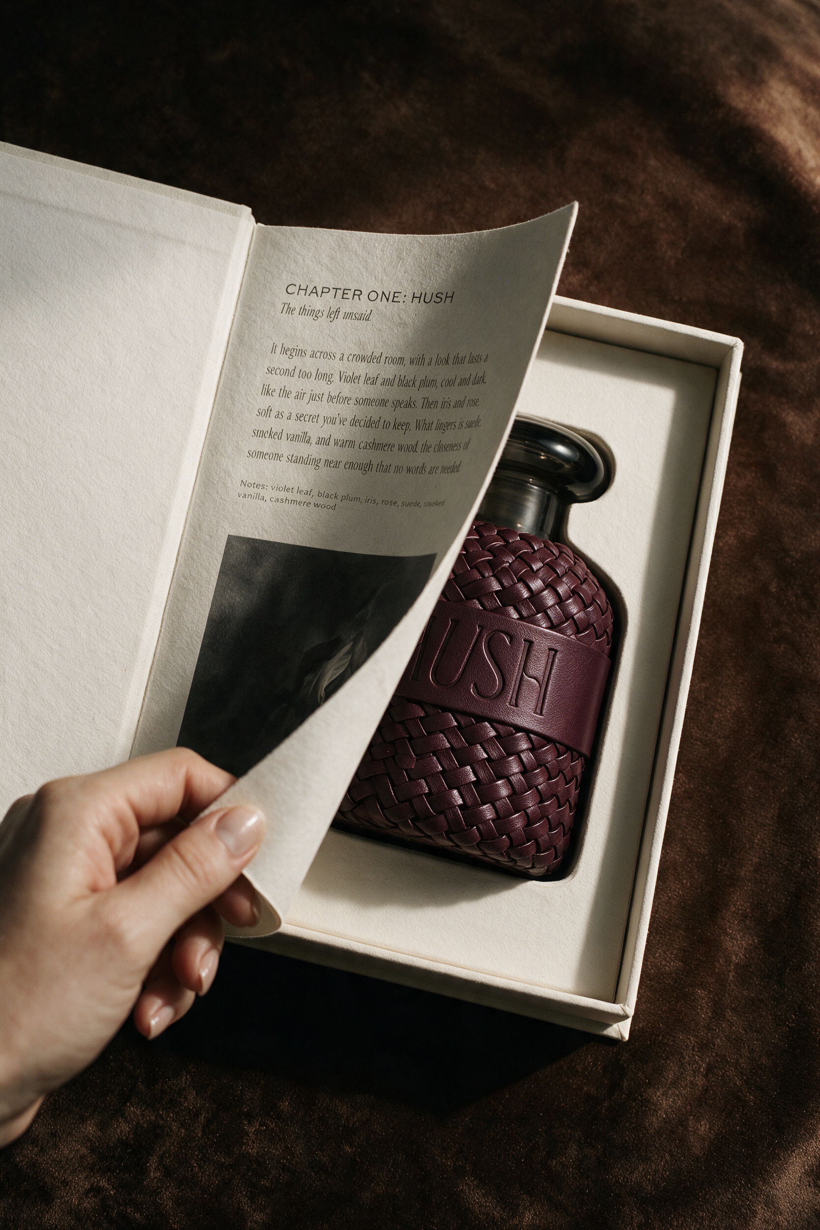
The packaging follows the same logic. Each book-style box is wrapped in textured cotton, with the scent's name bleeding off the top of the cover in its own color. Echo, the quietest chapter, appears only as a blind deboss, visible through light and shadow alone. Open the cover and a single page tells that scent's story, and beneath it, the bottle waits. The story comes before the scent.
THE CAMPAIGN
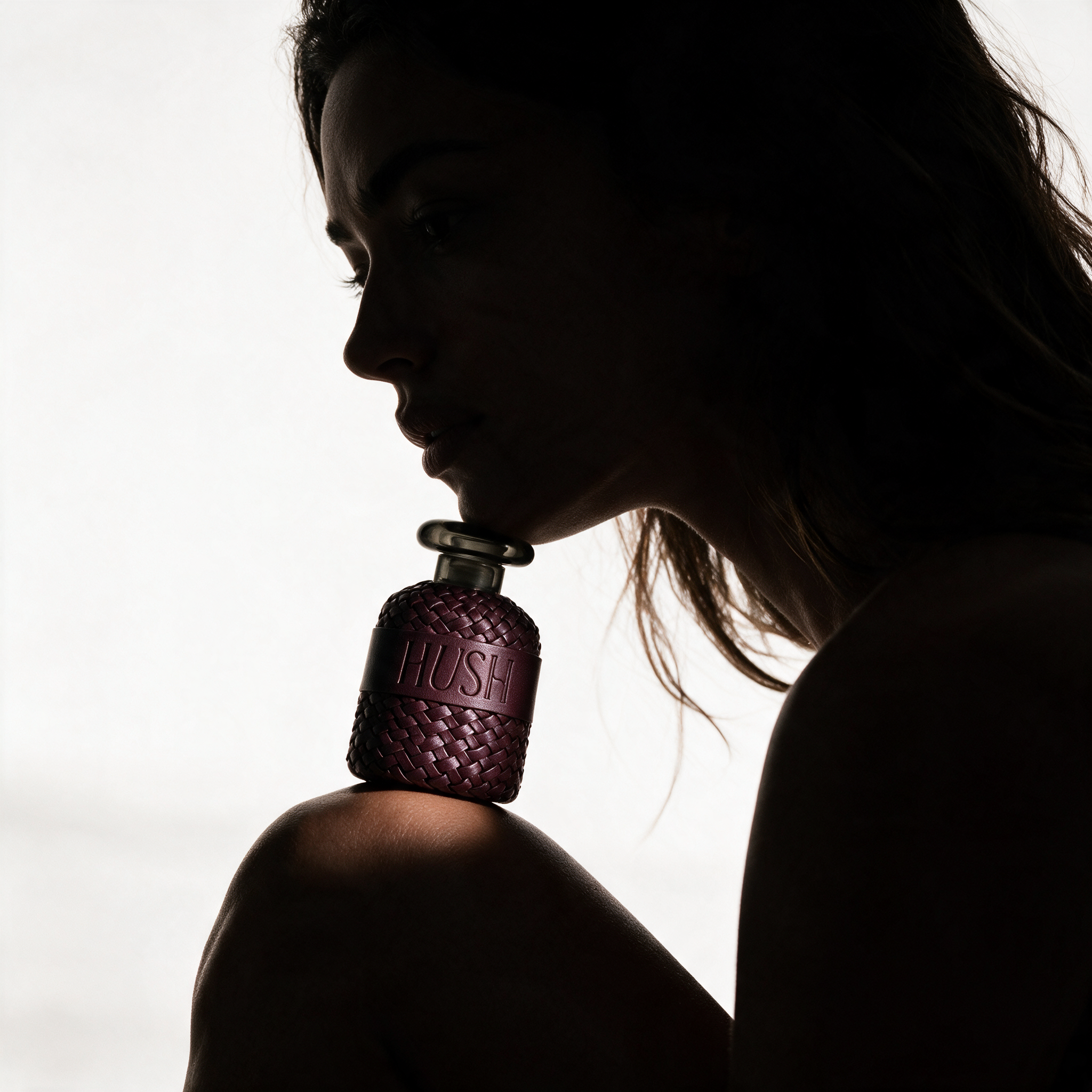
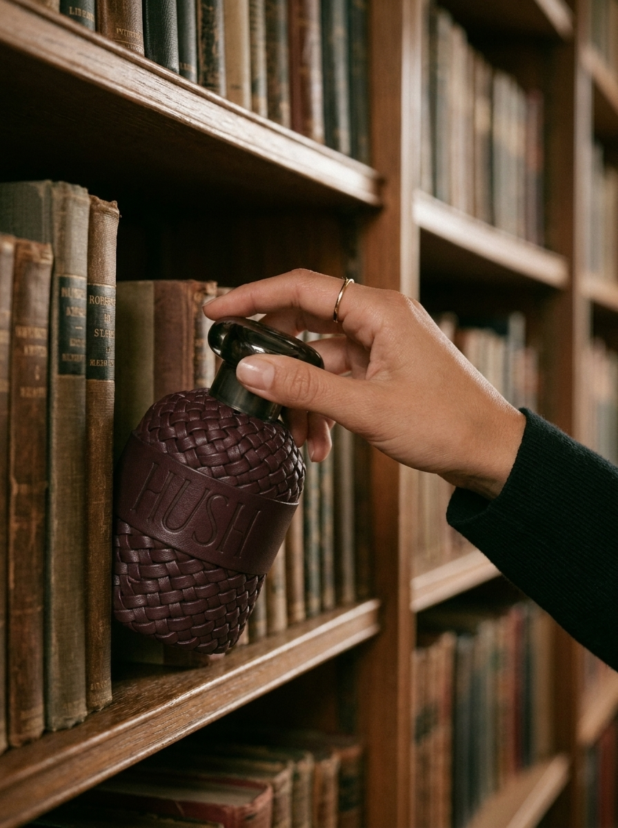
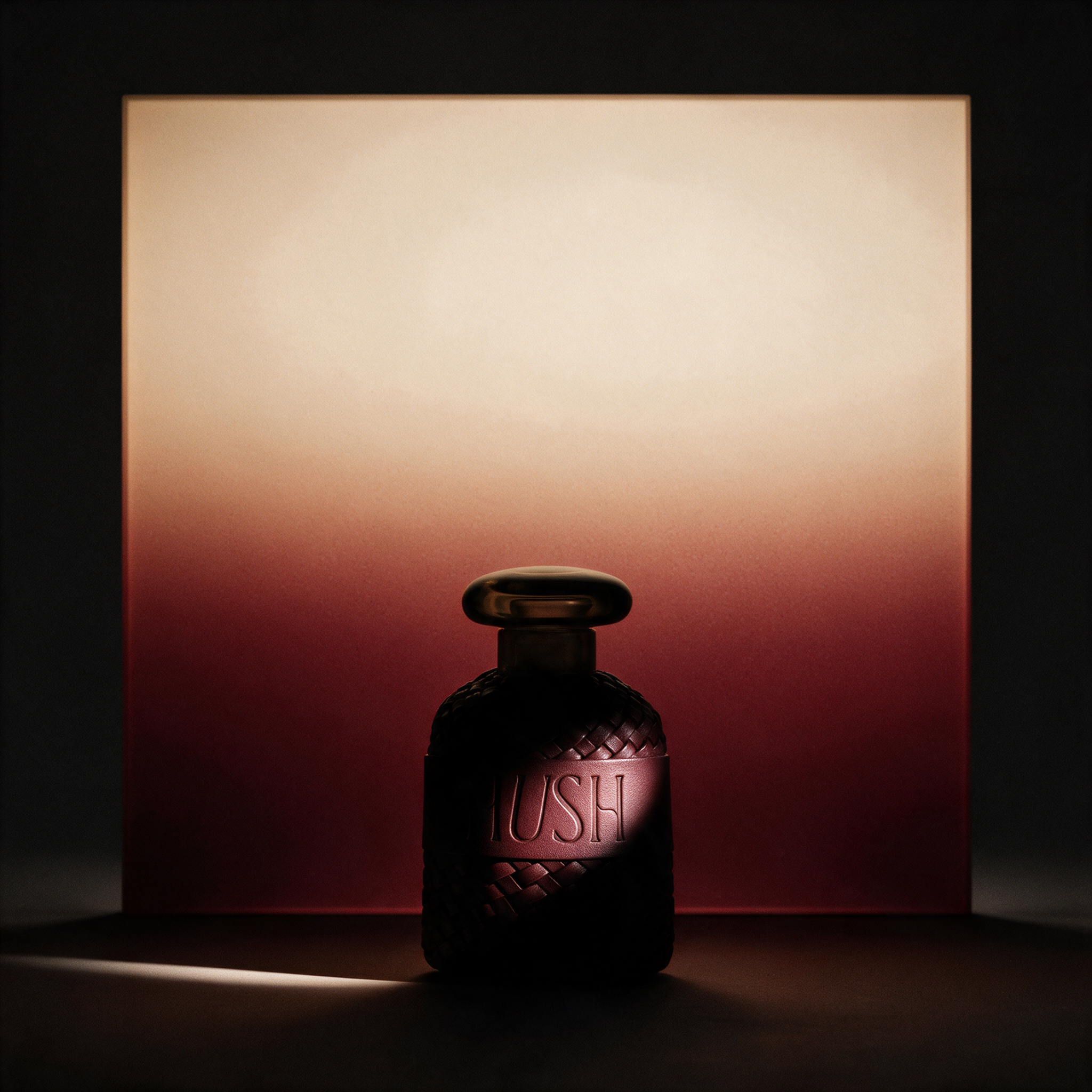
The photography leans into shadow and warmth: raking late-afternoon light, brown velvet, cream linen, and deep oxblood accents, so every image feels like a moment caught mid-story. Black-and-white florals open each chapter, moving from an iris half-hidden in darkness for Hush to a magnolia dissolving into morning light for Echo. From a page turning to reveal a bottle to a stopper lifted just before the first spray, the goal was always the same: slow the moment down and make every detail feel worth discovering.

WHAT I LEARNED
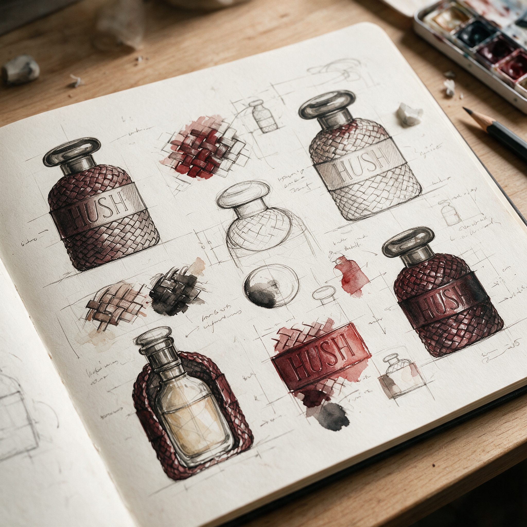
This project taught me how much of luxury lives in restraint and in the details most people never notice: the lean of a single letter, the gaps where two strands cross, a name pressed into cotton without any ink at all. It also reminded me that knowing when to let go is just as important as knowing what to add. A library scene, a vellum page, and a colored spine were all explored and set aside, and each one made the final direction clearer.