B!EN
WHY BIEN?
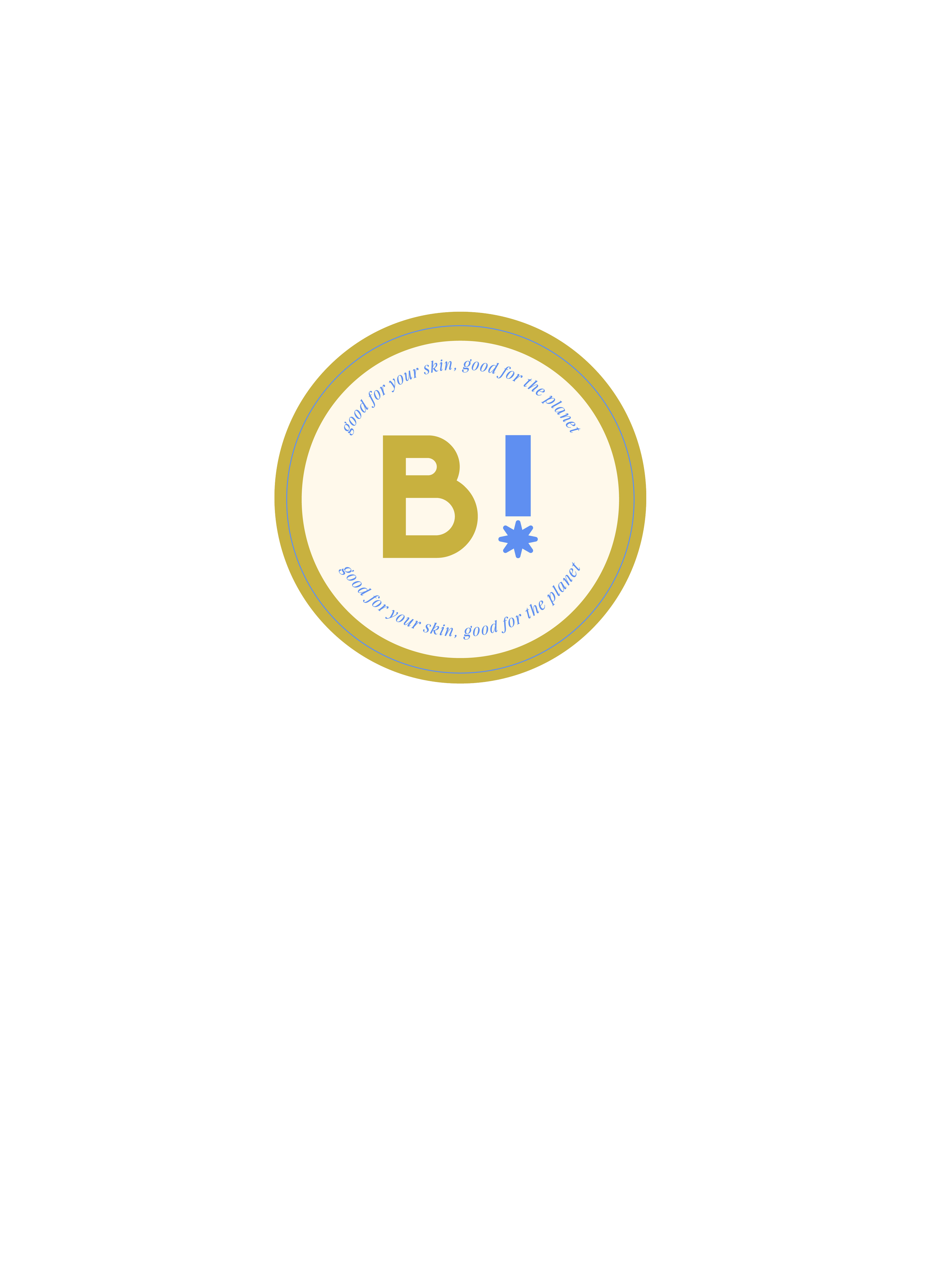
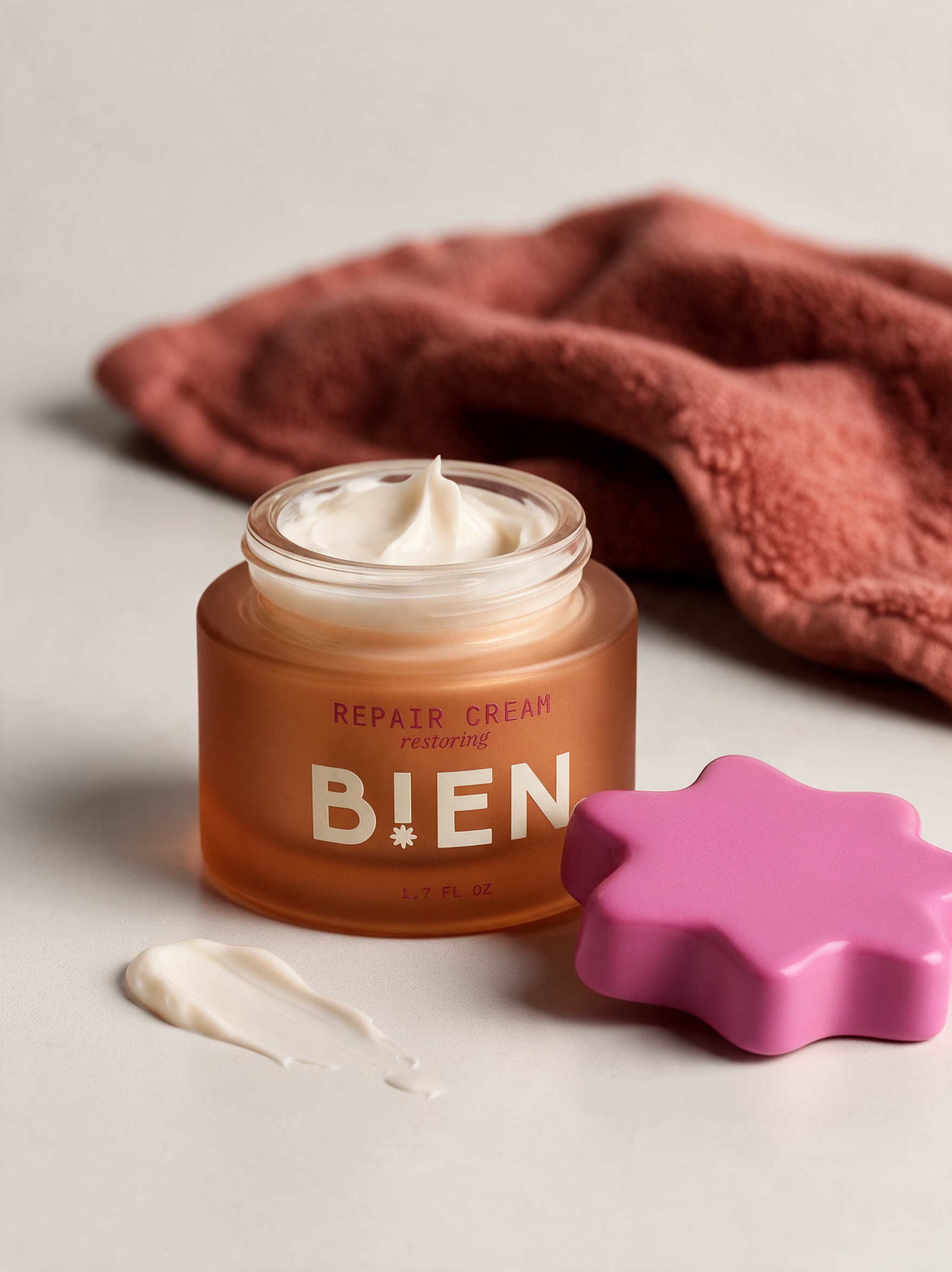
Bien means "good" in French, and the name became the whole philosophy: skincare without the pressure to perform self-care perfectly. The wordmark carries a small piece of wit at its center, an exclamation point standing in for the "I," which doubles as the literal shape used across every product in the line. That single star device shows up as a dropper collar, a pump top, a ceramic lid, always the same silhouette, never the same finish twice. The same star became an identifiable icon in the brand identity as well.
THE STRATEGY
Bien needed to position itself as environmentally friendly, not only in ingredients, but in packaging and sustainability. This shows up in the brand tagline, “good for your skin, good for the planet” and in the bottles themselves. The bottles are made up of recycled glass and the minimal plastic that is used, is also recycled.

THE COLOR PALETTE
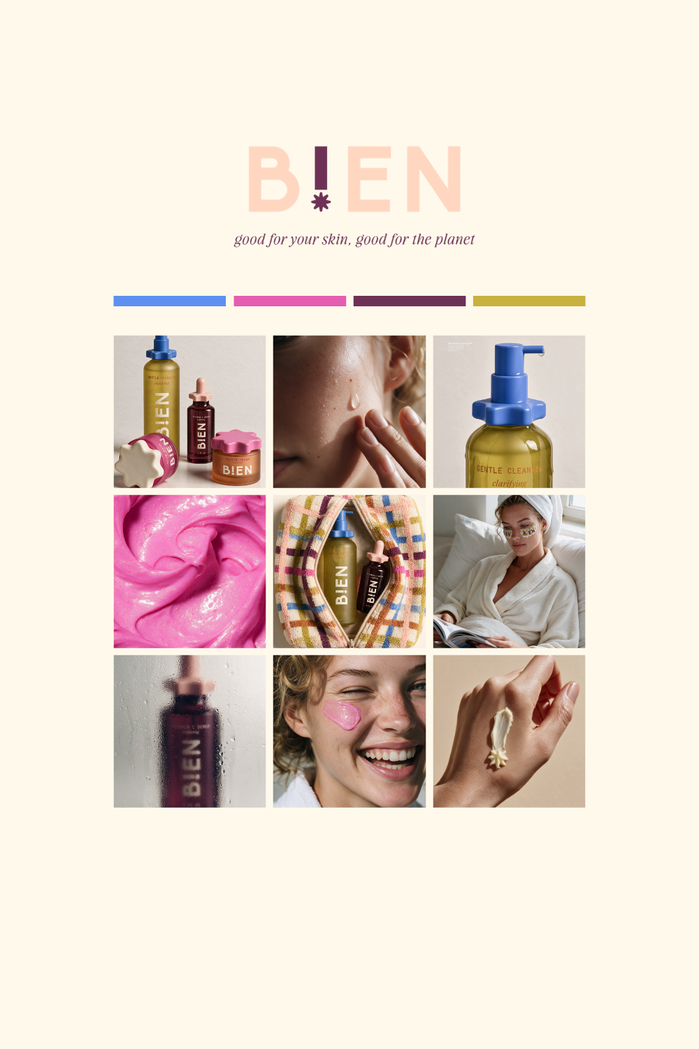
As with any brand identity project, color is a huge strategic choice. I always utilize color psychology when selecting a brand color palette as it’s more than just “pretty colors".
Plum/Maroon: rich, grounded, luxury, depth and quiet confidence
Mustard/Olive: earthy, optimistic, natural
Magenta: confident, modern, slightly rebellious, self-assured
Terracotta: earthiness, comfort, craft, grounded and natural
Cornflower: calm, clean, reliability
Blush: gentle, nurturing, approachable
Cream: simplicity, purity, quiet luxury
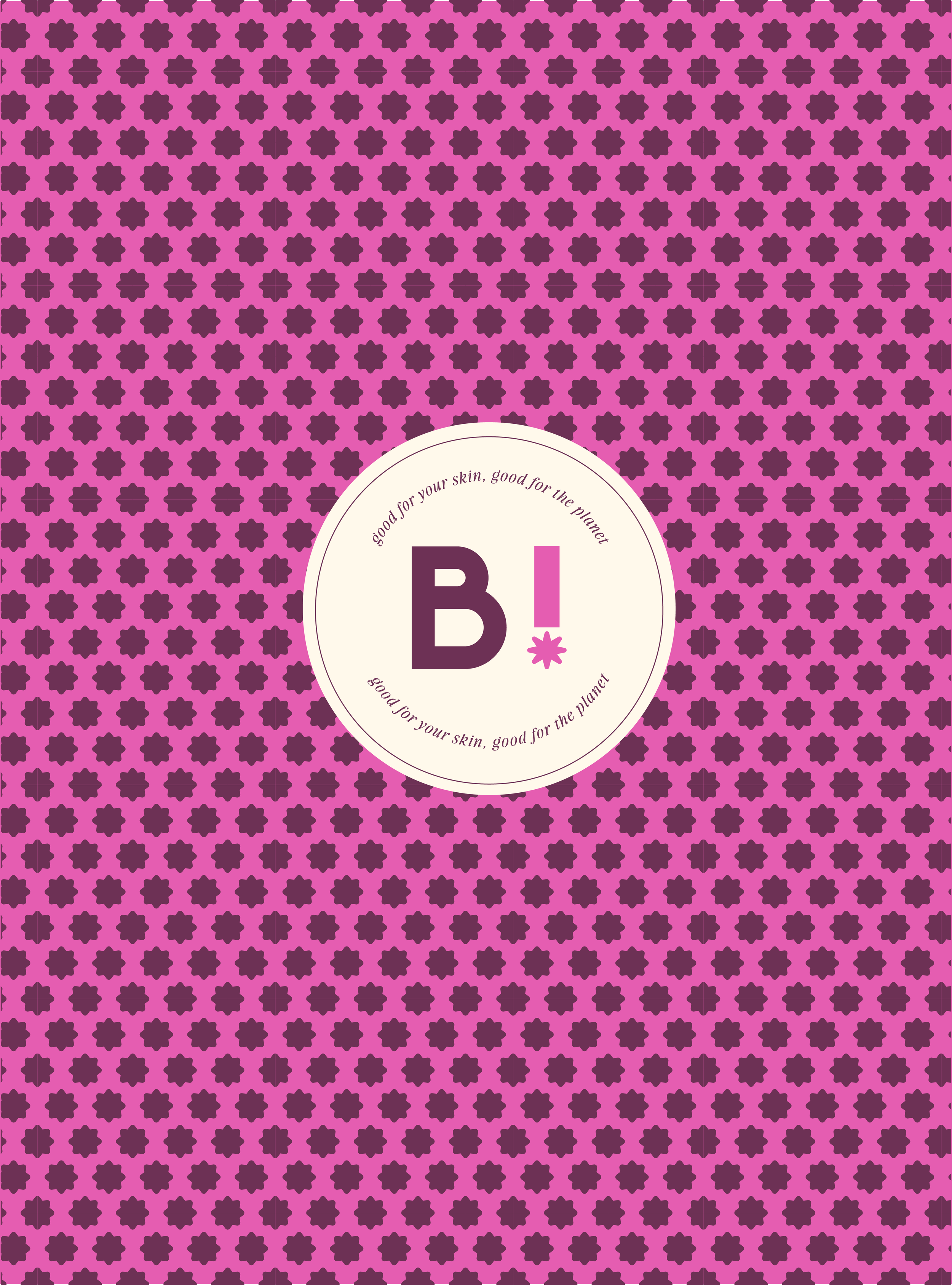
Every color in Bien's palette does double duty: plum and terracotta ground it in apothecary tradition, mustard and cornflower signal clean without saying it, magenta and blush let it play. The range proves a brand can be bold and considered at once, good skincare doesn't have to pick a single mood to be good.
THE GRID VIEW
I think imagery plays a huge factor, which is why I love to provide a grid view of what the brand’s socials could look like. I think it’s important to visualize your brand and I love designing the imagery once the branding is established.
THE CONCEPT
Bien started as a question: could I prove range without abandoning the muted, considered aesthetic I'm known for? Most of my portfolio lives in quiet neutrals, so I set out to build a brand that pushed into bolder color and more playful energy, while still feeling like my own point of view rather than a totally different designer's work.
THE SYSTEM
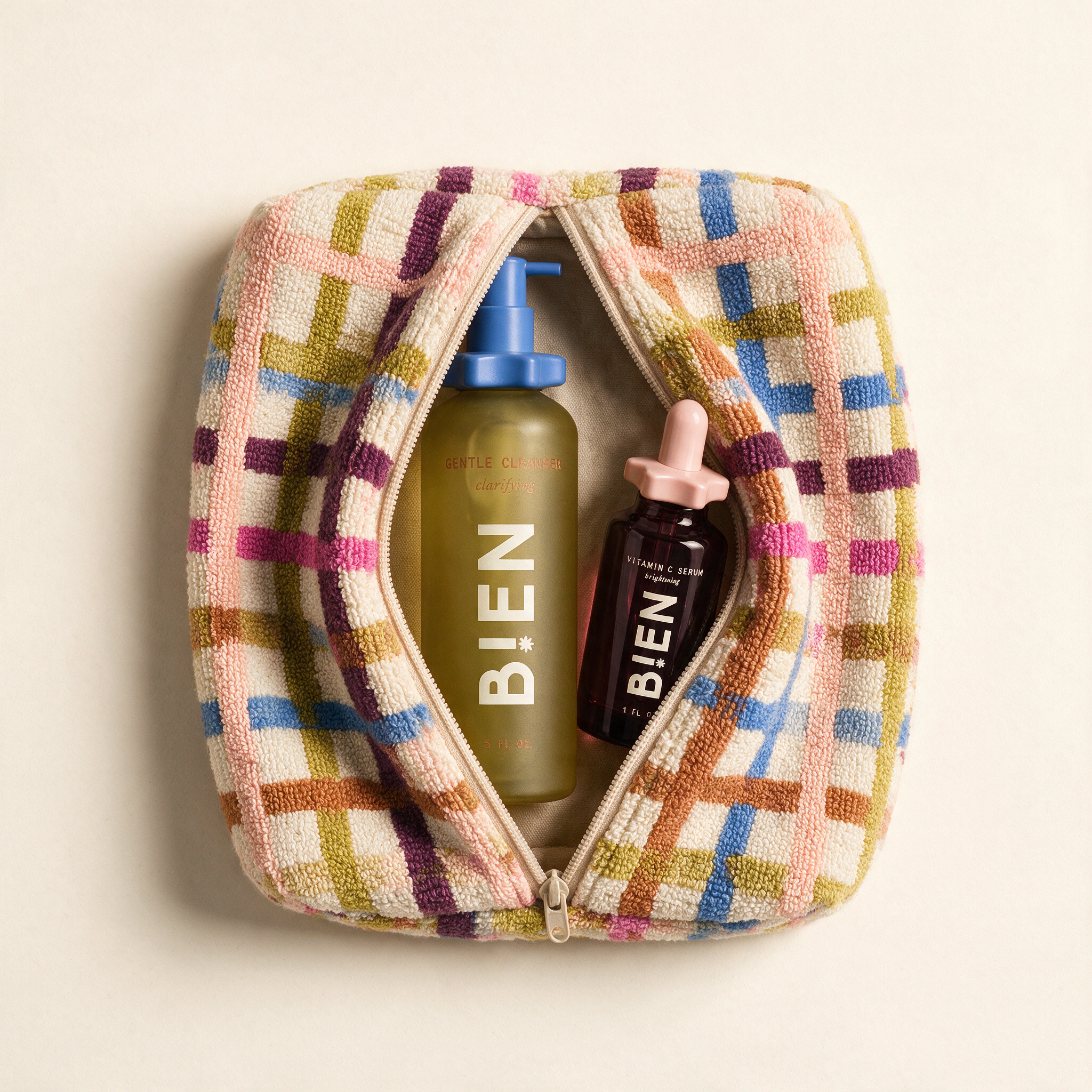
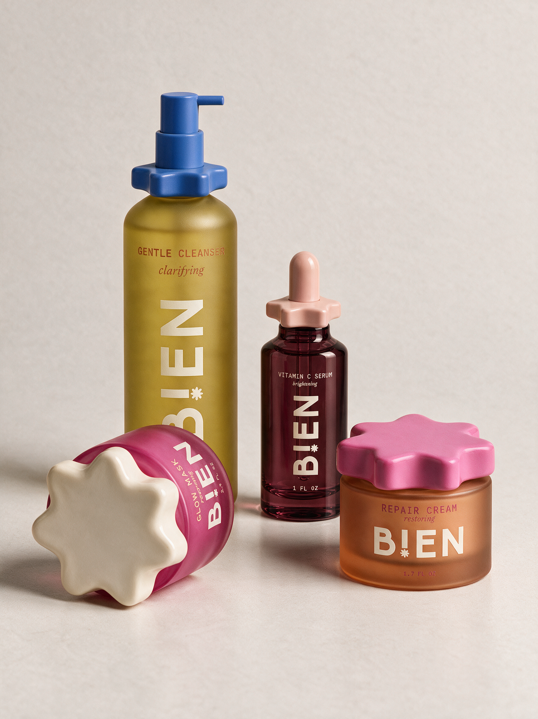
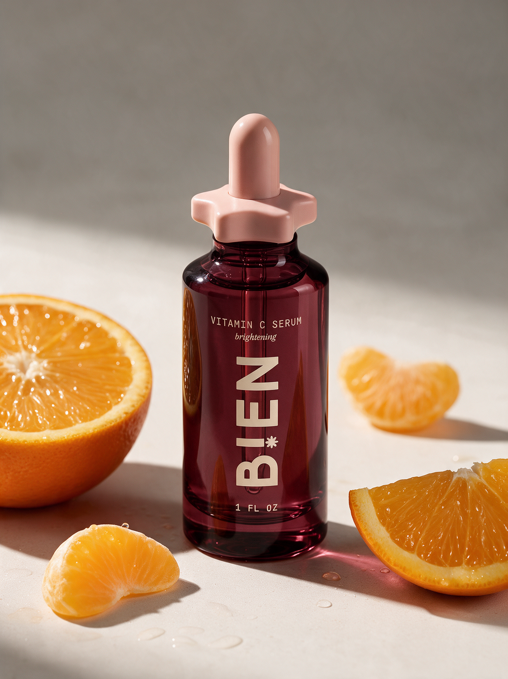
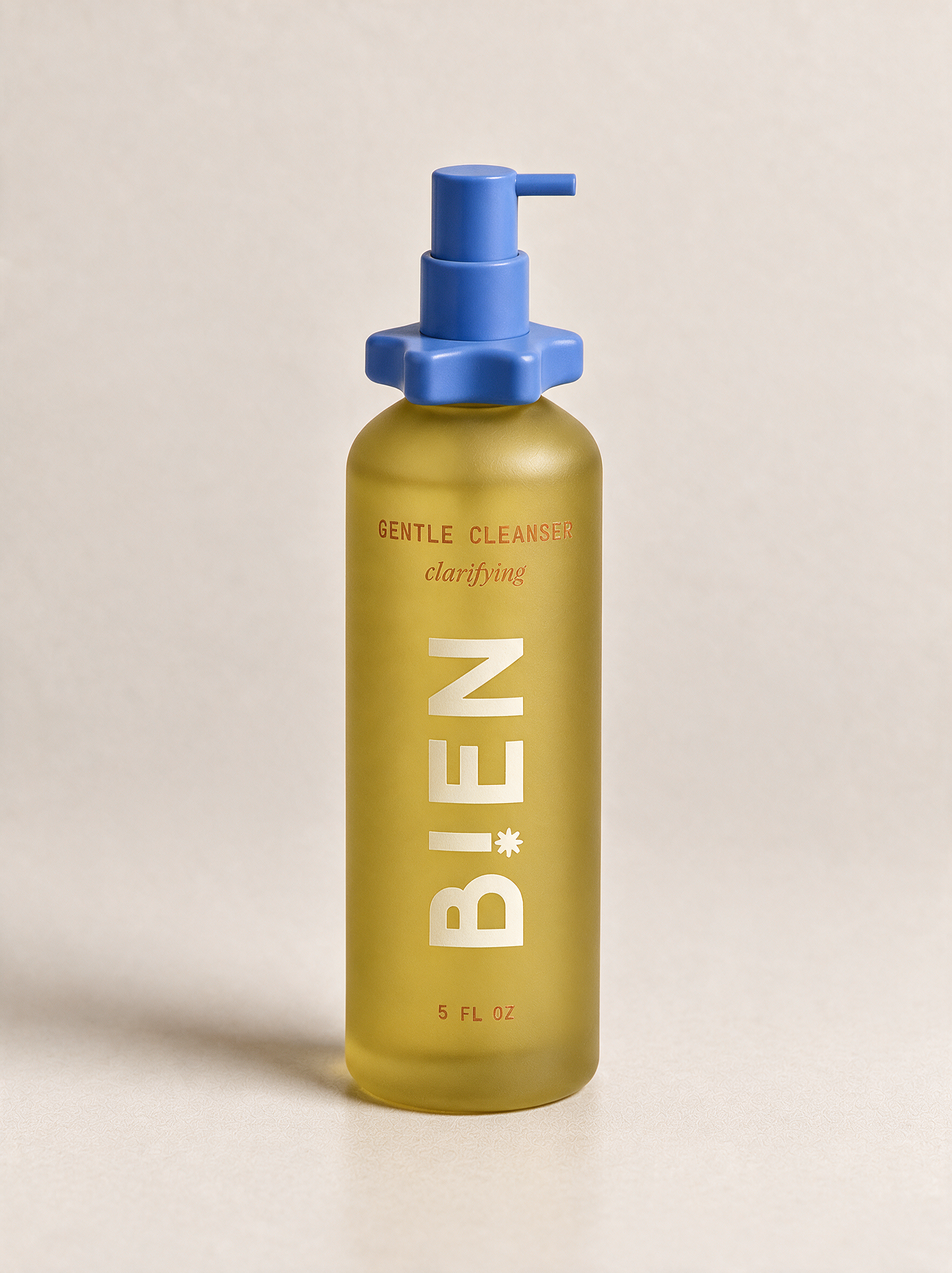
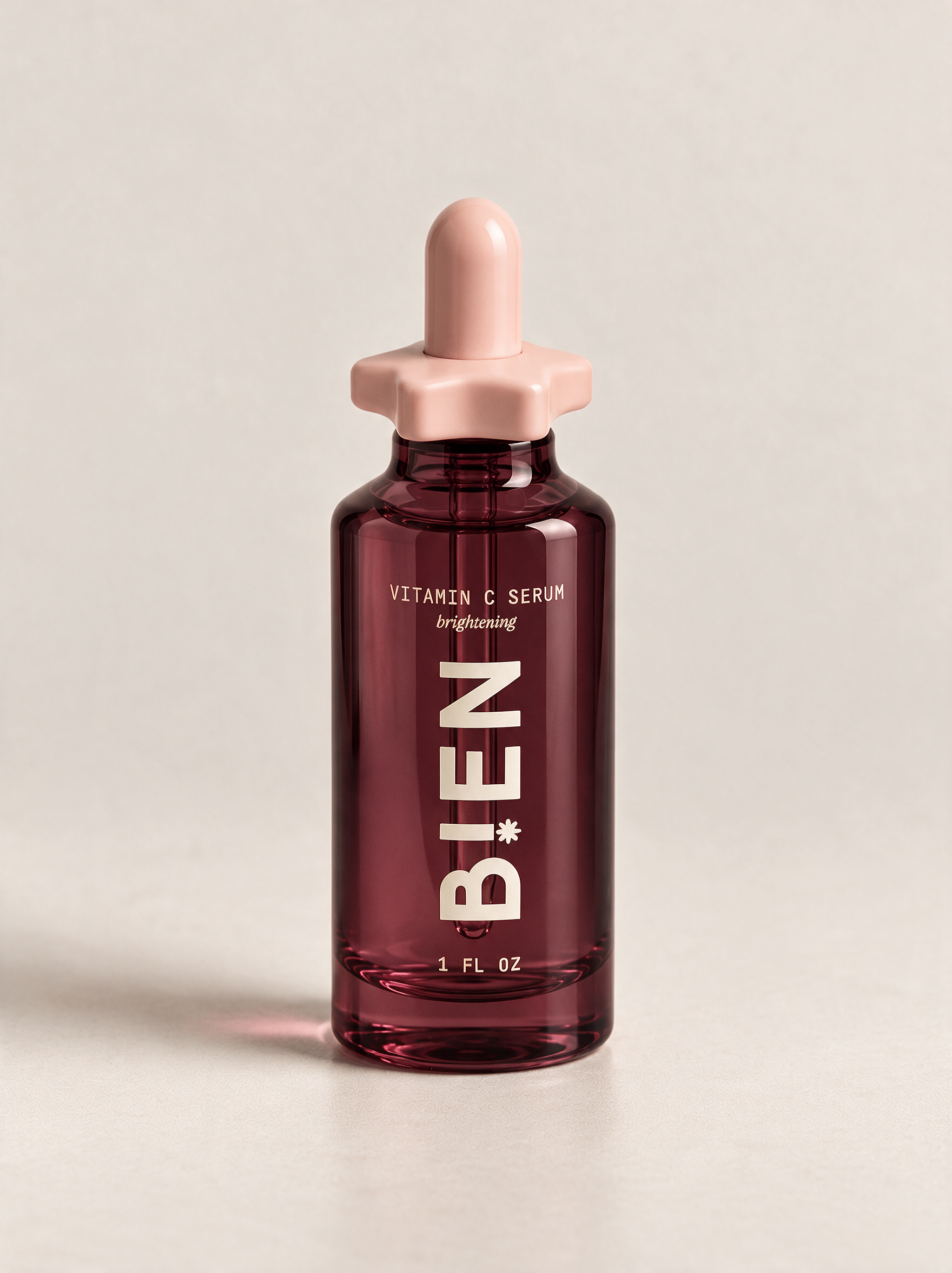
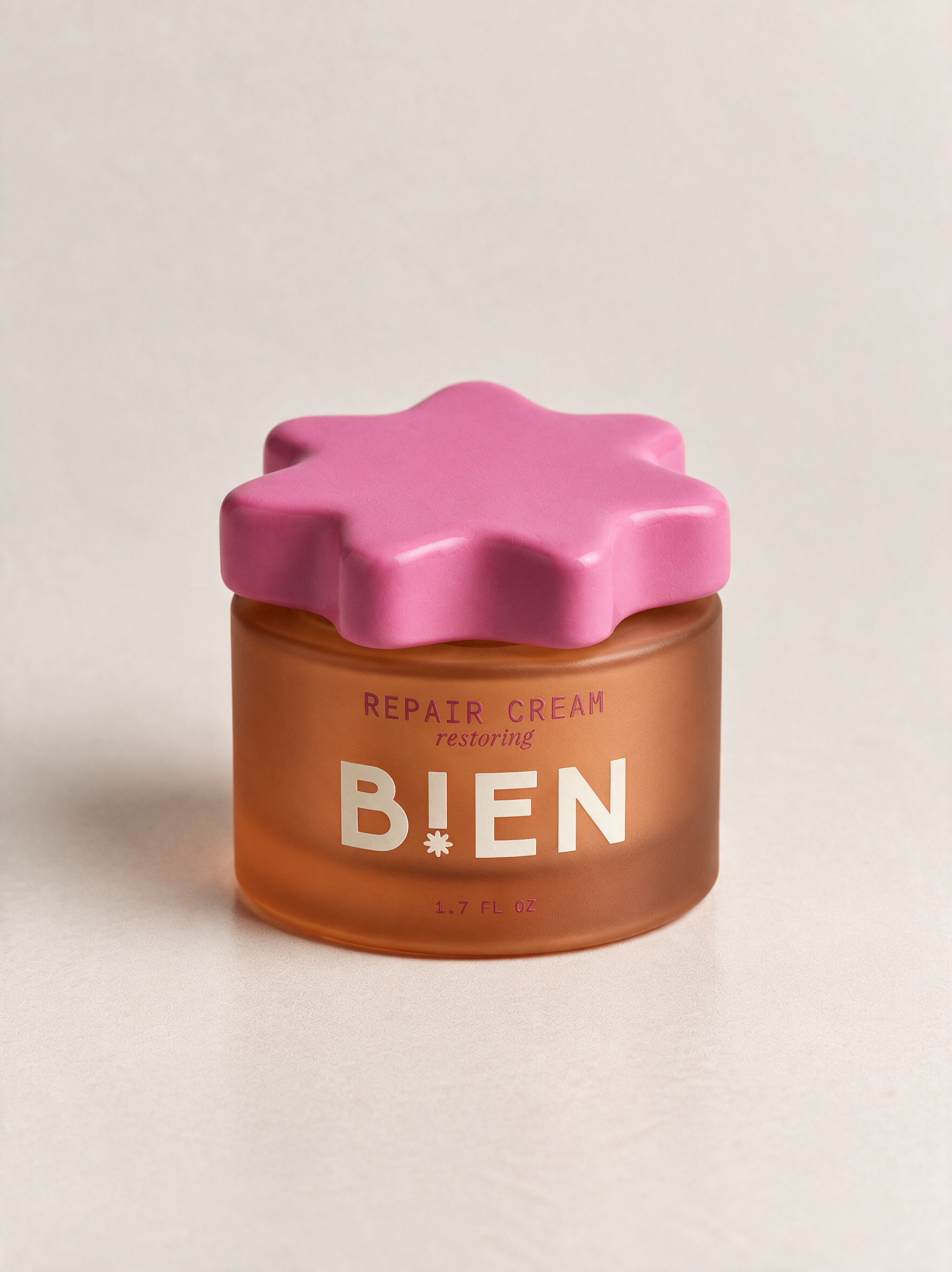
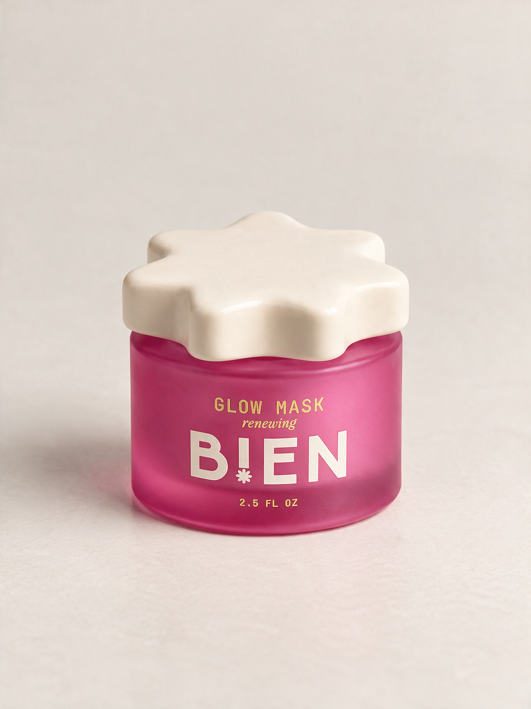
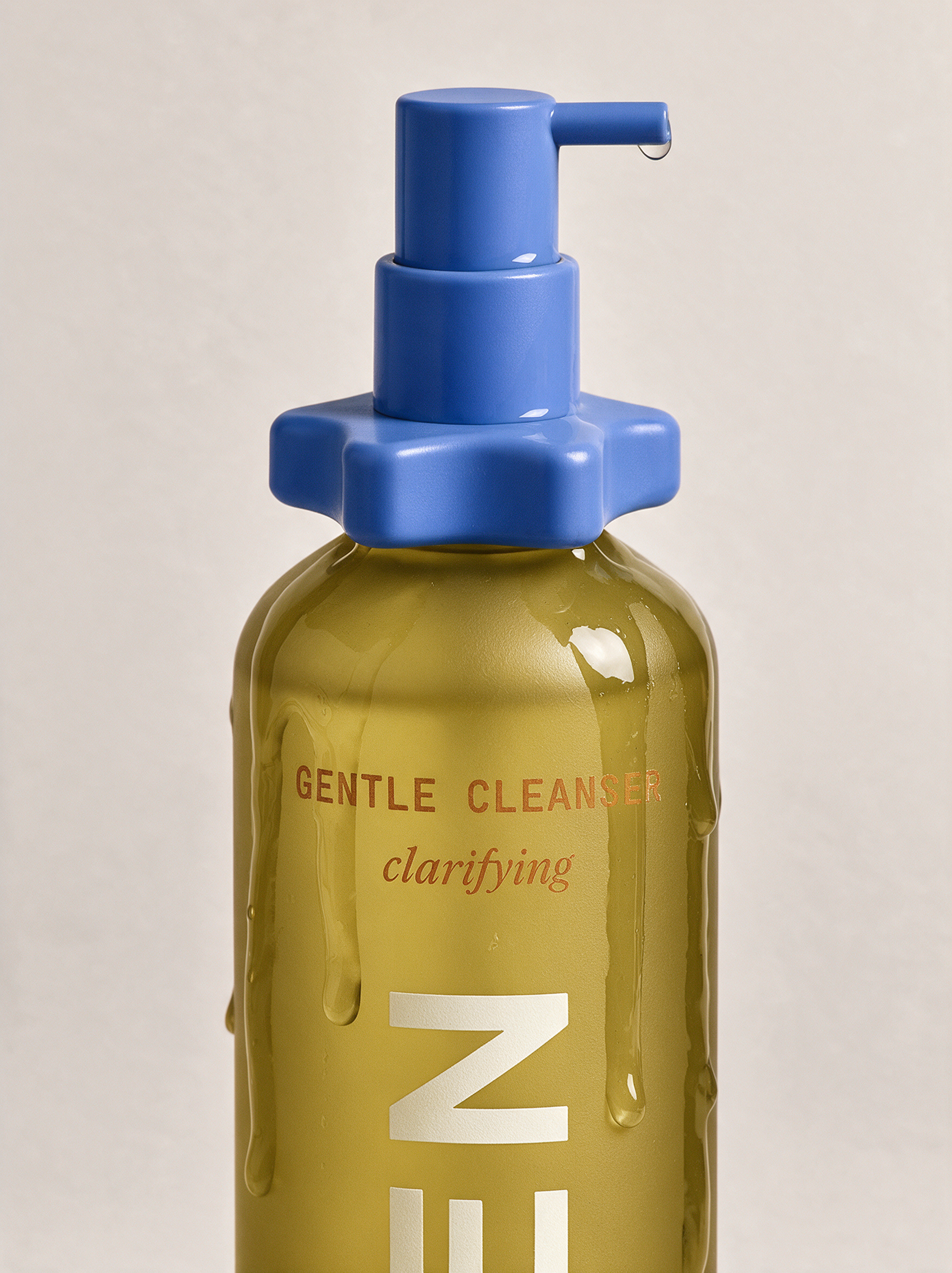
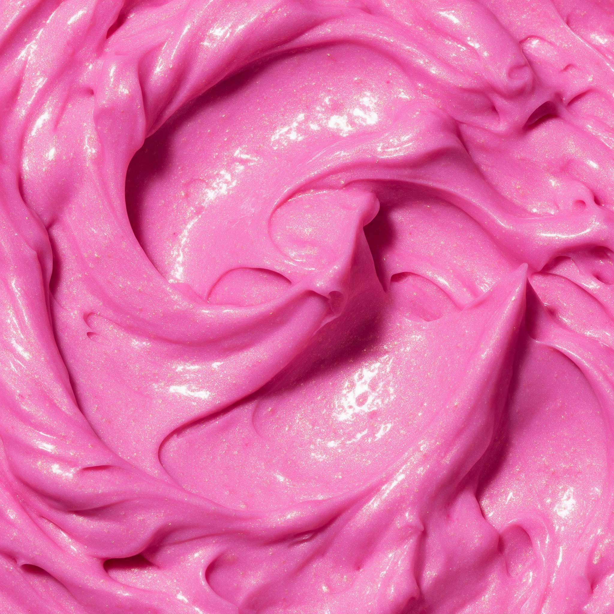
Four products, four distinct colors, one shared language: maroon glass and blush for the Vitamin C Serum, mustard-olive and cornflower for the Gentle Cleanser, magenta and cream for the Repair Cream, bright pink and cream for the Glow Mask. Rather than a single hero palette, I built a wider color family that still reads as curated, proving that range doesn't require abandoning restraint.
Packaging moved away from plastic entirely: tinted glass bodies, ceramic lids, ceramic dropper collars. Every material choice ties back to the brand's other half of its meaning, good for your skin, good for the planet, without needing to say it outright.
THE CAMPAIGN
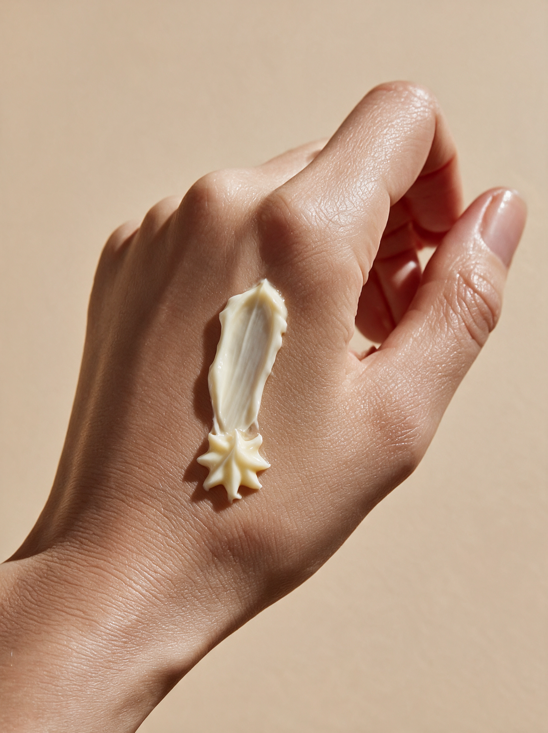
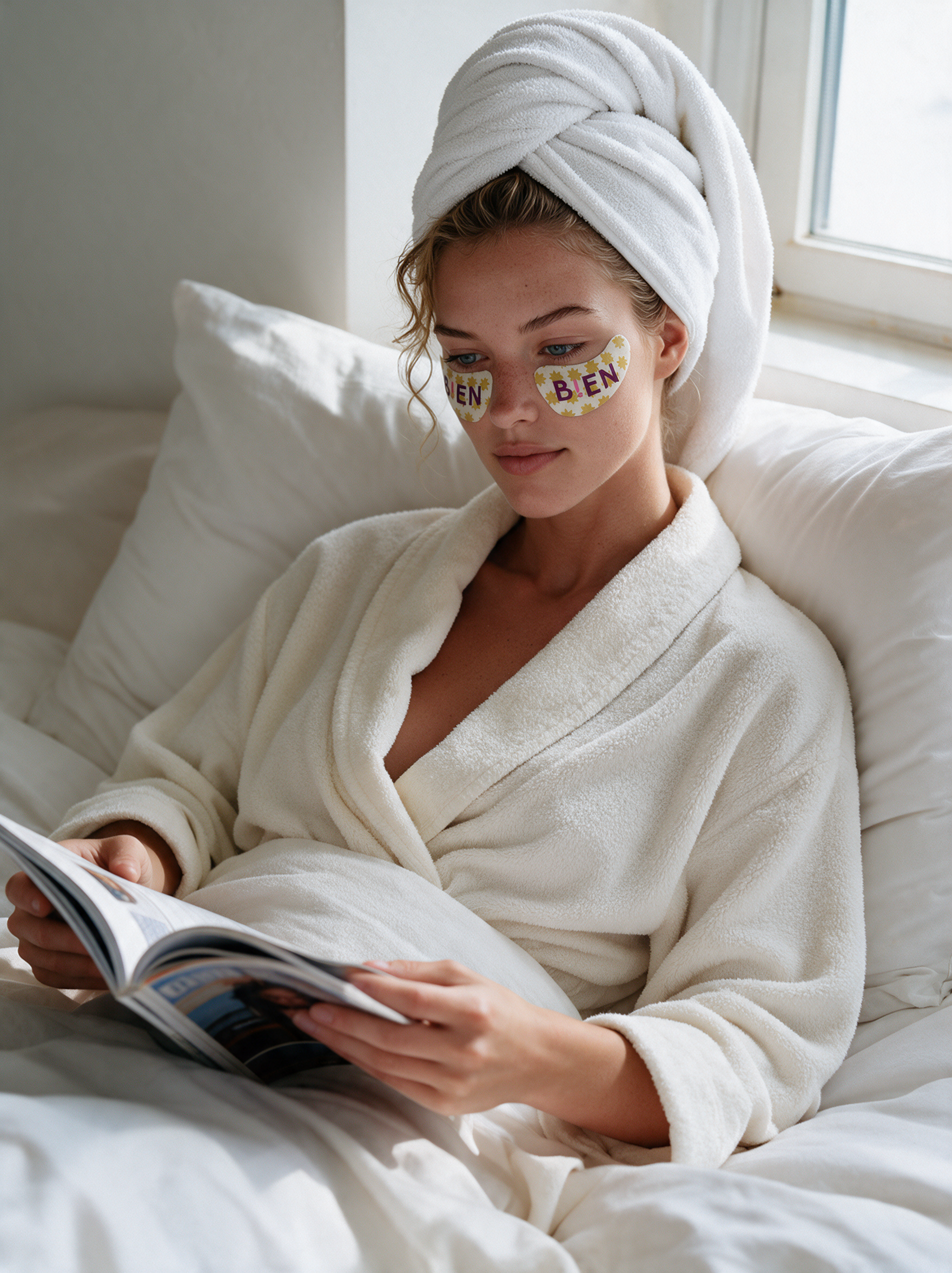
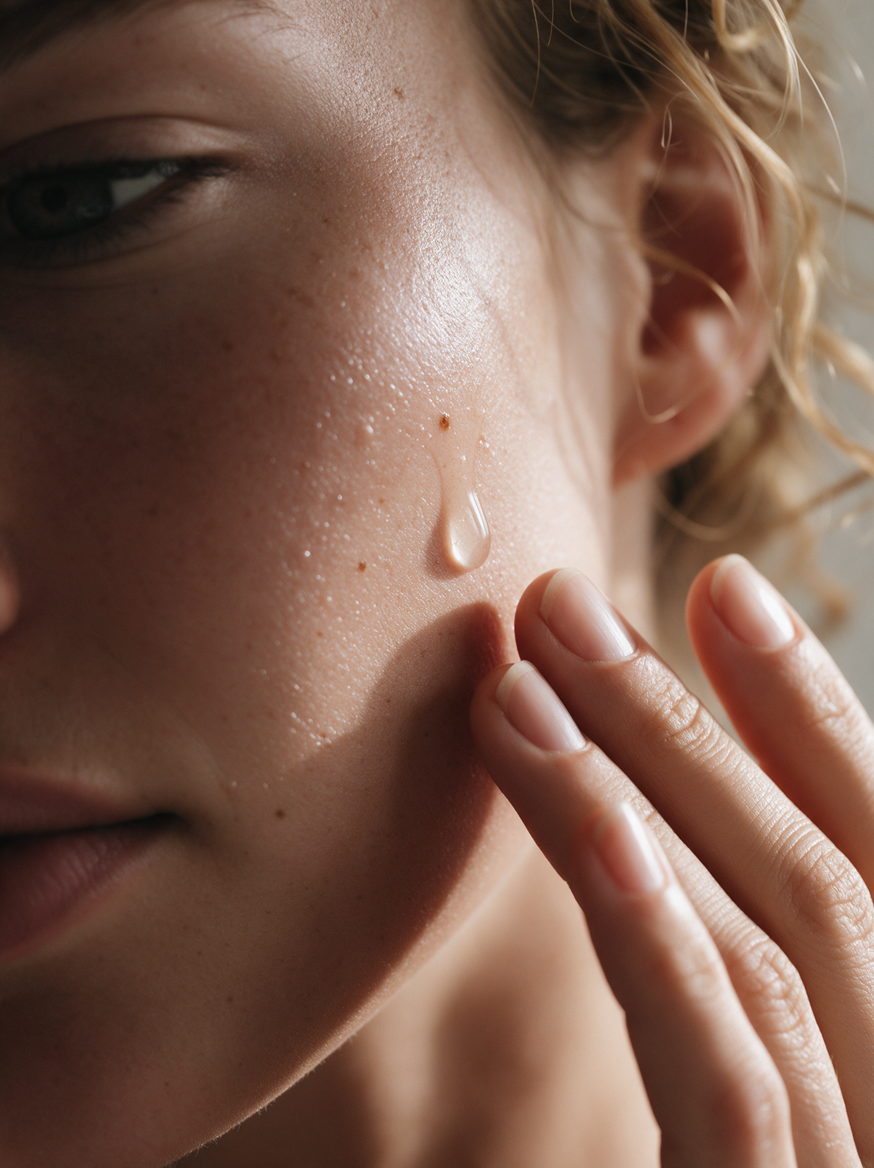
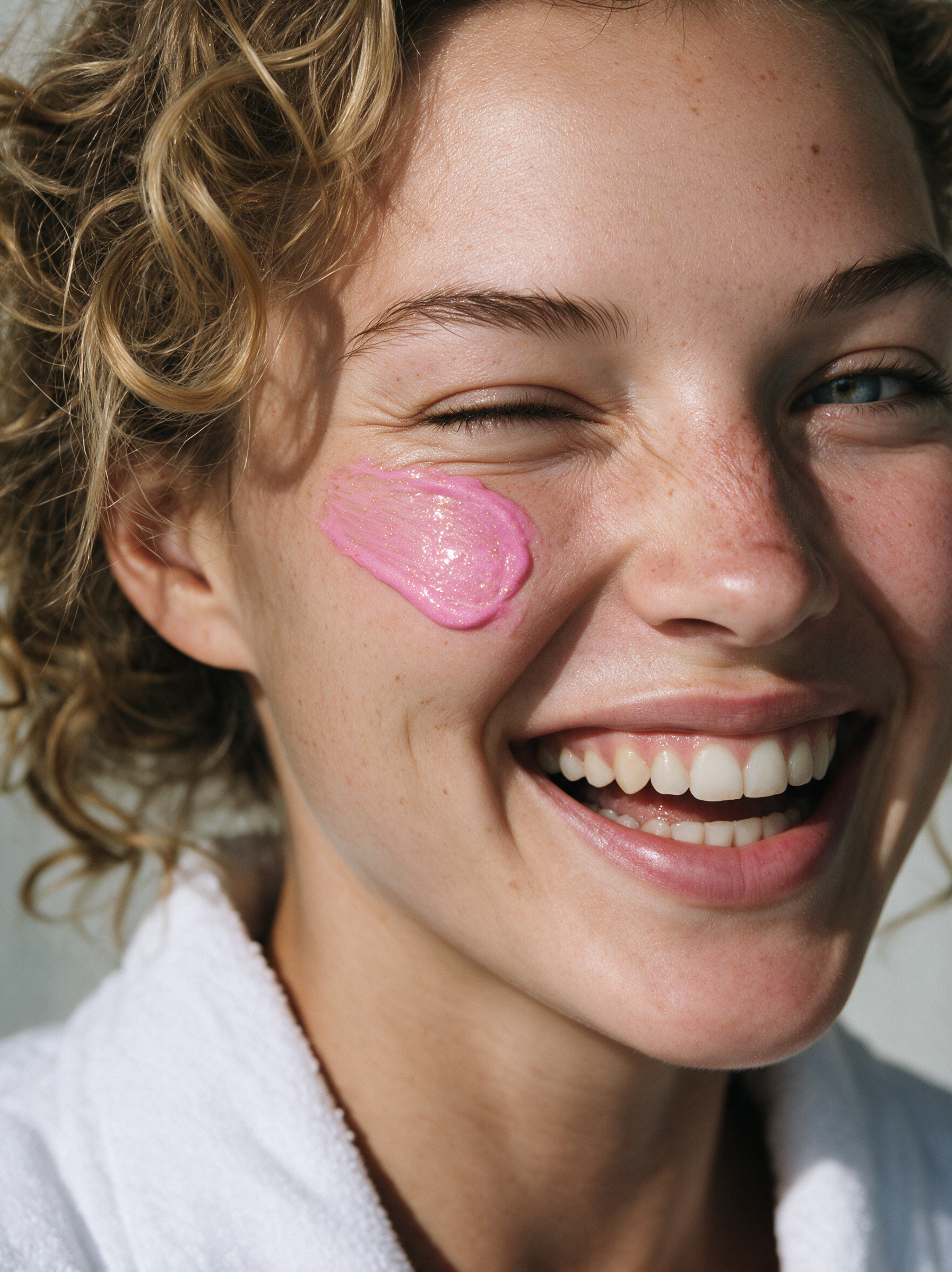
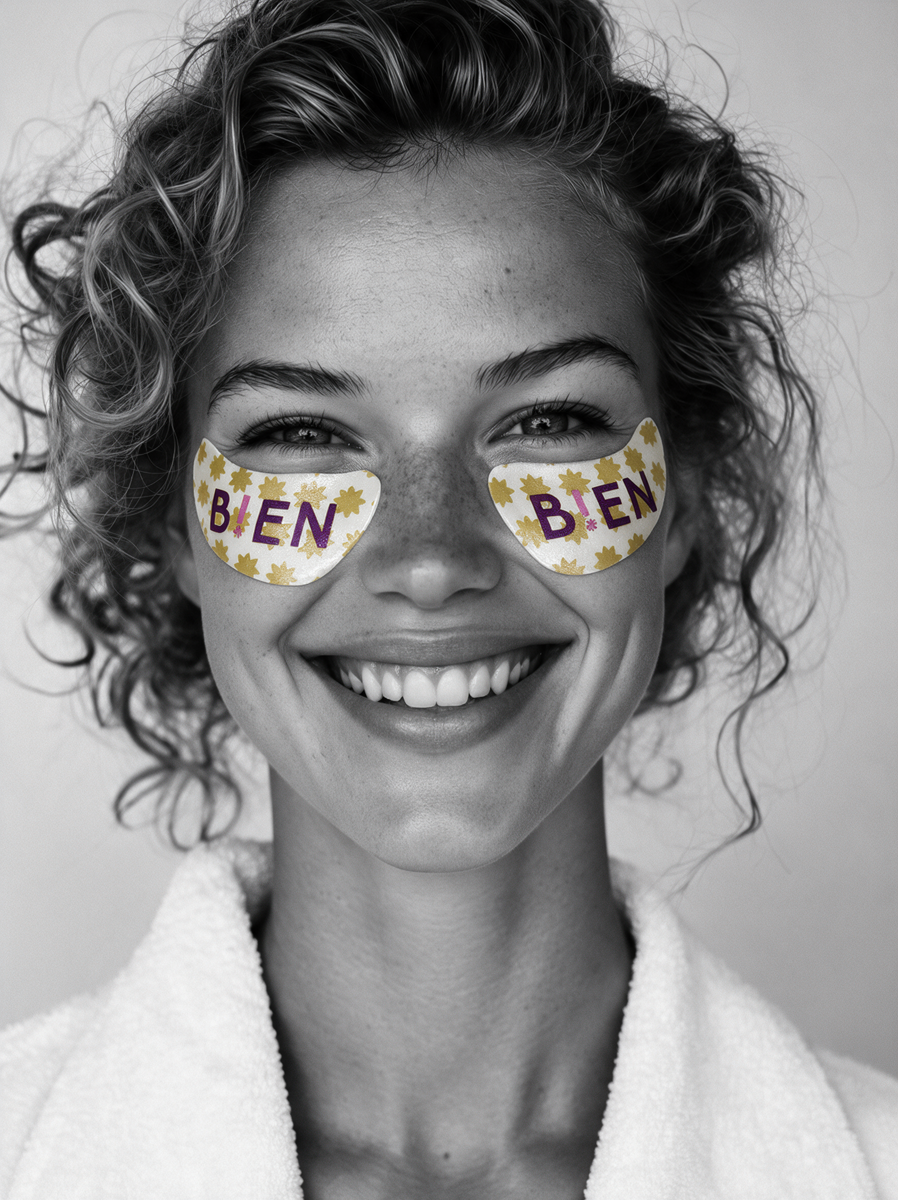
The photography leans into contrast: black-and-white lifestyle imagery with color isolated to the product, so the packaging itself becomes the visual signature of every shot. From a quiet morning routine to a genuine, unguarded laugh with a swipe of shimmering mask under one eye, the goal was always the same: real skin, real texture, real moments, not a performance of perfection.
WHAT I LEARNED
This project pushed me to hold two things at once: a genuinely wider color range than I usually reach for, and enough discipline to keep it feeling like one considered system rather than five different ideas fighting for attention. It also reminded me that the best creative decisions often come from being willing to scrap something that isn't working (an early cobalt-and-hot-pink direction that read more patriotic than premium) rather than forcing it to succeed.