
NOIR FLEUR
WHY NOIR FLEUR?
Noir Fleur began with a question. What could thoughtful gifting could feel like if it were treated as its own art form? Every detail, carefully curated and made to be noticed.
THE STRATEGY
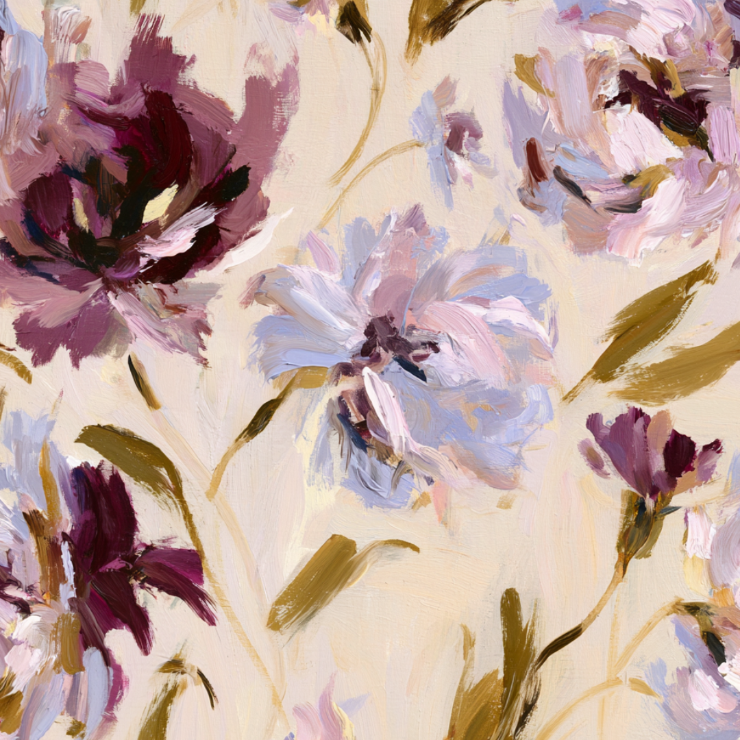
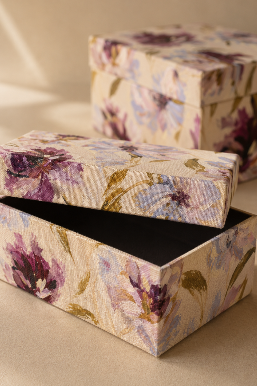
Pattern, texture and color needed to do a lot of the communication for this brand so careful consideration went into each detail. A painted floral that was used on the box, deckled edge paper, embossed details, printed ribbon. Nothing was left untouched.
THE COLOR PALETTE
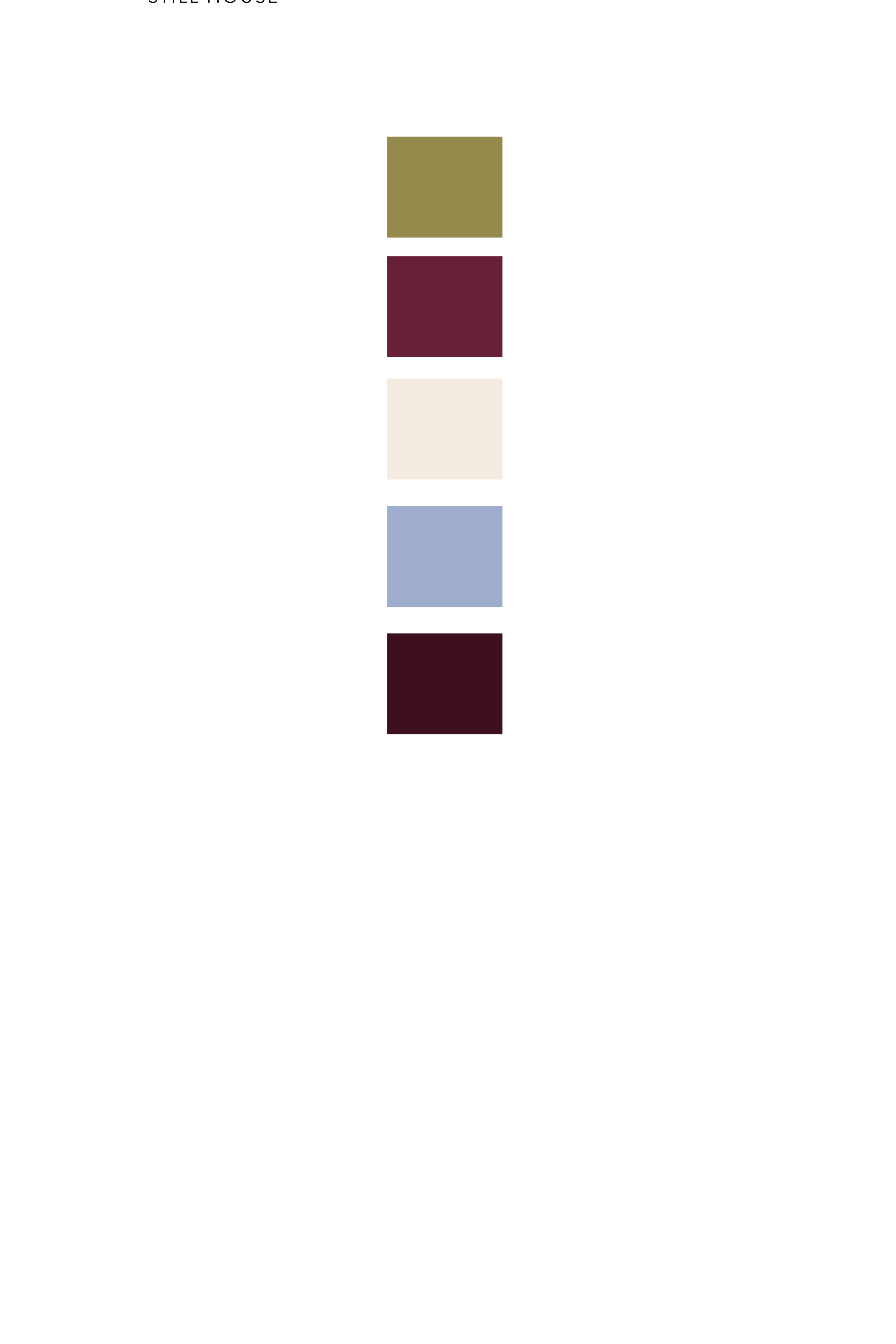
Every color in Noir Fleur's palette was chosen to carry weight without raising its voice. Deep oxblood anchors the brand in something romantic and a little dramatic, luxurious enough to feel worth the ceremony of unwrapping. Dusty periwinkle-blue softens that intensity, a quiet, almost melancholic note that keeps the identity from tipping into anything costume-like. Warm cream gives the palette room to breathe, the same restraint that lets debossing and texture do the talking on paper and velvet alike. Muted olive-gold adds a touch of warmth and permanence, reminiscent of aged brass or antique hardware, grounding the whole system in something that feels considered rather than trendy. Together, they read the way the brand itself is meant to feel: dramatic enough to be remembered in the few seconds before it's unwrapped, restrained enough to never need to shout.
THE BRAND
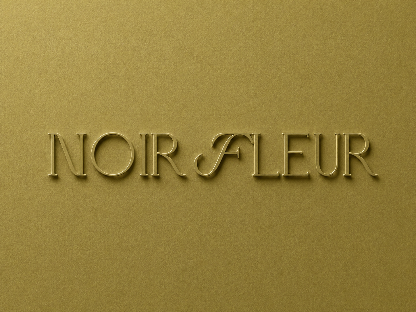
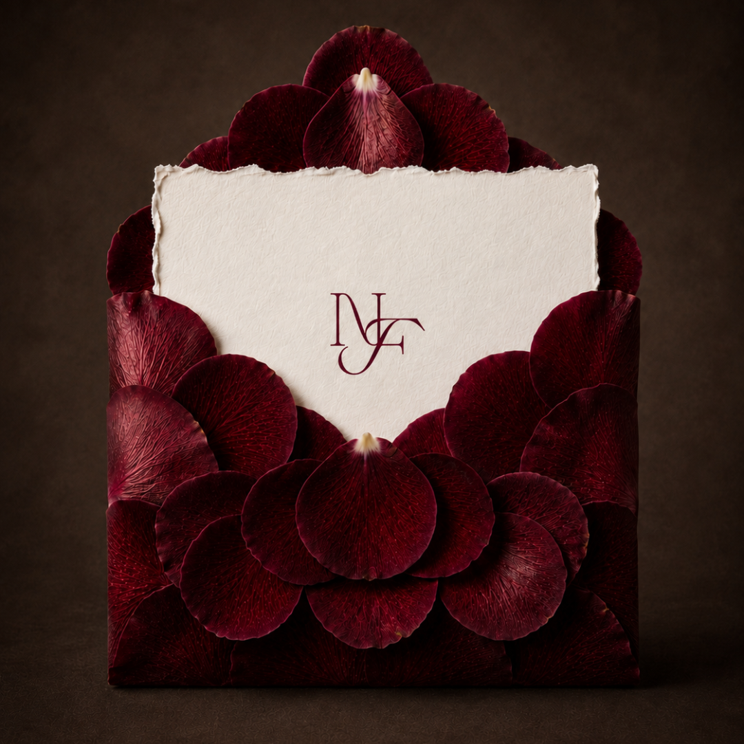
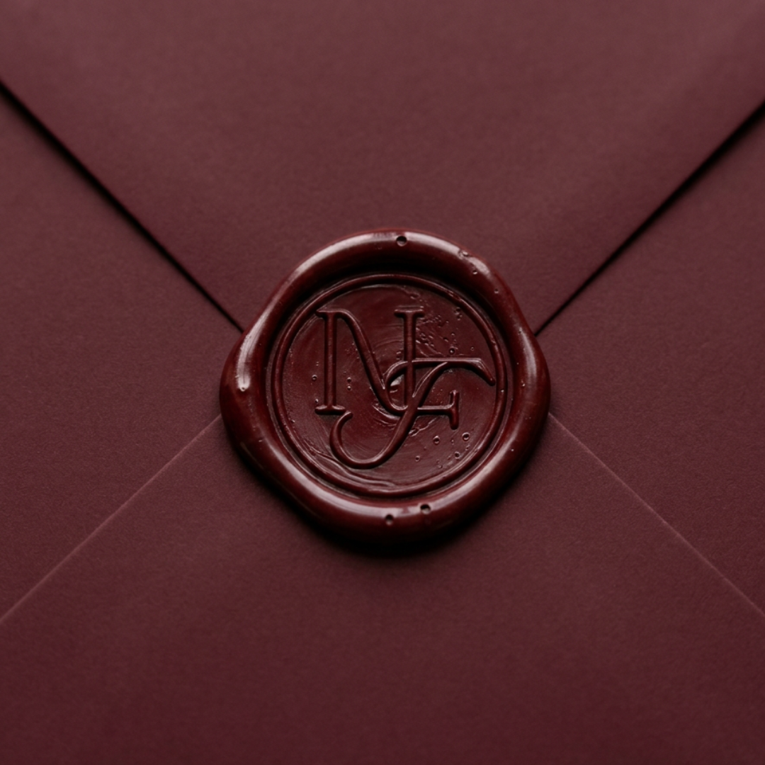
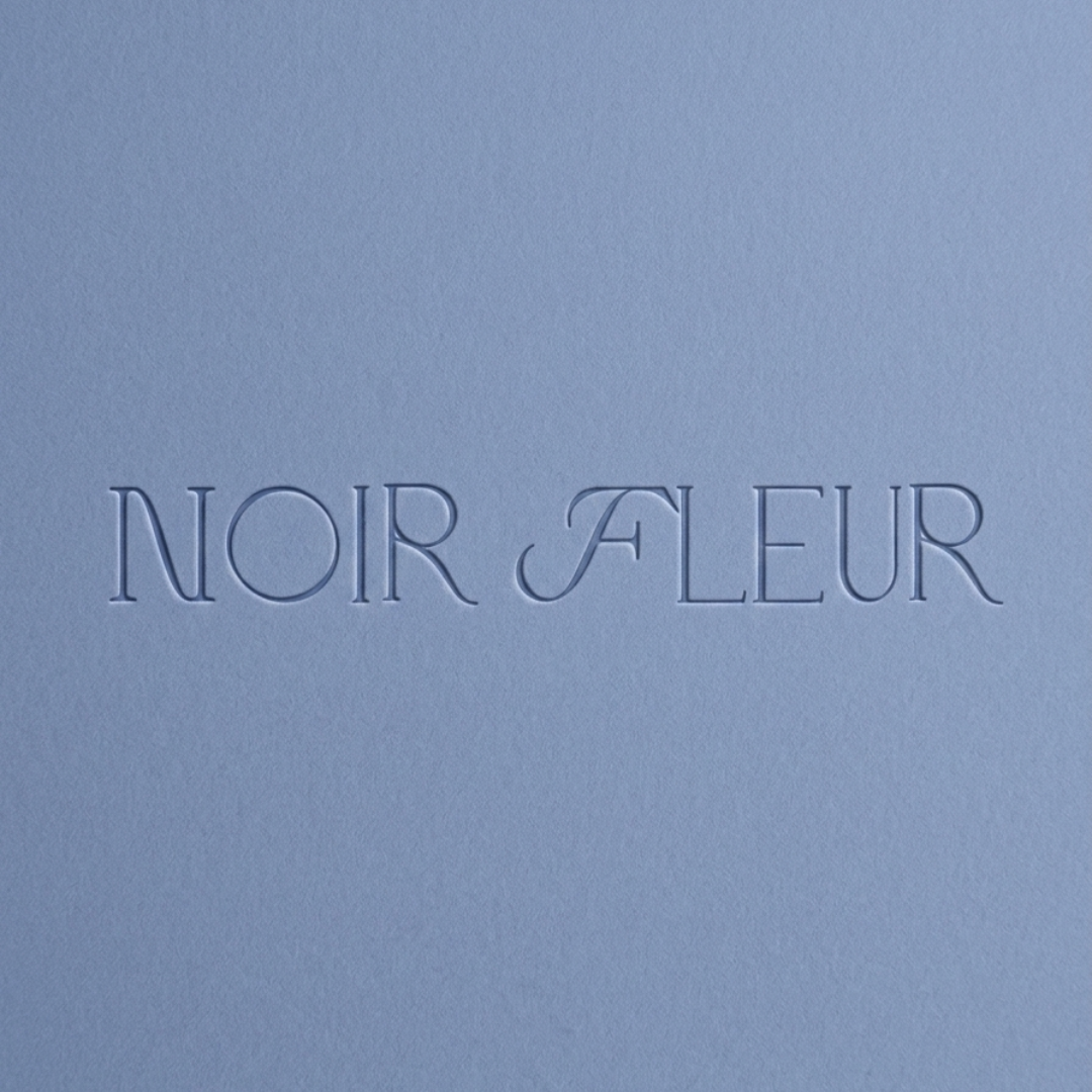
A gifting brand lives or dies by touch. Its most important surfaces aren't a website or a storefront, they're paper, wax, fabric, ribbon, things a person holds for only a few seconds before they're unwrapped and gone. I built the identity around restraint and material honesty: a hand-drawn primary wordmark (not generated) to communicate real craftsmanship, an interlocking monogram flexible enough to scale from a wax seal to a shipping box, and a soft supporting script beneath the wordmark to keep an otherwise structured identity feeling warm.
THE CONCEPT
Noir Fleur started as a question: what would it feel like if sending something small carried the same weight as receiving it? Rather than build for an existing client, I developed this concept from the ground up, a full exploration of luxury gifting from the first envelope to the last ribbon, treating the act of giving as its own art form rather than an afterthought to the gift itself.
THE SYSTEM
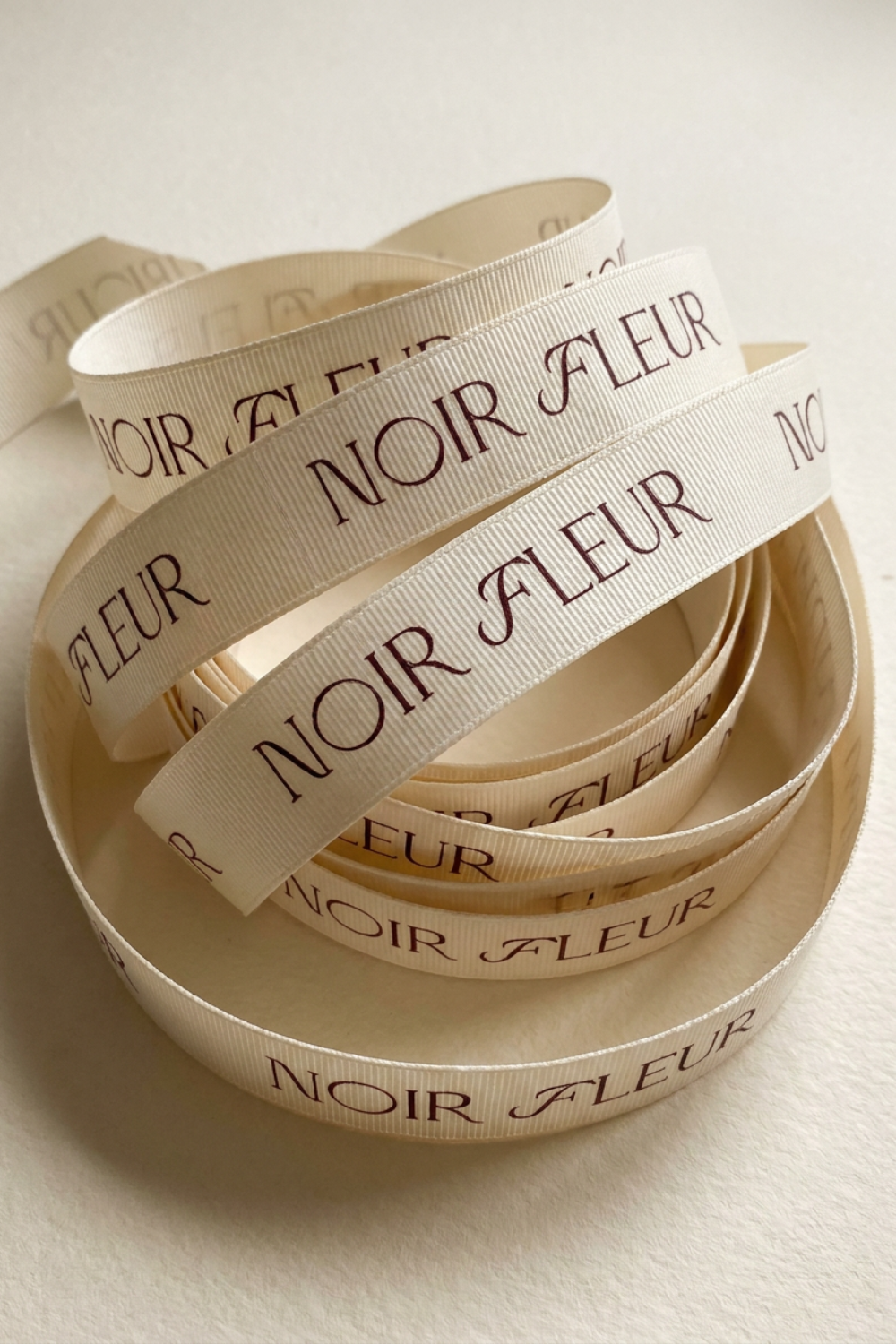
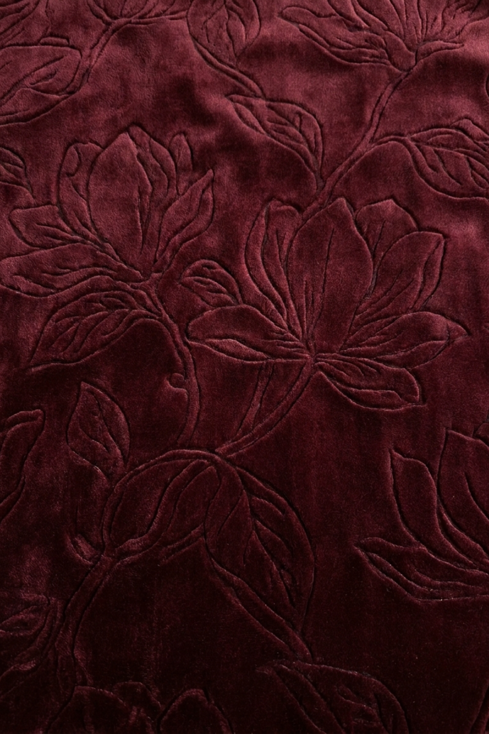
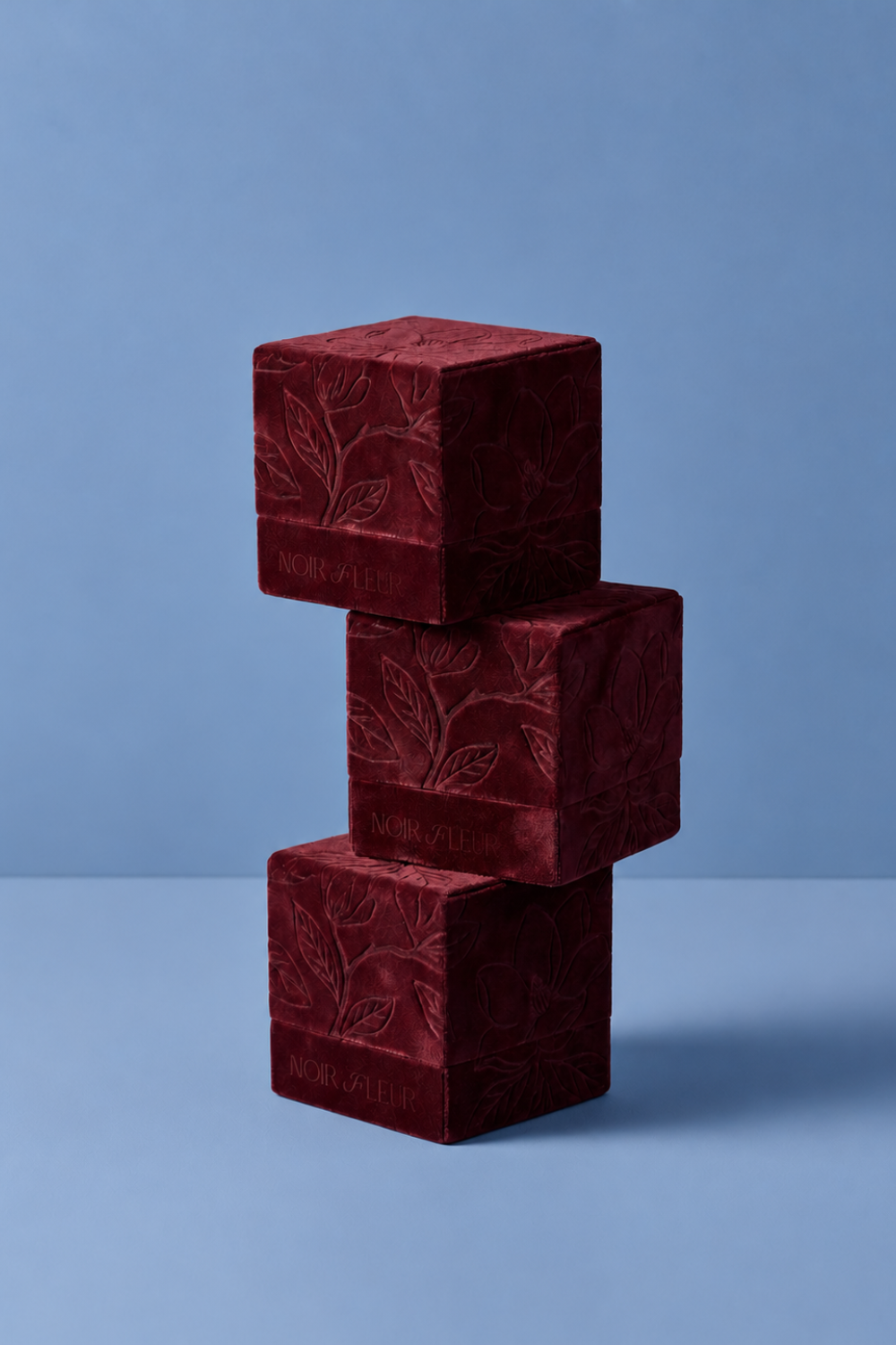
The identity had to hold together across materials that behave nothing alike: paper, velvet, wax, glass, fabric. A rose-petal envelope with hand-torn deckled stationery. A debossed velvet packaging line. A floral fabric box collection. A wax-sealed monogram closure. Branded grosgrain ribbon. Each material got its own considered finish, blind deboss, raised emboss, flat ink, so the mark always feels native to what it's printed on rather than layered over top of it. Whether pressed into wax or debossed into velvet, it stays recognizably, quietly itself.
WHAT I LEARNED
This project pushed me to think about branding as something felt, not just seen. Most identity work lives on screens; Noir Fleur only exists in the hand, for a few seconds, before it's gone. That constraint forced a different kind of discipline, restraint had to do more work than decoration, and every material choice had to earn its place rather than just look pretty in a mockup. It's the project that taught me luxury doesn't need to shout to be remembered.