MIRÁ
THE CHALLENGE
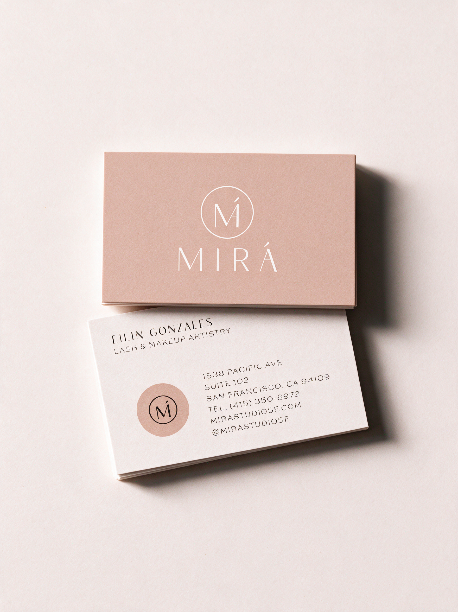
A name that means "the way we express our feelings through our eyes" is a gift for a lash studio, but only if the brand around it actually earns that meaning.
Eilin Gonzales, founder and lash artist, was opening a new studio in San Francisco's most polished neighborhoods — Russian Hill, Pacific Heights, Nob Hill, Marina — and needed more than a logo. She needed a name and a brand that could hold their own in that market without leaning on the beauty industry's usual playbook of glossy, interchangeable branding. The identity needed to feel as considered and precise as the artistry itself, not just pretty.
THE SOLUTION
We started before the logo with the name itself. "Mirá," short for mirada, is the Spanish word for the way we express feeling through our eyes: a name built specifically for a lash studio, not borrowed or repurposed from somewhere else. That meaning became the conceptual throughline for everything that followed, from the wordmark to the submark. The result is a brand that's quiet, elevated, and specific: refined typography, a restrained palette, and a logo mark built to feel as intentional up close as it does at a glance.